Are you a photographer looking to take your online presence to the next level? At Inkpot Creative, we are the unconventional website designers for photographers, and we know exactly what it takes to create a stunning online space that showcases your talent and attracts new clients.
In this blog post, we will walk you through the telltale signs that indicate you need a new website. By the end, you’ll know if it’s time to either stick with what you’ve got or start building a new site so that you can really stand out from the crowd.
Here are the signs you need a new website.
Your website is slow to load
Having a slow-loading website can be a major turn-off for potential customers. Think about it – aren’t you likely to exit out of a website if the page takes too long to load? (I know I do!)
The world is extremely fast-paced, so people expect websites to load quickly and provide a seamless browsing experience. When your website takes too long to load, it frustrates visitors and makes them lose interest FAST.
As a result, they are more likely to click away and find a competitor’s website instead. This means that if your website is slow, you could be missing out on valuable leads and potential customers.
The design and layout are outdated
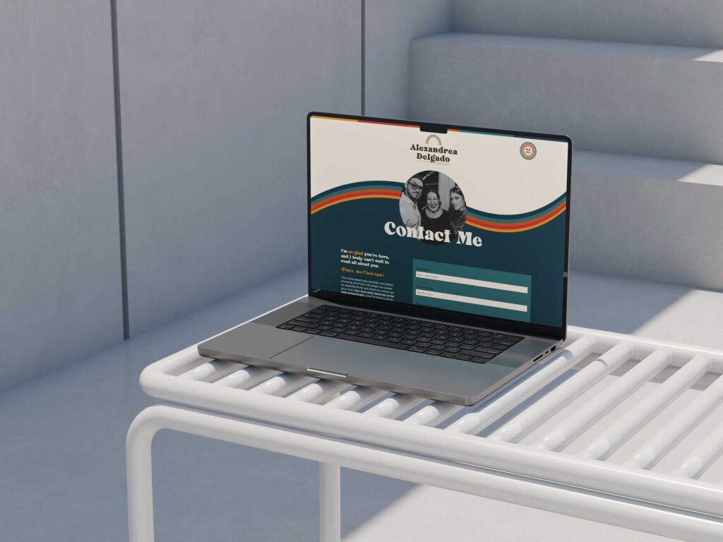
Many photographers and other creatives who inquire with us let us know that one of the main reasons they want a new website is because their design and layout are outdated.
Having an outdated and unappealing design and layout on your website is a clear indication that it’s time for a refresh. A visually unappealing website can quickly turn potential customers away.
First impressions matter, and if your website looks outdated, visitors may question your business’s credibility and professionalism. A modern and visually pleasing design is essential to both intrigue and engage users, ensuring they stay on your site and explore what you have to offer instead of exiting.
By investing in a new website with a fresh design and layout, you can create a positive user experience that reflects the quality of your products or services.
The website isn’t mobile-friendly
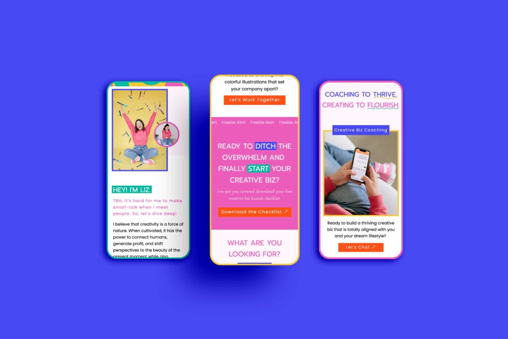
With most internet users accessing websites through mobile devices on the go, having a website that isn’t mobile-friendly can be a HUGE drawback. It is a clear sign that you need a new website.
When a website isn’t mobile-friendly, it can lead to an extremely poor user experience. Visitors may struggle to navigate through the site, with buttons and links being too small to click on and content not properly fitting on the screen.
This can be frustrating for users and could result in them leaving your website and seeking a competitor instead.
In addition, search engines like Google now prioritize mobile-friendly websites in their search results, meaning that your website’s visibility and ranking could suffer if it isn’t optimized for mobile. If your website isn’t mobile-friendly, it’s a clear indication that it’s time for a new website that caters to the needs of mobile users.
Your website is not optimized for SEO
Having a website that is not optimized for SEO can be detrimental to your online presence. It means that your website is not structured or designed in a way that search engines can easily understand and index. As a result, your website may not appear in search engine results pages (SERPs) for relevant keywords, making it difficult for potential customers to find you!
A website that is not optimized for SEO may lack critical elements such as alt text, meta tags, proper keyword usage, and internal linking. These elements are crucial for search engines to determine the relevance and authority of your website. Without them, search engines may not prioritize your website in their rankings, leading to decreased visibility and organic traffic.
A modern website should not only have an appealing design but should also be built with SEO best practices in mind. By investing in a new website that is optimized for SEO, you can improve your chances of ranking higher in search engine results, increase your organic traffic, and ultimately reach a wider audience.

It’s difficult to navigate and find information on your website
When users struggle to locate the information they need, it can lead to frustration and a negative user experience. This is one of the top signs you need a new website, and unfortunately, we see this all the time.
A poorly designed navigation menu, cluttered layout, or lack of clear call-to-action buttons can all contribute to this problem. A new website can address these issues by implementing a user-friendly interface, intuitive navigation, and a streamlined layout that guides visitors a lot easier through the site.
Many creatives don’t realize this, but a website that is challenging to navigate can also impact your business’s credibility and professionalism. If users struggle to find information about your products, services, or contact details, it can create a sense of distrust and cause them to seek alternatives elsewhere.
By prioritizing usability and making information easily accessible, you can ensure that potential customers stay engaged and find what they need effortlessly.
Your competitors have better websites that attract more traffic and sales
Having competitors with better websites that attract more traffic and generate higher sales can be a clear indication that it’s time for your business to invest in a new website.
Think about it: a website is often the first point of contact between a customer and a company. If your competitors have websites that are more appealing, user-friendly, and optimized for search engines, they are likely to attract a larger audience and, consequently, gain a competitive advantage.
You’ve rebranded or changed your business focus, but your website doesn’t reflect that
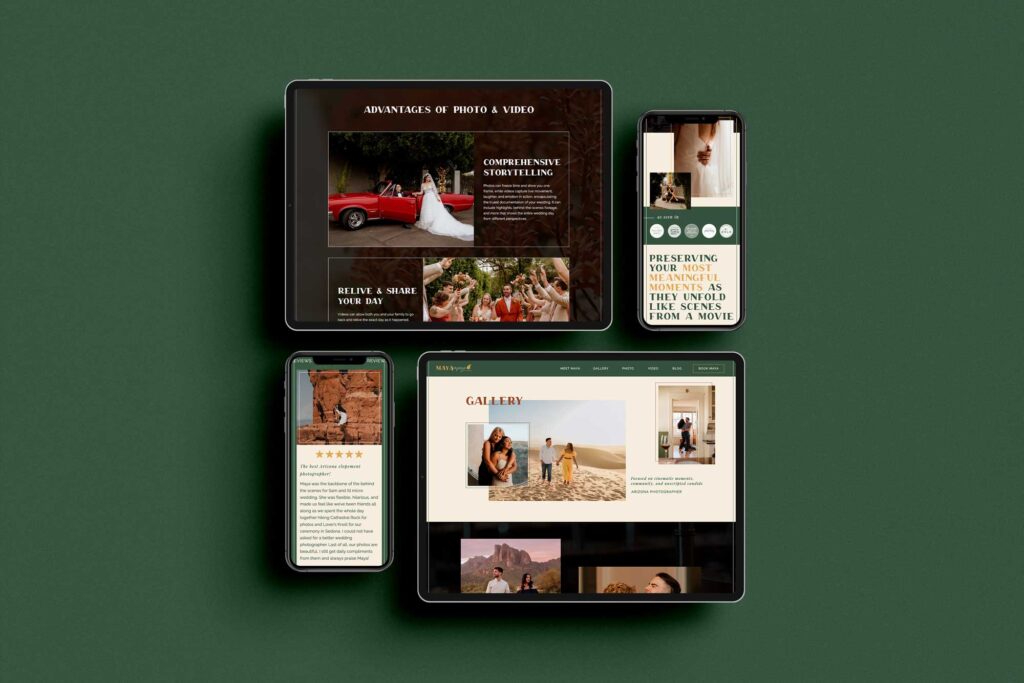
If you’ve recently rebranded or changed your business focus, but your website still reflects the old image, it’s time for a new website. Your online presence should align with your current brand identity and messaging, as it serves as the digital face of your business.
A website that doesn’t accurately represent your business can confuse visitors and potentially drive them away. You want to ensure that your online platform accurately reflects your current brand image and effectively communicates your updated business focus.
This is also true if you’ve recently pivoted. Make sure everything is aligned!
The content is outdated and doesn’t accurately represent your products or services
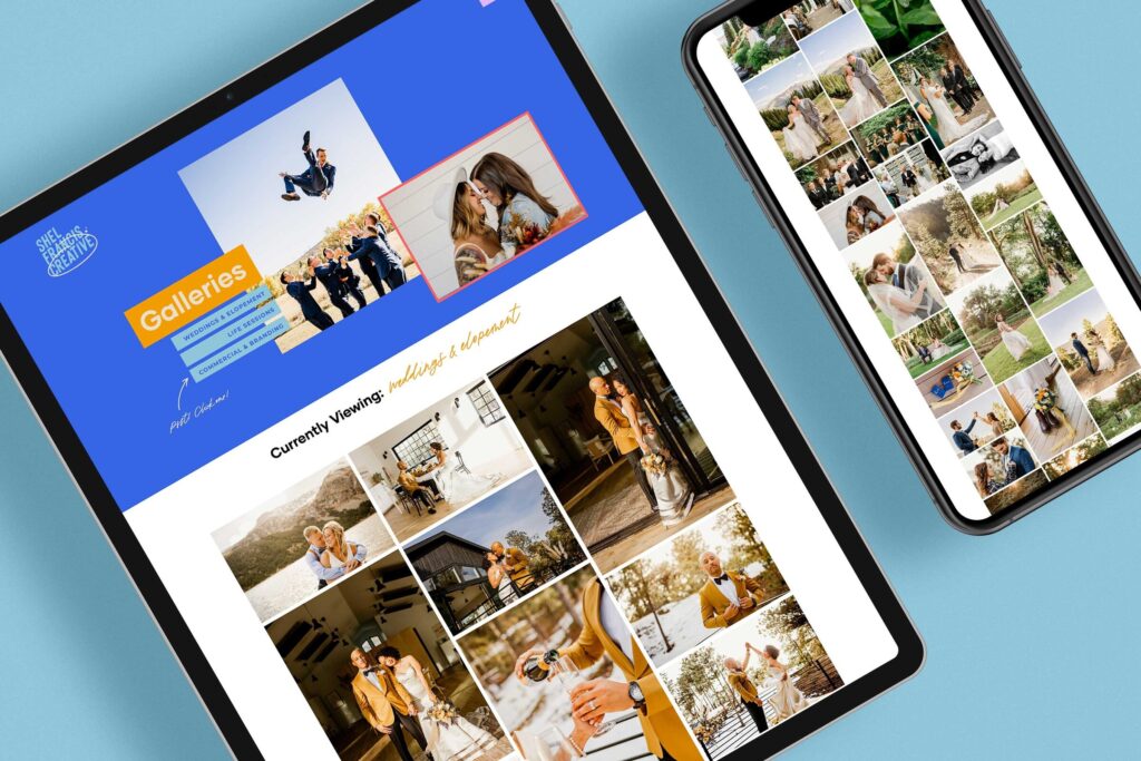
Having outdated content on your website can be detrimental to your business. When the content on your website doesn’t accurately represent your products or services, it creates confusion and can lead to missed opportunities.
Your potential customers may not be able to find the information they are looking for, or worse, they may get the wrong impression about what you offer. It’s crucial to have a website that reflects your current offerings and positions your business as relevant and trustworthy.
Your website has broken links or errors
When visitors come across broken links, it not only disrupts their browsing experience but also reflects poorly on your brand’s credibility (eek!). These broken links can lead to frustration and may cause users to abandon your site altogether.
Errors such as 404 pages or slow loading times can leave a negative impression on your audience, too, making them question the professionalism and reliability of your website.
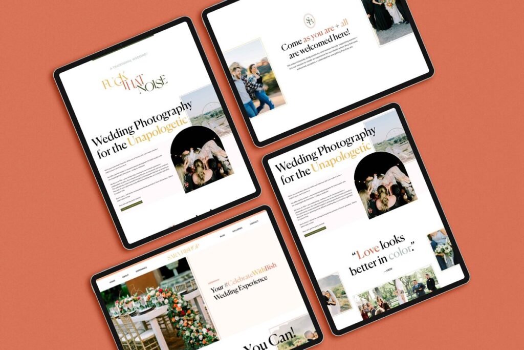
There are no clear calls to action
Having clear calls to action on your website is super important for driving conversions and guiding visitors toward their desired actions!
When there are no clear calls to action, it becomes challenging for users to know what steps they should take next, resulting in a poor user experience and missed opportunities for your business. If you find yourself in a situation where your website lacks clear calls to action, it is undoubtedly a sign that you need a new website.
So, what actually happens when you don’t have actions that are clear to follow? Without clear calls-to-action, visitors may feel lost and uncertain about how to proceed. They might leave your website without taking any action or end up navigating aimlessly, decreasing the chances of them becoming actual customers.
A website with well-placed calls-to-action not only enhances user experience but also increases the likelihood of conversions, ultimately boosting your business’s success.

You’re unable to easily update or add new content to your website yourself
Having a website that is difficult to update or add new content to can be a frustrating experience for you, and unfortunately, it’s one that we hear often. It not only hinders your ability to keep your website fresh and relevant, but it also limits your control over your own online presence.
When you’re unable to easily make changes or add new content yourself, it can be a clear sign that it’s time for a new website.
A website should be a platform that allows you to showcase your business and engage with your audience. However, if you find yourself relying on a web developer or IT team to make even the smallest updates, we don’t think it’s the ideal situation. You should feel confident that you can update your website yourself.
Whether it’s updating product information, posting news and blog articles, or making changes to your services, having to rely on external help can be time-consuming and expensive (let’s be honest).
By investing in a new website that offers a user-friendly content management system, you can regain control and have the freedom to update and add content whenever you need to.
Your website has a high bounce rate
Having a high bounce rate on your website can be a clear indication that you need a new website. When visitors land on your site and quickly navigate away without engaging with your content or exploring further, it suggests that something is not resonating with them.
A high bounce rate can be attributed to various factors, such as a slow-loading website, poor user experience, outdated design, or irrelevant content. It is important to address these issues to ensure that your website captures and retains the attention of your target audience.
By investing in a new website, you can create a visually appealing and user-friendly platform that encourages visitors to stay longer, explore your offerings, and ultimately convert into customers.
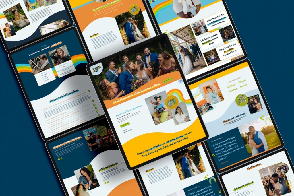
You’re embarrassed to share your website with potential clients
When you avoid sharing your website with potential clients, it’s not only a missed opportunity to showcase your products or services, but it also shows a lack of confidence in your own brand. Investing in a new website that accurately represents your business and engages your target audience is crucial for establishing credibility and attracting potential clients.
By having a website that you’re embarrassed to share, you risk losing valuable opportunities to convert potential clients into customers.
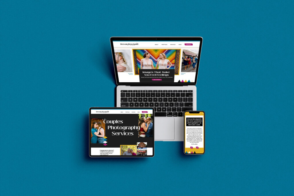
So.. do you need a new website?
Having a well-designed and functional website is crucial for any business in today’s digital age. It serves as the first point of contact for potential customers and can make or break their decision to do business with you.
If you’ve come to the realization that your website needs an update or a complete overhaul, then now is the perfect time to take action. Don’t let an outdated website hold back your business growth this year!
We specialize in creating modern, personality-driven, and user-friendly websites that will help elevate your brand and attract more customers. Click here to get in touch.
Save this post for later:
- Caregiver Brand Archetype Examples For Photographers - February 12, 2026
- Hero Brand Archetype Examples For Photographers - January 28, 2026
- Sage Brand Archetype Examples for Photographers - January 20, 2026
1/19/24
Published On:
Krystianna Pietrzak


