Looking for therapist website examples? You’re in the right place!
Establishing a strong online presence is crucial for therapists looking to connect with their clients. A well-crafted website not only serves as the virtual face of your practice but also reflects your style and philosophy.
In this blog post, we delve into a curated collection of examples of therapist websites that we’ve designed here at Inkpot Creative. Each example stands out for its unique approach in design, functionality, and the ability to create a welcoming and informative online space for potential clients.
Whether you’re a seasoned practitioner or new to your practice, these websites offer a variety of inspiration to help you design a platform that resonates with your professional identity and meets the needs of those seeking your guidance.
Keep reading to learn more about these therapist website examples and see some must-haves that you need on your therapist website.
Therapist Website Examples
Be Here Wellness & Counseling
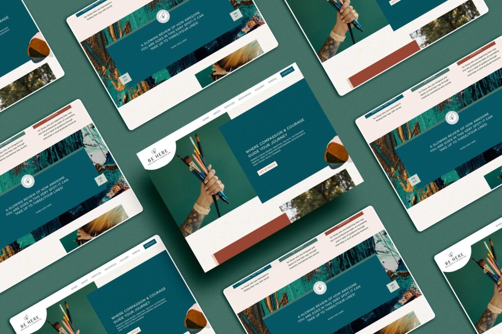
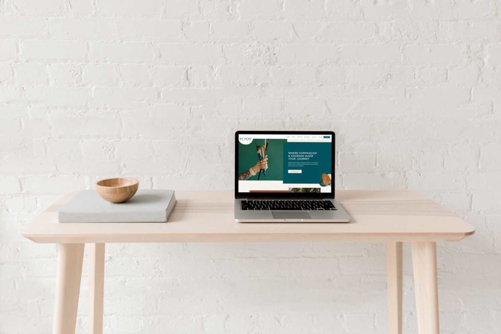
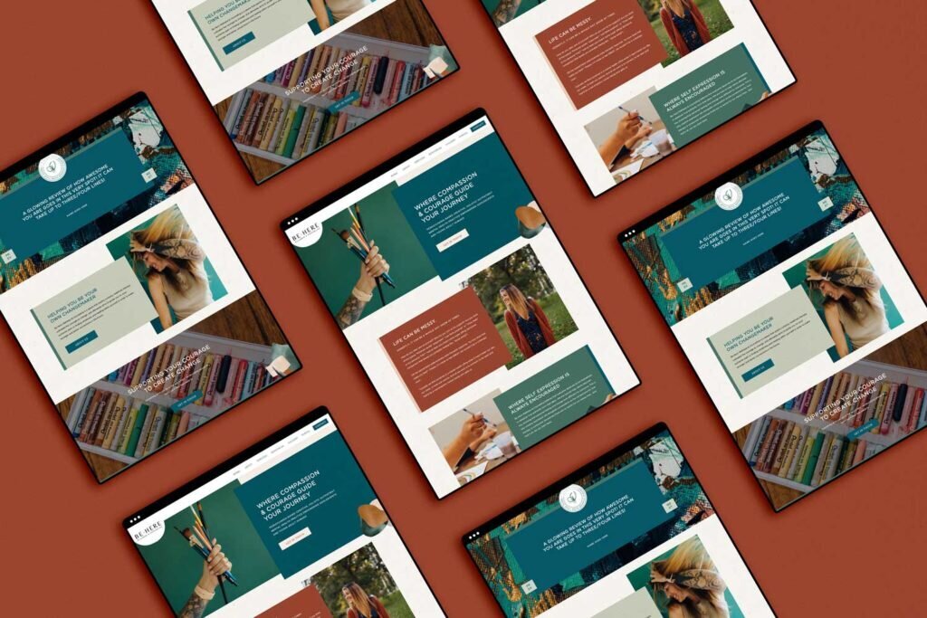
Be Here Wellness & Counseling is an art therapy practice led by the remarkable therapist Brooke (she/her). Brooke’s vision for a distinct online presence led her to invest in a custom website design with us, which we were excited about.
Collaborating closely with Bethany Works for branding, our primary objective was to translate this creative branding into an online storefront that embodies the essence of Be Here Wellness & Counseling.
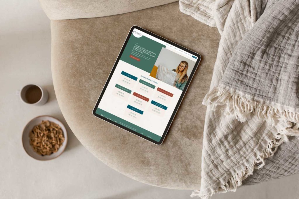
The website blends aesthetics with user-friendly elements, and we leaned heavily into the artistic branding. Visitors navigating the site are greeted with dynamic paint swashes that draw themselves onto the pages, creating an engaging and interactive experience.
This artistic touch is complemented by moving galleries and carefully crafted GIFs (thanks to the beautiful brand photography by Kylee B Photography), adding an element of fun and movement that captures the eye.
The design elements are not just visually appealing but also resonate well with the practice’s teen clientele.
Brooke’s website is also meticulously designed to be accessible and easy to navigate, especially for the parents of teen clients. Understanding that simplicity in navigation is key for a diverse age group, the layout is intuitive, ensuring that all necessary information is just a click away.
The blend of unique design for the younger audience and straightforward functionality for the adults sets this website apart, making it a perfect digital representation of Be Here Wellness & Counseling’s commitment to catering to all their client’s needs.
Goodworks Counseling
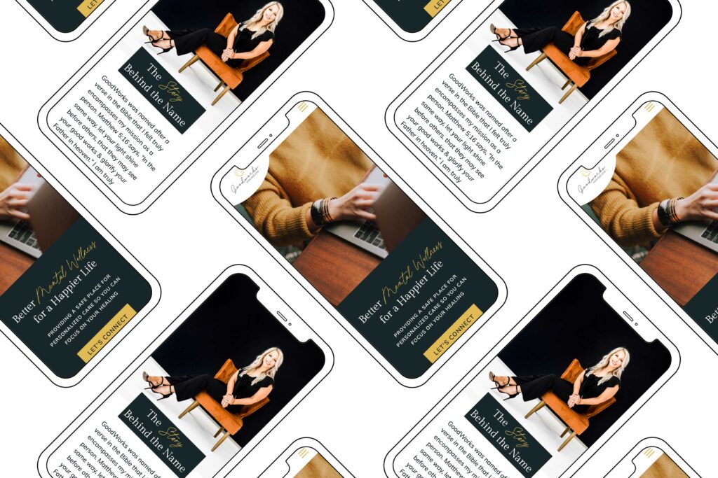
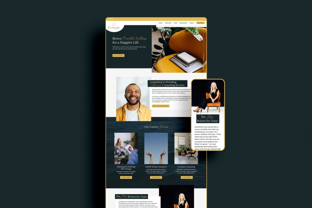
Next is Goodworks Counseling, based in Texas, which is still just as bold and colorful as Be Here Wellness & Counseling but appeals to a different audience. This was not a custom website, but instead is based on our Lorna Showit Template.
Goodworks Counseling’s website features a user-centered approach in its design, prioritizing user experience (UX) to create an engaging and intuitive online environment.
This focus can be seen in the strategic placement of clear calls to action, which are thoughtfully integrated throughout the site to allow for easy navigation for visitors. This means that users can effortlessly find the information or services they need, making their overall experience and interaction with the site that much better.
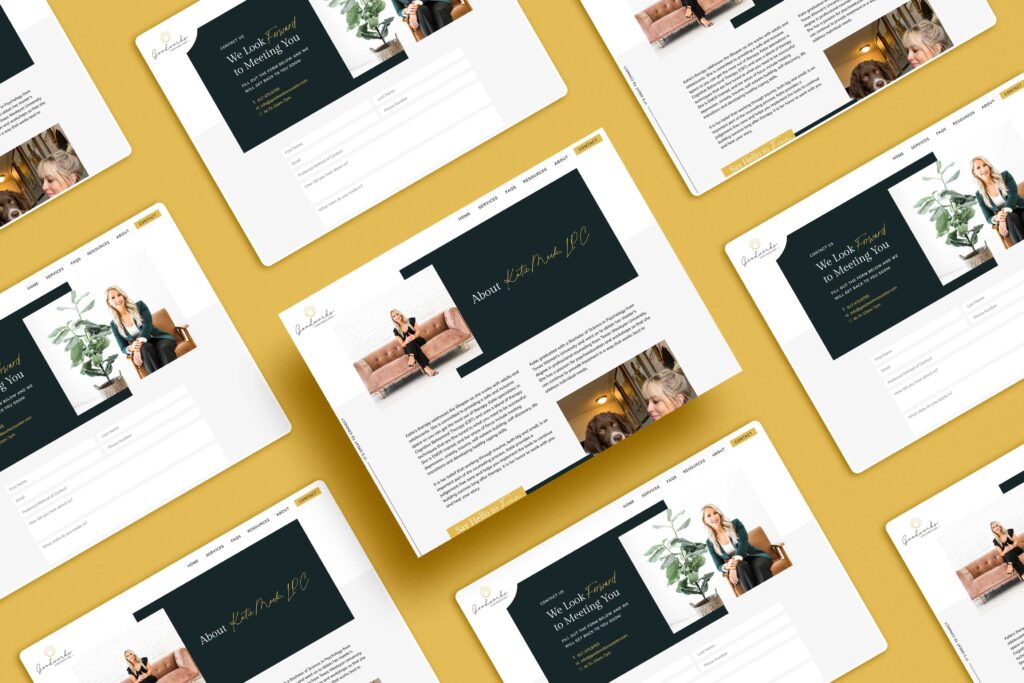
The website also boasts several distinctive features that contribute to its dynamic and inviting nature. One of the key elements is the creative use of layering throughout the site (which we love), which adds depth and a sense of movement, making the user’s journey through the pages more engaging.
Additionally, the website has a focus on a vibrant yellow color scheme, a deliberate choice to inspire action and positivity among visitors. This color not only makes the website visually appealing but also aligns with the energetic and hopeful ethos of Goodworks.
Plus, the site includes fun hover effects for desktop users, adding an element of surprise and delight that encourages visitors to continue exploring and interacting with the content.
Goodworks Counseling’s website reflects the organization’s core values and commitment to inclusivity and ethical practice. The site explicitly states Goodworks’ dedication to being LGBT-friendly and its policy of nondiscrimination right in its footer, putting its values at the forefront.
What to Include on Your Therapist Website
Wondering what to include on your therapist website? These are some of the elements you won’t want to skip out on.
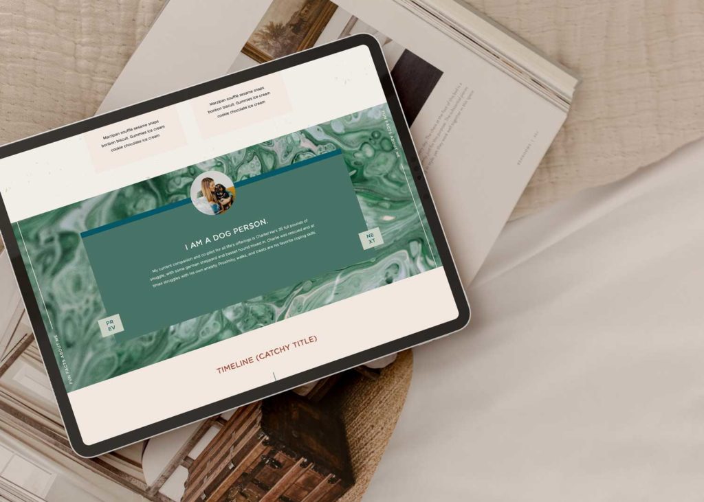
About Me section
Having an “About Me” section on your therapist website is essential. It allows you to humanize yourself and connect with your potential clients more deeply. By sharing personal stories, you can create a sense of relatability and establish trust with individuals seeking therapy.
This section provides an opportunity to showcase your personality, helping clients feel more comfortable and confident in reaching out to you.
The “About Me” section serves as a platform to give a glimpse into your background, experience, and qualifications. By sharing your educational accomplishments, certifications, and years of experience, you can instill confidence in potential clients that you are a qualified professional.
Services offered
When it comes to a therapist website, it is also essential to openly discuss the services you offer. A clear outline of your areas of expertise and the types of issues or concerns you treat can greatly benefit potential clients.
By transparently showcasing your specialties, you can attract individuals who are specifically seeking help in those areas. This helps potential clients feel confident in your abilities to address their unique needs.
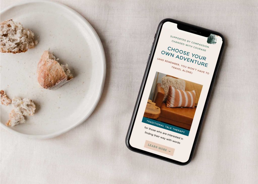
Approach to therapy
It is also important to discuss your approach to therapy on your therapist website to ensure that potential clients have a clear understanding of your therapeutic philosophy and methods.
By explaining your approach in an easy-to-understand way, you create a sense of transparency and trust. Use empowering language to convey your commitment to supporting positive change and growth in your clients’ lives.
Contact & booking information
Having contact and booking information, as well as insurance information, readily available on your therapist website is so important. Not only does it provide a sense of professionalism and credibility, but it also facilitates a smooth and efficient process for potential clients.
By including booking information, such as an online scheduling system or clear instructions on how to make an appointment, you make it easier for clients to take the next step and seek your services.
Insurance information is equally essential as it lets website visitors know if they need to look elsewhere or if you’re able to provide the coverage they need.

Photos of you
Having a photo of yourself on your therapist website is incredibly important, particularly one that is professionally taken. A well-crafted photo can serve as a powerful tool to establish a sense of trust and connection with potential clients.
It adds a personal touch to your website and allows visitors to put a face to the name, making you more relatable and approachable. A professionally taken photo also demonstrates your commitment to your practice and shows that you take your work seriously.
Remember, the photo you choose will be the first impression many people have of you, so it’s worth investing in a high-quality image that accurately represents who you are as a therapist (as opposed to showing a selfie).
Final Thoughts: Good Examples of Therapist Websites
Well, there you have it! We hope you enjoyed learning about must-haves and seeing examples of therapist websites.
While we specialize in helping photographers stand out online, we’ve helped our fair share of therapists, too.
At Inkpot Creative, we understand the unique needs and requirements of therapists when it comes to their online presence. Whether you’re a psychologist, counselor, or any other mental health professional, we can create a website that effectively represents your practice and attracts potential clients.
Click here to get in touch with us and discuss how we can help you in building a compelling online presence.
Check out these posts next:
- Therapist Web Design for a Changemaking Art Therapist
- 7 Benefits of SEO for Small Business
- Behind the Scenes of Inkpot Creative’s Web Design Process
- 5 Reasons Why Your Photography Business Isn’t Getting Traffic To Your Website - March 30, 2026
- Why Bespoke Website Design Matters for Photographers - March 20, 2026
- Outlaw Brand Archetype Examples For Photographers - March 2, 2026
1/19/24
Published On:
Krystianna Pietrzak
