


Your bookkeeping brand should always come before you start to build your website, and part of the branding process is logo design! As a brand and website design agency, we want you to challenge the idea that financial businesses need traditional, corporate-looking logos – we’re all about fun and creativity here!
This guide shares with you how to build an unforgettable bookkeeping logo and provides you with bookkeeping logo examples from past clients we’ve worked with.

Why Does Your Bookkeeping Business Even Need a Logo?
A logo is also often one of the first impressions someone has of your business – you want to make sure it’s a good one. Here’s why your business needs to have a logo:
- To establish credibility and create a recognizable identity for your business.
- To help potential clients remember you and distinguish you from competitors!
- To create a consistent visual identity across your website, social media, client documents, & all of your marketing materials.
Why Your Bookkeeping Logo Should Be Full of Personality
So many bookkeeping logos are boring; they look corporate or overly serious (BOO!) Bookkeeping is a relationship-driven service. People aren’t just hiring someone to manage their finances – they’re choosing someone they want to work with.
A personality-filled logo can EASILY communicate your approach, values, and the kind of clients you serve. Personality still matters even if you have a team (we promise!). Your brand represents the collective experience and culture of your business, not just its founder. Professionalism and personality can absolutely coexist.

What Actually Makes a Good Bookkeeping Logo?
Here’s how to set your bookkeeping logo apart from your competitors:
- Create a logo that is memorable & distinctive enough that potential clients recognize it.
- Have a logo that truly reflects your business, personality, and ideal audience without relying on obvious financial symbols. Not every bookkeeping logo needs a money sign!
- Display your logo everywhere -across your website, social media, documents, and other places.
- Make sure your logo is scalable and recognizable at different sizes. (Brand marks are best for this!)
- Have your logo built around your brand rather than a passing design trend that might not be “in” in a few months or years.
- Keep in mind that the best bookkeeping logos aren’t necessarily the ones that look the most traditional!

Why Your Bookkeeping Business Needs More Than Just a Logo
If you already have a bookkeeping logo, you’re off to a good start – but remember, a logo is just one part of your overall brand identity!
With a complete brand identity, you’ll get –
- A color palette to establish a recognizable visual personality and create consistency.
- A typography suite to give your brand a distinct voice through its fonts and hierarchy.
- Alternate brand marks to provide flexible logo variations for different spaces and applications.
- A brand pattern to add personality and create more opportunities for memorable visual storytelling.
All of these elements work together to create a cohesive brand that can grow with your business!

Your Bookkeeping Logo Needs a Website to Bring Your Brand to Life
A website is what brings all your brand elements together into a complete experience. A cohesive logo and website make your bookkeeping business feel more established and trustworthy, which is really important when financials are involved. Strategic website design communicates your services, builds trust, and encourages inquiries. A great brand deserves more than being dropped into a generic website template (please, we beg you not to do this)!

Bookkeeping Logo Example for the Aisle Advisory
About
The Aisle Advisory is the new go-to legal, tax, and bookkeeping partner built exclusively for wedding pros who are leveling up and want real support without the stiff, scary vibes. It’s fun, friendly guidance paired with seriously smart strategy, so six-figure (or aspiring six-figure) wedding planners, photographers, florists, DJs, venue owners, and more can finally feel on top of their business backend.
What we did
We built the full brand identity, and we gave creative direction for the brand.
Here’s the exact brand concept we shared: “The Aisle Advisory will brand itself as an approachable but bold business that stands out against the crowd. From the vibrant color palette to the unconventional font suite, the brand will be able to confidently express expertise without losing the fun and unique voice that draws clients in.”
Building Aisle Advisory’s Logo
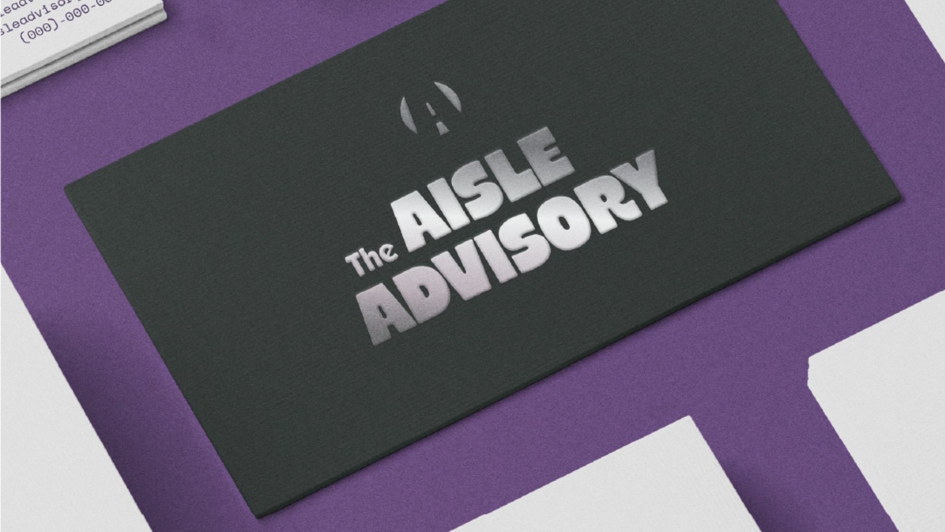
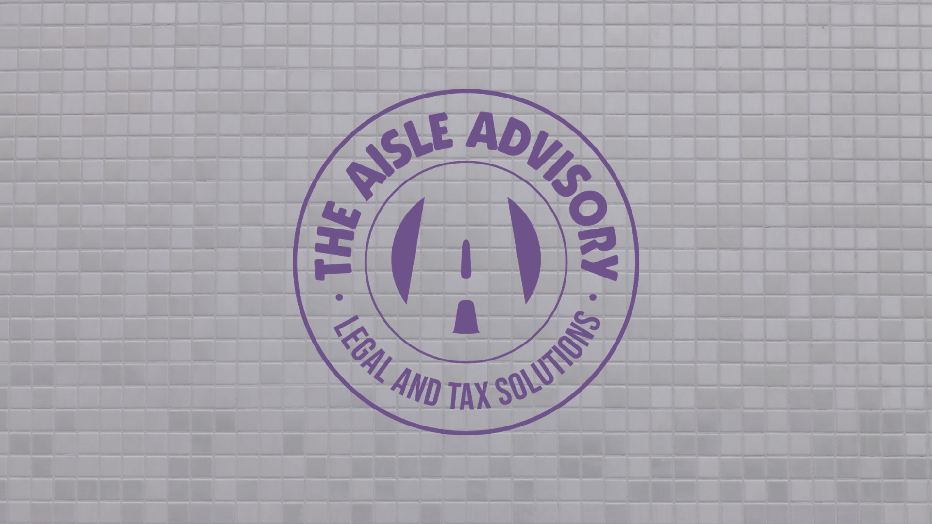
Inspired by the bold but digestible feeling of the moodboard, the primary logo uses a heavy sans serif font with rounded corners. Customized to give a strong visual impact, this retro-inspired logo is paired with an icon that features a unique 3D bubble effect. We combined the primary typeface with a softer secondary font to balance the visual weight of the overall logo. We also used rounded, bold typefaces with unique effects to create a playful brand voice.
Brand identity
Color palette
This color palette blends calm, reliable professionalism with an optimistic, expressive vibrancy. Energetic, bright pops of color mix with serious and modern neutrals to create a brand that feels sophisticated without being sterile. Purples will be used on the academy side of the business, while greens will be used for The Contract Club, one of Aisle Advisory’s signature offers.
Brand pattern
A brand pattern based on the checkerboard inspirations found on the moodboard was created to create a sense of excitement and fun for the brand. Featuring the brand’s icon as well as a few of the brand’s iconic characters, the pattern will come in a variety of the brand’s colors to welcome potential clients. We also built Aisle Advisory’s website, which you can check out using the links below!
Portfolio link – https://inkpotcreative.com/the-aisle-advisory
Website link – https://www.theaisleadvisory.com/

Ready for a Bookkeeping Brand That Looks and Feels Like You?
Our signature service, The Rebrand Edit, combines intentional branding with strategic web design to help businesses stand out and sell without saying a word. Here at Inkpot Creative, we create personality-filled identities rooted in each business’s goals and audience, so no two of our brands look the same! Remember, bookkeeping brands don’t have to sacrifice personality to appear credible.
Whether you’re just starting out or ready for a major glow-up, we’ll build you a brand and website that does the heavy lifting for you! The Rebrand Edit is the ultimate rebrand package that puts your business in front of your dream clients.
The Rebrand Edit is the ultimate rebrand package that puts your business in front of your dream clients. Learn more about what the Rebrand Edit includes here, or get in touch with us here!
Read these next:
11/09/26
Published On:
Krystianna Pietrzak