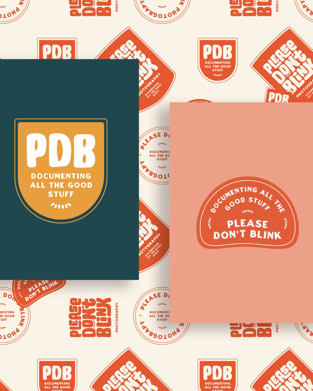
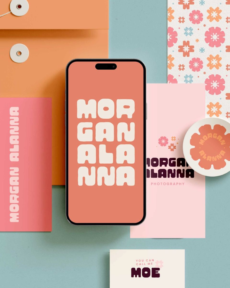
So many people rave about the one concept method when it comes to branding, but nobody really touches on it at all in website design!
So it’s something I’m pretty excited to delve into because it’s definitely something I implement in my own business, and I’m pretty sure a lot of other web designers do too. It’s just not really called this most of the time.
Keep reading to learn how to use the one concept method and strategy with website design!
What is the one concept method?
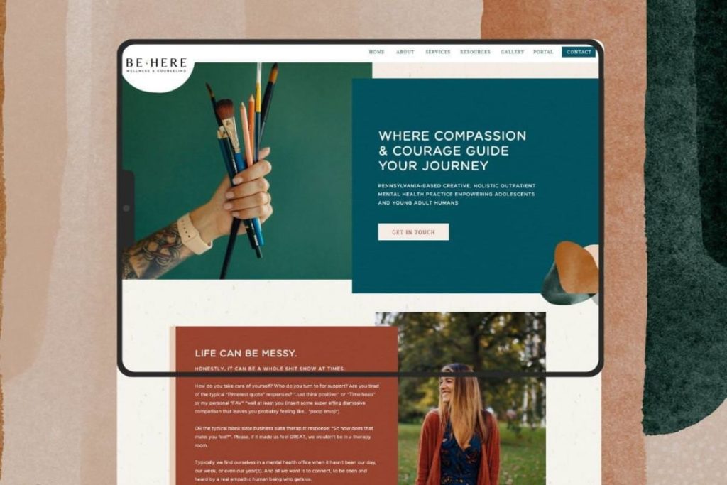
So, first things first, what the heck is the one concept method? Now, basically, the one concept method just refers to presenting one concept to the client.
I know this probably seems a little bit overwhelming. I know for sure back when I used to do brand design, it felt so overwhelming to give just one concept to the client and be like, this is the best choice and here’s why.
But it’s something I’ve actually always done with website design. Even when I first started, I very rarely presented more than one version of something to a client.
When designing websites in the one concept method, you basically are still doing all of that work on the back end. So even though I present just one homepage version to the client, I still usually create around three to five different homepage versions, even if they have very slight alterations in them that I look at.
I send them over to Jessie (my team member and website developer), and we decide which one looks better and is a stronger overall layout for conversions. That’s the one that we send to the client!
So even though only one is sent, it is still just as much work because we’re just putting in all of the work on our side and not necessarily showing it to the client.
One of the cool things, though, is oftentimes if a client says something like, oh, I would love to see how it looks this way, then we do already usually have that alternate version made in one of those other versions that we have made.
So it does kind of save us time, too, because if they do want to see something in a different way, we can show it to them, and then we can also explain why we did it the way that we did in the first place.
What’s the alternative to the one concept method?

The alternative to the one concept method would be just designing multiple versions of your pages to present to the client.
This, I have found, can take a lot more time than presenting multiple branding options just because a lot of pages on websites have so much copy, so much content, that it can really take you three to five hours per page.
If you were to present three different homepages to a client, then also they would have to go through and leave all of their feedback on every single page. So it can end up being a much more time-consuming process!
What the heck is website strategy?
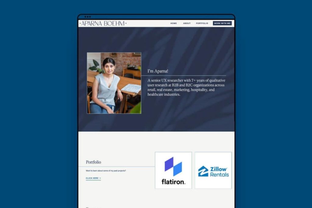
Essentially, strategy in web design is the reasoning behind the decisions made when designing the website. So the way that we present strategy in our websites is we actually have a call prior to when the client works with us.
In or website process, we actually have a call with a client. We just call it a vision call. We go through 14 questions that we ask, ranging from what is the goal of this website to what is your inspiration?
But we do not go to Pinterest. So really kind of digging into what exactly is actually the client is envisioning for the site, and then we confuse that with our own strategy.
What could website strategy include?
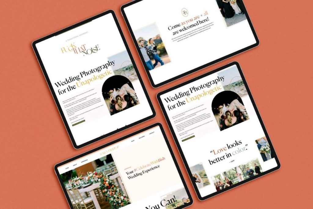
Some of the most important things that we include in our website strategy are the goals. That is always the very first thing we ask, and that is because every single website should have one primary goal in mind.
Obviously, you can have secondary goals. Even if you visit our site, I would say the primary goal is to book us for services because that’s mostly what we promote.
But alternative goals could be to sign up for our email list, take our free website platform quiz, buy a template from our shop, and enroll in one of our courses. Those are all secondary to our main call to action, which is to work with us.
So if you’re scrolling through our site, the majority of buttons are going to say things like inquire now, book now, or learn more, and it will take you to a contact page. We ask this question so that then we know what the main call to action is going to be throughout the website. It’s really as simple as that.
We also always ask things like what are your current pain points?
We ask what their inspiration is, but we always basically word this in a way that has them call out their competitors. Then we pull up the competitor’s website after asking them what other sites inspire them.
We have that kind of shared screen walk through everything like that and showcase what they like because oftentimes, it is not the entire site. So we actually ask them to pinpoint exact things they like, and you end up finding out that it’s really tiny things.
Like maybe they like that the navigation bar is very clear, and it doesn’t have a hamburger menu on desktop. Or maybe they like that there are always edge-to-edge images, and that’s something that they really want to bring into their own website.
So we really kind of ask a lot of questions like why or what do you like about this? Just to delve into it a little bit more and get really clear on what the client actually likes and doesn’t like.
Again, kind of going with that it’s just as important to find out what someone doesn’t like in addition to what they do like. That’s something that I feel like a lot of people forget. Then, of course, we also do our own competitor analysis to try to figure out what we’ll be doing to fill the gaps in the industry to make their site different so that they can stand out.
We delve into the website style guide and kind of touch on different colors and the way the buttons will look and things like that. We also always include a website sitemap which we don’t go super crazy on, but we mostly just do that to make sure that we are thinking through exactly what should be on each and every page of the site.
How do website strategy and the one concept method work together?
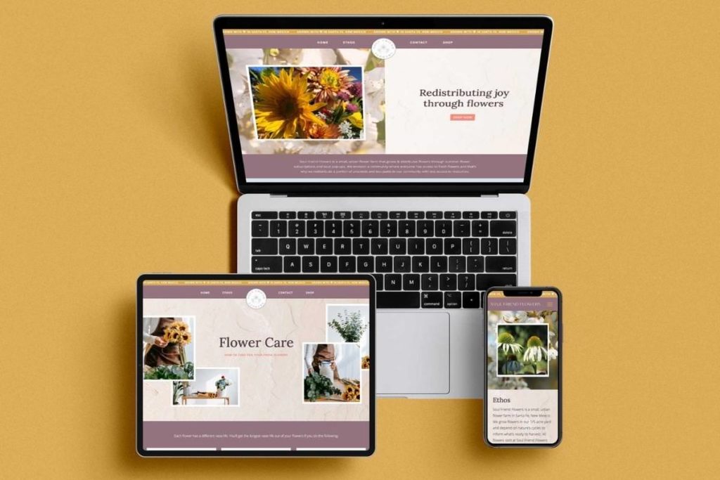
Now that you know what one concept method is for website design and also the things that you want to include in website strategy, the main thing you want to know is that having that strategy in place before you go to design is going to make you that much more confident in presenting one concept.
So basically, when you’re designing, you’ll be using all that strategy that you came up with with the client by backing up all of the decisions you’re making. Maybe you add a border on an image, and you’re like, OK, so what was the reasoning behind that? Like was it necessary? Was it really just to make the images pop a little bit more or was there another reason behind it?
What also is really nice about this is as you’re designing, it kind of makes you second guess everything that you do. Instead of just throwing things on the page because they look nice, you’re really thinking through, okay, why did I put that there? Does that make sense there?
It also helps you keep things simple because I said this before, and I’ll say it again, but a simple design is best for communication. You really don’t want to overdo it.
What’s nice about this, too, is then when you go to present the site to the client or the first draft to the client, we actually just use Loom, and we record a video walking through everything.
But even if you do it on a live call and you share the site with the client as you go through, explain those decisions to let the client know that you are really staying in line with that strategy that was agreed upon and you’re really working to reach their goals.
That automatically is going to position you as more of an expert, and it’s also going to show your client that you really value their business goals and that you really want to make sure that they reach those goals through investing in you.
You should be using both!

So all this to say, if you have not started using website strategy in your business, 100% do it. It’s something that we’ve tested out kind of on and off.
Back when I first started, I actually did a lot of my strategy kind of on the back end, so I would have all the strategy, but I never really thought to present it to the client. So I would have all the strategies on my end.
Then when I would send those videos with updates, I would just walk through all of those decisions made, and I’ve since switched to put it in a presentation doc literally. I just have a template, and I put it all in this presentation doc, and I send it over to the client to just review it.
This helps to ensure that we’re on the same page when we officially start the project, which is something I love. So we’ve actually kind of been split-testing both of these options since this spring, and I would say they both definitely work, but personally, I feel more confident when I send it all in a presentation, too, just because it all looks nice.
In addition to really laying out everything that’s going to be happening with the site before we start to design, it just leaves a lot less room for error. Then if the client disagrees with anything in the strategy, of course, they can give you that feedback, and you’ll have it all addressed before you start to design.
Now you know all about how we use the one concept method in our website design!
Read these next:
- How to Start a Web Design Business with No Experience
- Web Designer vs Web Developer: What’s the Difference?
- What You Need Before Hiring a Web Designer
- Behind the Scenes of Inkpot Creative’s Web Design Process
- Showit Ecommerce Web Design for a Photographer (using Shopify Lite!)
- The Importance of Boundaries in Business
- Jester Archetype Brands: Examples for Photographers - September 23, 2025
- Explorer Brand Archetype Examples for Photographers - September 4, 2025
- Brand Values Examples (That Don’t Sound Like Everyone Else) - September 1, 2025
10/14/22
Published On:
Krystianna Pietrzak
