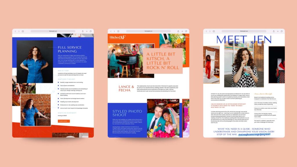
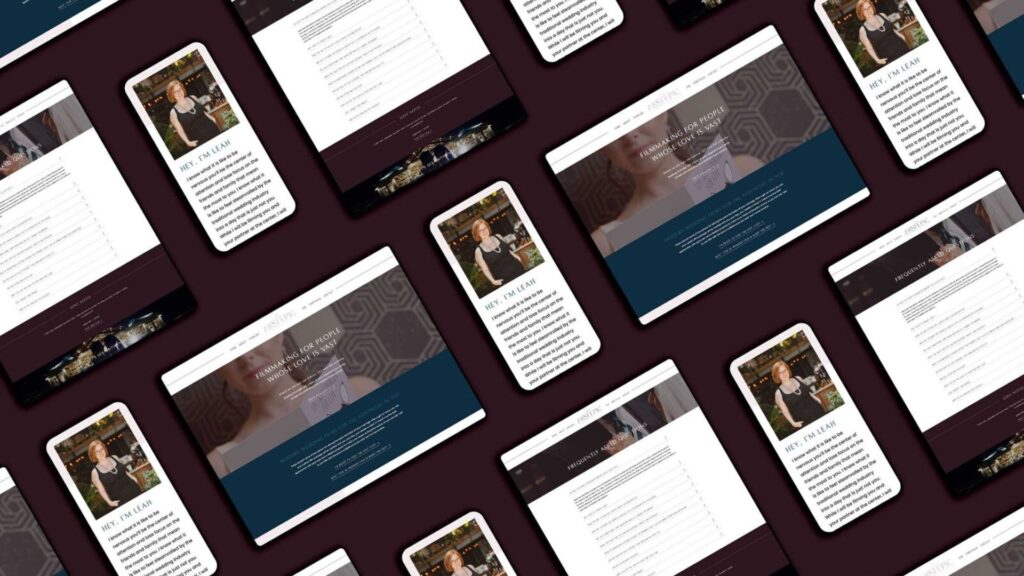
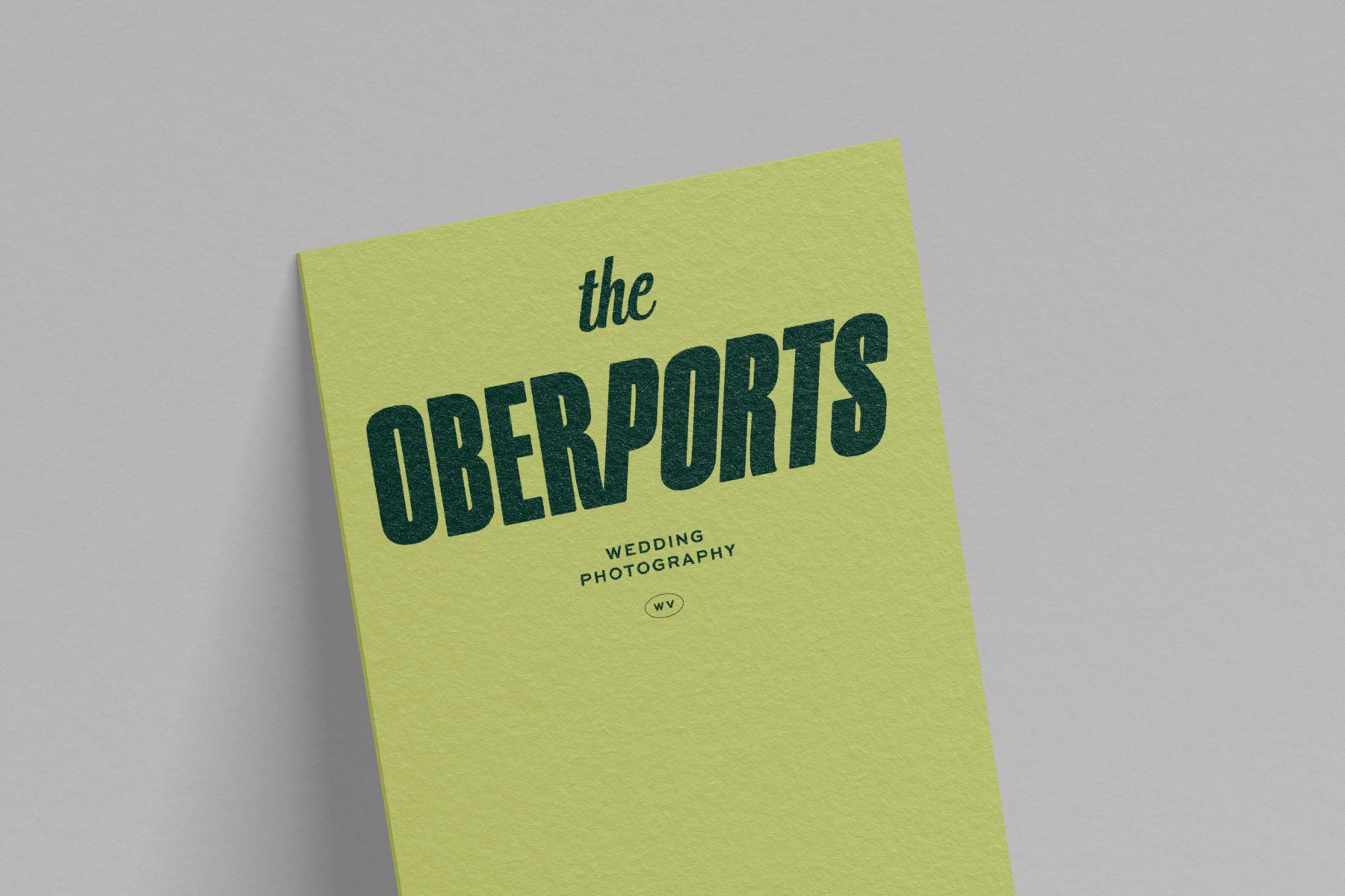
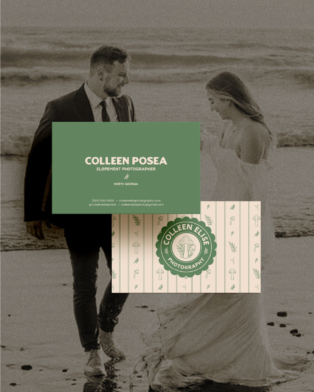
Wondering how to make your website stand out? Having a website that stands out is crucial for attracting and retaining visitors. With countless websites vying for attention, it’s important to make a lasting impression that captivates your audience from the moment they land on your site.
In this blog post, we’ll explore effective strategies and actionable tips on how to make your website stand out from the crowd, showcase your unique brand identity and engage your users in a meaningful way.
Whether you’re a business owner, a freelancer, or a web designer, this guide will provide you with valuable insights to elevate your website to new heights of success. So, let’s discuss the secrets to crafting a standout website that leaves a lasting impact on your audience.
This blog post is based on an episode from The Unexpected Entrepreneur Podcast.
How to Make Your Website Stand Out
Add Subtle Animations & Movement

When we talk about movement in web design, we’re not referring to overwhelming distractions. Instead, we’re talking about tasteful animations that enhance the user experience.
Consider incorporating elements like fading titles, discreetly playing videos, or even turning your logo into a GIF that showcases your brand colors (peep ours as an example!). Small details like these can captivate your visitors without overwhelming them.
Showcase Your Personality with On-Brand Photos

To create a visually appealing website, it’s crucial to have photos that reflect your brand identity. We recommend investing in brand photos that truly capture your personality and align with your brand’s colors and vibe.
These photos can be used to showcase your brand’s story, values, and the services you offer. If you don’t have brand photos, carefully select stock photos that match your brand’s mood and messaging.
Engage Your Audience with Bingeworthy Copy

While website design is essential, the copy you use plays a vital role in converting visitors into customers. Your copy should align with your brand messaging and speak directly to your target audience. Identify your dream client and craft your messaging around their needs and desires.
Remember that website visitors want to know more about how you can help them. They don’t necessarily want your entire life story as an entrepreneur! (I know it can be harsh to hear.)
Break up your text into easily digestible sections to make sure that skimmers can capture the key points. Compelling copy that resonates with your audience is the key to driving conversions on your website.
Align Every Element With Your Goals & Strategy

Website strategy is often overlooked, but it’s just as important as brand strategy. Every element on your website, from the placement of text to the choice of images, should work together to achieve your main goals.
Determine your primary call to action and design your site around it. Secondary goals can also be incorporated, but ensure they align with your overall strategy. Flexibility is essential, as you may need to adjust your goals based on business needs over time.
Utilize Your Entire Color Palette

If you’ve worked with a professional brand designer, you likely have a color palette with multiple hues. Don’t limit yourself to using just a few colors on your website.
Embrace your entire color palette and use it strategically. Use accent colors to make your call-to-action buttons stand out and maintain consistency across your site. By utilizing your full color palette, you’ll create a stunning website that’s actually fun to scroll and stands out from the crowd.
Did you enjoy these tips to stand out with your website?
Incorporating these five essential elements into your website design will help you create a standout online presence. Remember to add tasteful movement, use on-brand photos, craft compelling copy, align your website strategy with your goals, and utilize your full color palette.
These tips will level up your website and captivate your audience, ultimately driving conversions and growth for your business.
Ready to have your website match the level of your work? Click here to get in touch.
Like this post? Save it for later!
- Creator Brand Archetype Examples for Photographers - October 28, 2025
- Everyperson/Everyman Brand Archetype Examples for Photographers - October 9, 2025
- Jester Archetype Brands: Examples for Photographers - September 23, 2025
1/25/24
Published On:
Krystianna Pietrzak


