
When it comes to selling to your ideal customer, you need a high converting website. Without it, you may easily get visits to your website only for clients to exit out before even scrolling past your home page.
Over the years, I’ve created quite a few different website designs for my own businesses, and I’ve managed to find the perfect formula to rank among the best converting websites to get customers to purchase my services.
Below, learn about the key elements you need to have a high converting website and set yourself up for success.
Prefer to listen? Here’s our podcast episode!
On Brand Photography

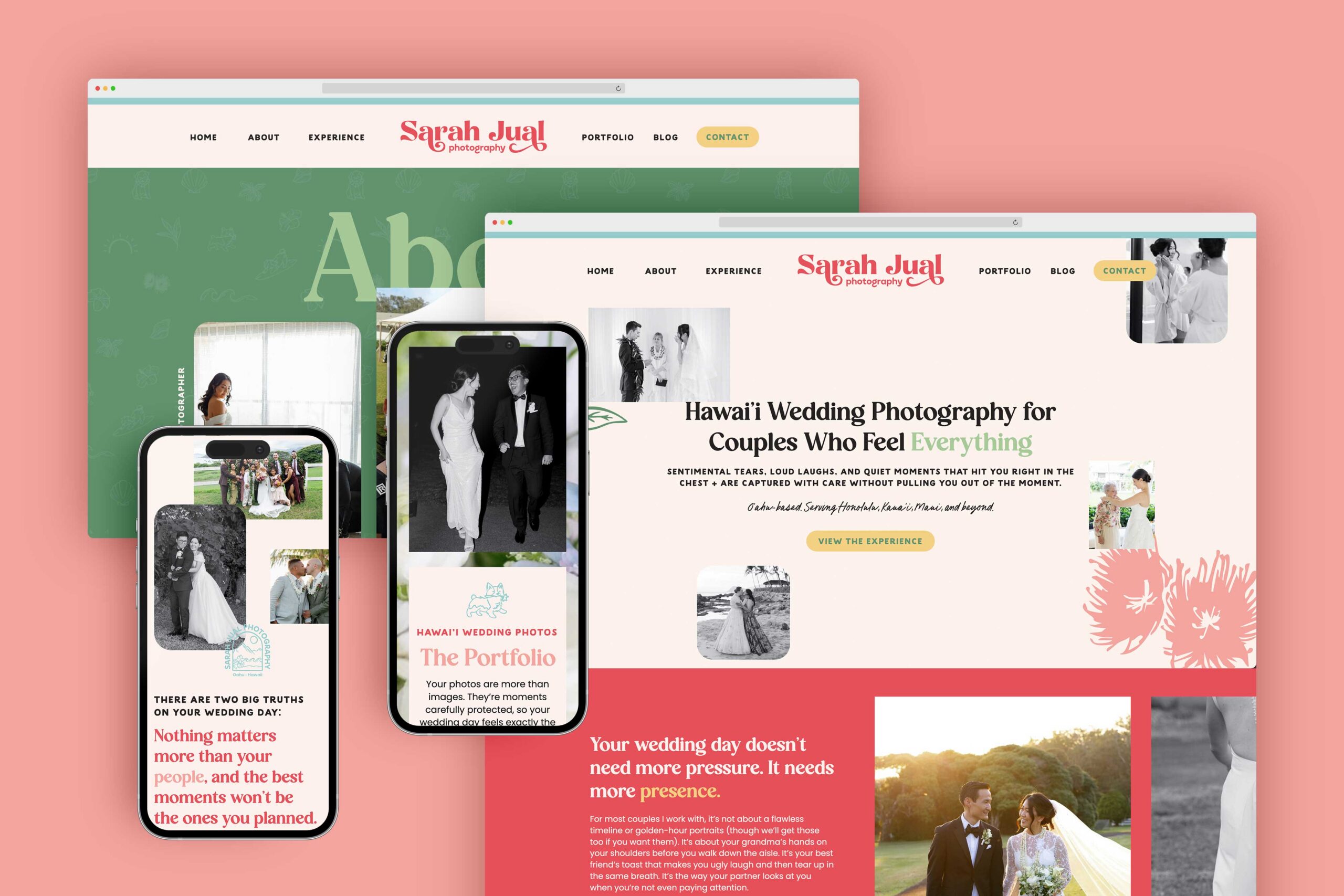
While this may seem simple, one of the easiest ways to have a high converting website is to make sure all the photography used is on brand.
This does not necessarily mean that you have to have an entire photoshoot with your brand colors, because I understand not everyone can afford that. However, if you can afford it, that will certainly help.
It can be as easy as using free stock photography that matches your brand colors. For example, if your main branding colors are forest green and navy blue, then make sure that all of the stock photos you use include at least one of those colors.
This will help your website look a lot more cohesive and will make people visiting your website get a feel for your style and what you stand for as a brand.
Strong CTAs

The best converting websites have strong CTAs everywhere. A CTA is a call to action, which essentially is what the fancy little buttons throughout a website are. For instance, BOOK NOW and SIGN UP are CTAs.
Traditionally, the shorter the CTA, the better converting it will be. I like to keep mine between two to three words at most because then they are quick and easy to read by someone visiting my site.
When it comes to designing the CTAs on your site, it’s smart to make sure that they are always the same. So, this could be as simple as making sure that every CTA button on your website has an orange box behind it. This way, when someone scrolling through your website sees an orange button, they’ll immediately know that it’s something they can click on. Always keep your user in mind!
Focus on the Customer

While you may not want to hear this, your website should not be all about you. Your customers are visiting your website because they want to know how you can best help them succeed. They don’t necessarily care about your entire life story.
This is especially important to keep in mind on the home page of your site. If you start off by talking about yourself, then the person visiting your site might leave in a heartbeat.
Instead, focus on creating the entire home page on your customer. Call out their pain points, let them know how the services you offer can fix them, and make them feel like you already know them even though you’ve never met.
This is crucial when it comes to having a high converting website.
Movement

One of my personal favorite elements that truly helps a website stand out from its competitors and really grabs the attention of people visiting the site is to have movement. Now, this can be in a few different ways.
A simple way to have movement is to utilize GIFs. For instance, make your main logo in your header a GIF that changes colors, or have an icon that pops up next to it. This can really picque the interest of someone visiting your site because it’s different.
A more advanced way to add movement is via video. Most web design platforms will allow you to add a video as a .mp4 and this can help to add some visual interest and make your site not feel as static. An easy place to add videos is as a background. Instead of using a photo, consider using a simple video that matches your brand colors!
Consistent Branding

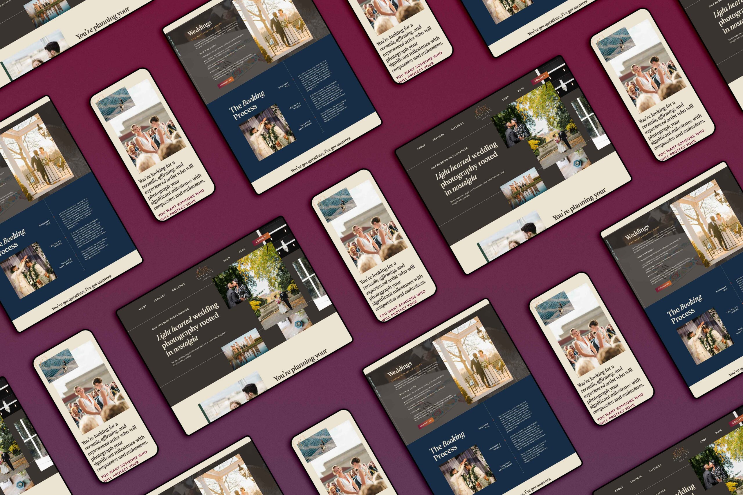
Yes, it’s true: high converting websites need to have consistent branding. This means your colors and type suite need to be the same throughout. You can’t have your heading font be all caps in one place and then all lowercase in another. Consistency is key.
Branding is also a lot more than just your logo. It’s everything; the photos you use, the reasons behind the colors, the typefaces, and more. It can be hard to DIY a brand on your own, so try to find a great brand strategist to help!
Clear Service Offerings

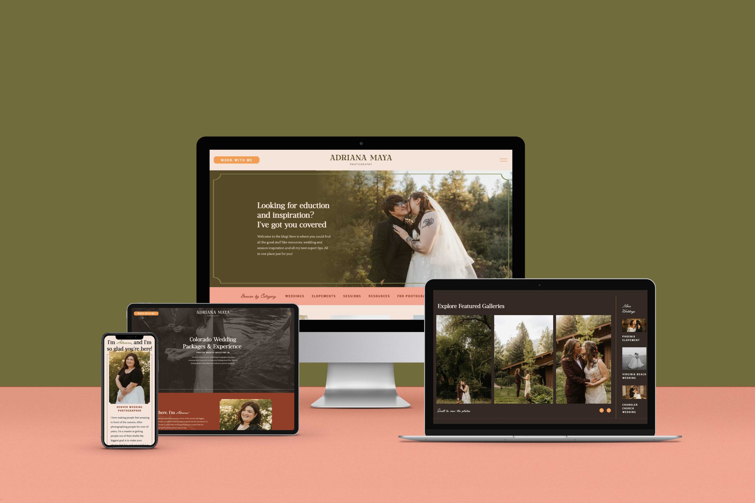
If you’re a service-based business owner, or you sell anything at all on your website, you need to make it clear on your website. The best place to do this is right on your homepage at the top so that it’s the first thing that people read when landing on your site.
For example, my homepage clearly states that I create bold and unique solutions for adventurous souls. Right from my homepage, anyone can tell that I love working with those who are travelers, like bold design, and want to be different from everyone else.
User-Friendly

A high converting website needs to be user-friendly. You aren’t the one who will be visiting your website for services. Think about what your customer would want to see, and really consider the user experience.
This can be as simple as making sure that the way your pages are organized makes sense, and that other pages are properly linked together so that your client can easily jump around your website as needed.
Fully Responsive

Last but not least, the best converting website design needs to be fully responsive. Let’s face it: we live in a world where we are always on technology. More often than not, people visiting your website will most likely be seeing it on their phones.
If your website isn’t mobile responsive, then you could be potentially turning away tons of customers. The key when designing a mobile version of your website is to remember that it’s vertical design, while the desktop version of your site is horizontal. Pieces of your design might have to get moved around, but it should still generally be the same for consistency.
Ready to step it up?
Hopefully, this post has helped you with your own business’s website. If you’d rather not do all the work on your own, I’d love to connect and see how I can help you have the best high converting website of your dreams so that you can finally find your dream clients.
Learn more about my web design services here!
Read more:
2/09/21
Published On:
Krystianna Pietrzak

 (1)")