
Are you looking for photography website tips? In this post, I’ll be sharing how to stand out online as a photographer.
90% of my clients tend to be photographers and we love working with photographers so much. Photographers have so many fun, creative ideas which result in such a fun collaboration. In fact, as Showit website designers, in the last year alone, we’ve helped launch about 20 photographer websites.
With so many photographers online, it can be really hard to figure out how to stand out. However, even if you are DIYing your website, you can definitely find your special sauce or follow these tips to stand out.
Without further ado, keep reading to learn more about the top photography website tips!
Photography Website Tips
Find your secret sauce
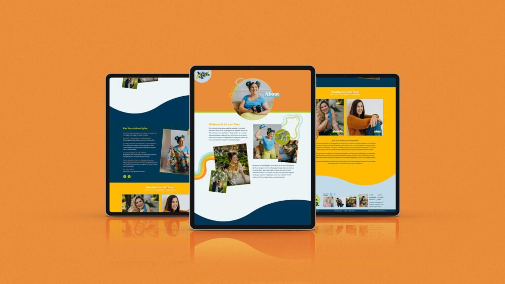
You’re really going to want to sit down and find your secret sauce and figure out what makes you different. I know, as a photographer, this can feel a little weird, but it is one of the best photography website tips!
It felt weird, even as a designer, to try to figure out what made us different, but you can kind of think of it in a few ways. It could be something in your values, for instance.
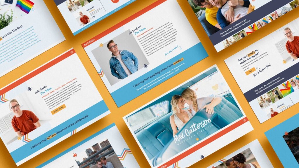
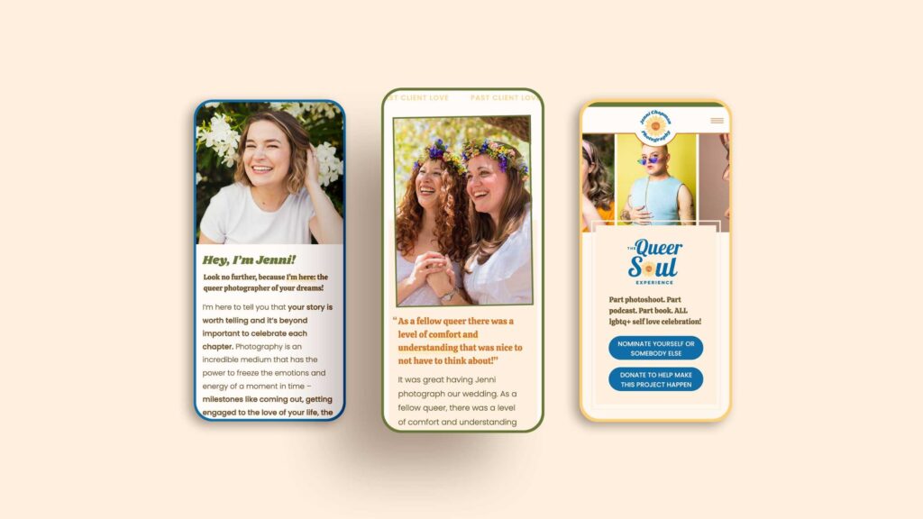
Here at Inkpot Creative, as you know, one thing that we’ve always really put a big emphasis on is being inclusive in our work, especially as a queer-run studio. That’s something that we very much value, and we only work with other business owners who feel the same way.
It was like a big gap that we kind of saw in the web design industry back when we started in 2020. It was something that we saw that we could very easily fill. All queer voices deserve to be heard, and with our web design studio, that’s something that we really aim to do.
Again, it could be something with your values, kind of like ours is.
It could be something in your style, even. Maybe you edit your photos a certain way, or maybe you pose your couples or whoever else you’re taking photos of in a certain way.
It could also even be your personality. One thing that I love is a lot of our clients tend to obviously; not only are they really sitting out in their values and putting those at the forefront, as well as their photography style and everything, but they have a really fun standout personality!
When they come to us, they’re like, “I really want my website to show that. I want the website to almost feel like a home to me. When people visit the site, I want them to be like, ‘Oh my gosh, we’re totally going to get along. Then they smash the contact button.'”
It could also just be your personality. Maybe you’re very quirky, and you can try to hide some fun patterns throughout the site that kind of show your quirkiness. Find tiny ways to embed your personality throughout your site!
Craft a stand-out brand
Once you figure out what makes you different, I then recommend you go ahead and get your branding done. You can’t skip this – it’s one of the must-do photography website tips.
Obviously, when you’re first starting out, you’re probably not going to be able to afford a top-notch designer.
But even if you just do your branding yourself, what you’re going to want to do is take that thing that makes you different and try to think about who exactly your ideal client is or who you really want to photograph.
So, for instance, if it’s someone that maybe works in a corporate space or maybe you really want to work and do brand photography for corporate businesses or something, then what you’re going to want to do when you make your branding is really have it showcase kind of that corporate feel, using more business type photos.
Then, with your own brand photos, try to be a bit more corporate (maybe wear a suit) and just try to design things that you know people in that space are going to be attracted to.
Meanwhile, if you really want to work with adventurous couples, like maybe you want to do elopements, then your whole branding should kind of be adventurous, right? Use more earthy tones in your brand colors and maybe use sort of fonts that kind of evoke that feeling of adventure, so maybe even use the fonts that you see at national parks as inspiration!
When you do your branding, whether you work with a brand designer or you’re doing it yourself at a minimum in order to build your site, I would recommend that you get at least a primary logo, which, of course, is just the logo that you know you’ll use in the header of your site. You’ll probably use it on social media and everything too.
You’ll also want a color palette, and I usually recommend at least five to six colors because then it’s a little bit easier for you to kind of play around on your site when you go to build it.
And then, you will also want your type suite, which is just the fonts that you use. So you’ll want a header font, a button font, a body copy font, and everything like that.
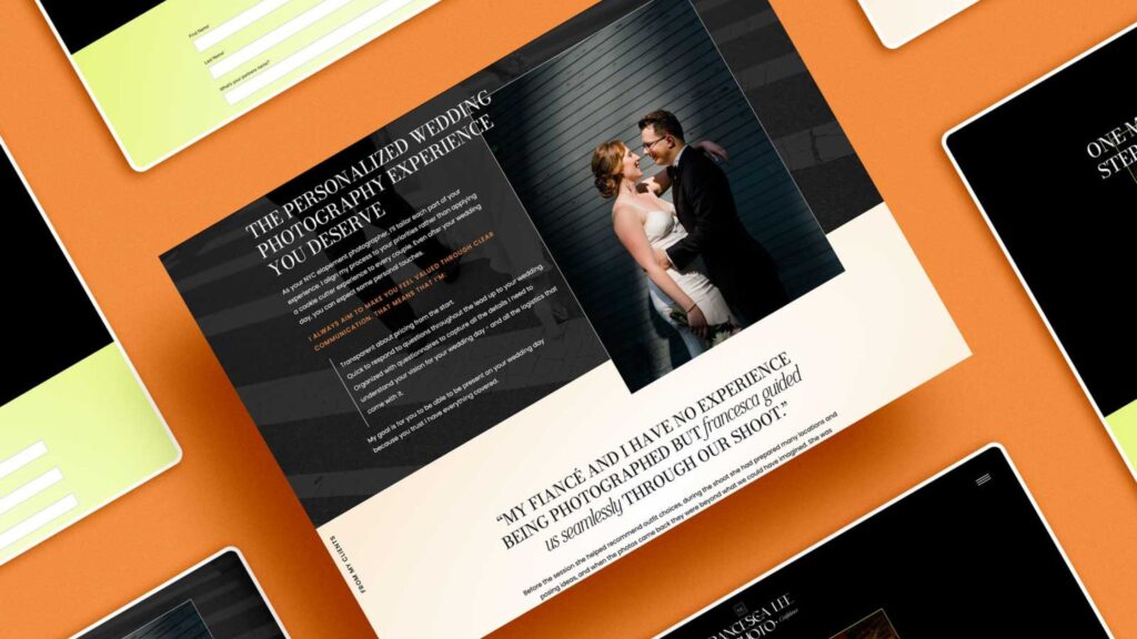
Invest in copywriting
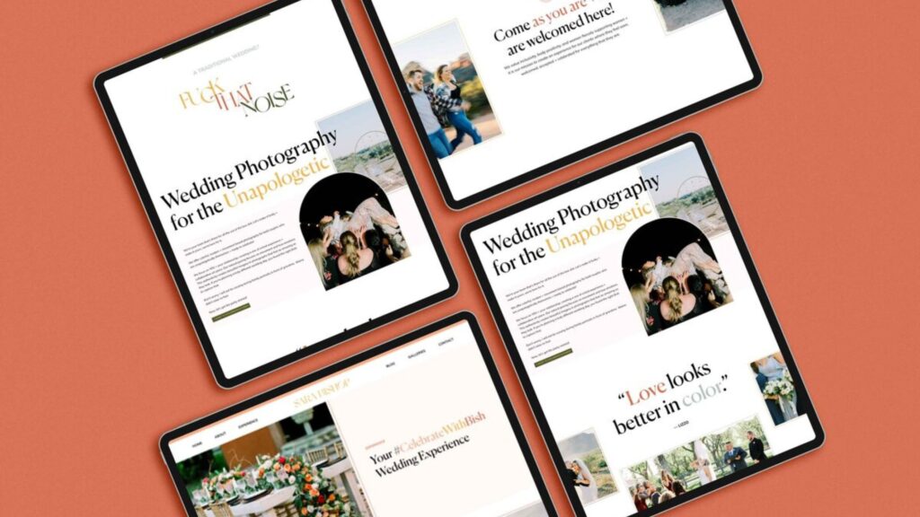
Your website copy is really what’s going to sell everything for you, in my opinion, almost even more so than your branding. Don’t come at me, but that’s kind of how I feel!
Your copy is really what’s going to evoke emotions from people when they land on your site, and it’s really going to help them figure out who you are and if you’re the perfect fit.
So a lot of photography websites, especially the ones that kind of, we see when people first reach out to us, all of the copy is kind of the same. It almost feels like we’ve seen it before. Try to focus on showing some of your personality without being over the top and using tons of slang and stuff that people won’t understand while also showcasing your services in the best light.
Remember to also use the word “you” a lot so that you’re talking directly to the person who visits your website. You really want to make them feel heard and seen when they’re scrolling through your site, and by the end of them even scrolling your homepage; you want them to feel kind of like, “Oh my gosh, I feel like they know me, they know exactly what I need.”
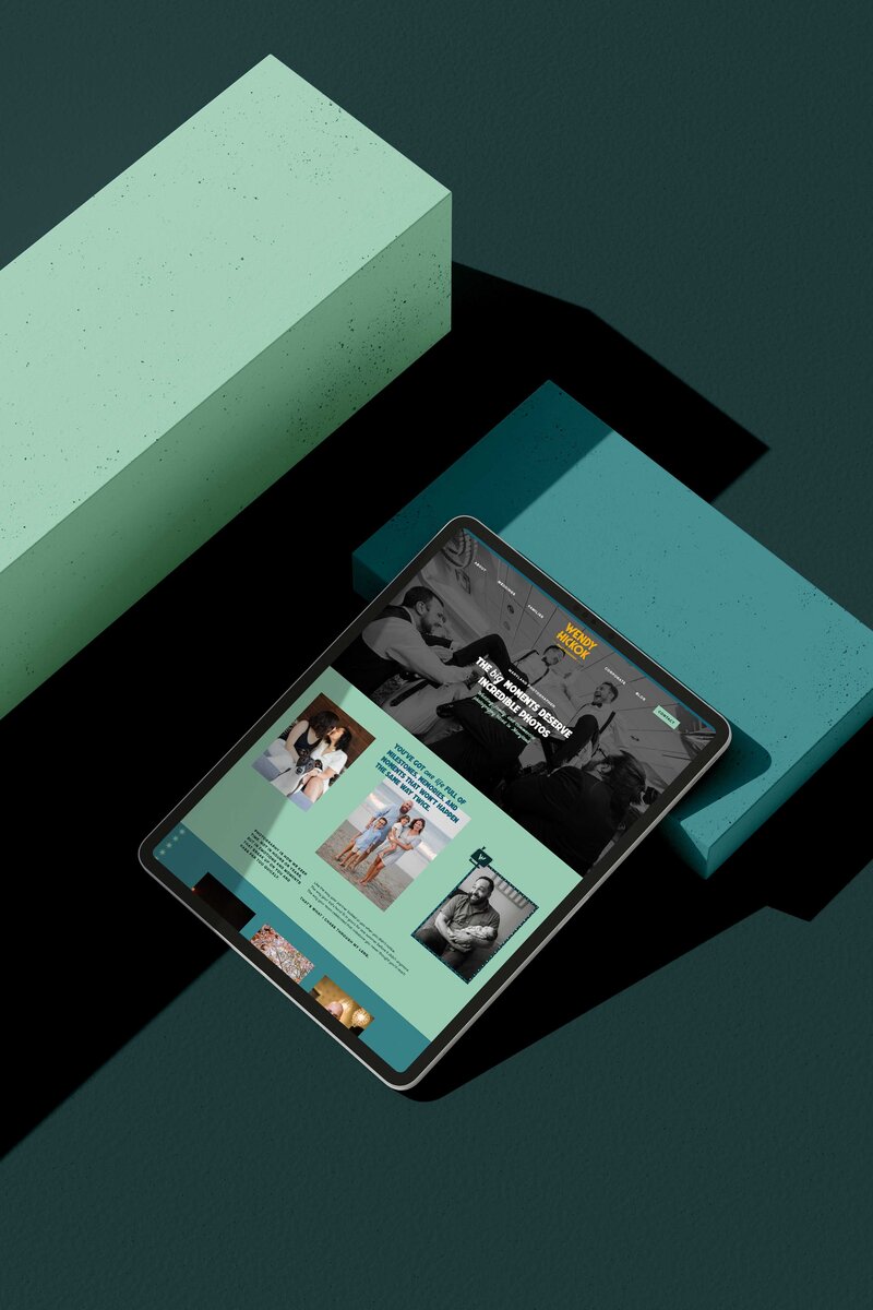
Create a boundary-pushing website
Try to think outside the box when it comes to your website layout. A lot of photographer websites tend to have very similar layouts, and I’m not sure if it’s because everyone’s starting from the same templates or what, but try to have fun with your website layout!
Use different sections throughout the site that kind of help to break up piece by piece what’s going on on the pages and just really try to think outside the box visually.
When you’re DIYing your site, too, I highly recommend trying to think of one or two things that you want to keep consistent throughout the site.
So maybe you want to add a line element that you use throughout the website. Then you’re going to want to try to use that line on every single page of your site.
It could even be something like adding a hover effect, and you want to be like, okay, so this is going to be like the shining star of my design. I’m going to make sure I have these hover effects on every page on my site.
So don’t try to go overboard! I would try to max out at around two things that you want to try to keep throughout your entire site. That’s going to make it different because if you go overboard, which it’s very easy to do with a website, then you’re really going to overwhelm your visitor.
Use bold colors (or have at least one bold colors)
Next, really don’t be scared to use bold colors, and even if, when you do your branding and everything, you decide that you want to attract adventurous couples, for instance, and you really want to use kind of earthy tones, I think there’s a way to bring like a bright color in there somewhere, even if it’s just for your CTAs throughout your site or your buttons.
A color that could probably really easily work with earthy tones is neon yellow because that’s going to stand out very well against greens and browns and everything like that, and then that way, you’ll really be driving the visitor’s eye throughout your site where you want them to click!
That’s just a really smart move to make, and just try to think about that, too, while you’re getting your branding done. I say this because a lot of photographer sites tend to have themes that are just black and white, or they’ll just have the same three to four colors, and I feel like a lot of photographers tend to use the same exact color palette, which, of course, obviously there’s still ways to stand out with that, but just try to keep that in mind.
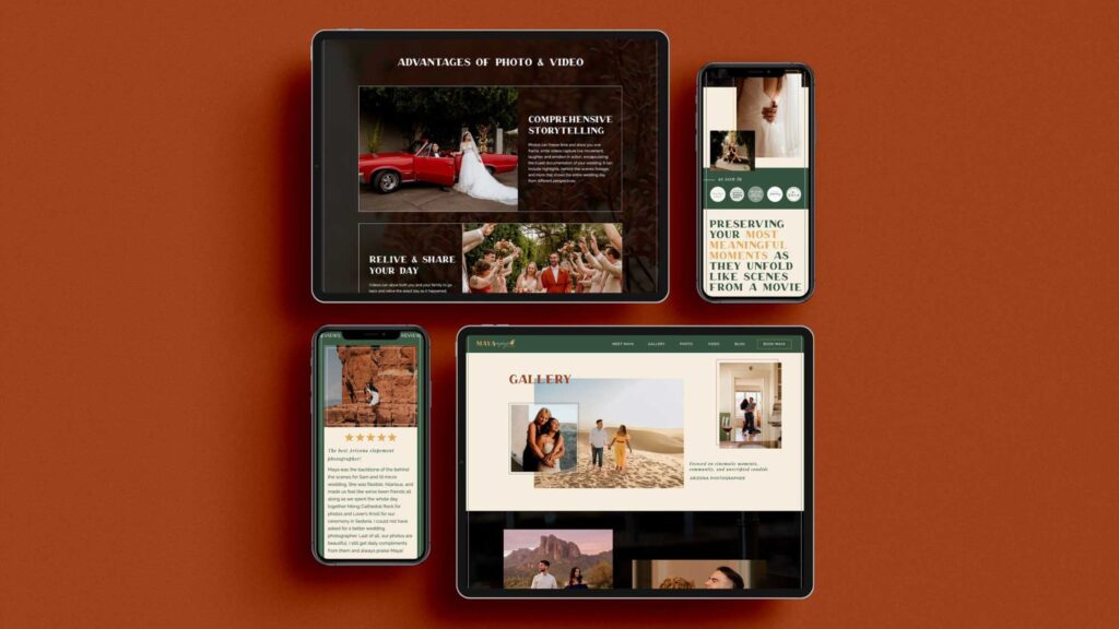
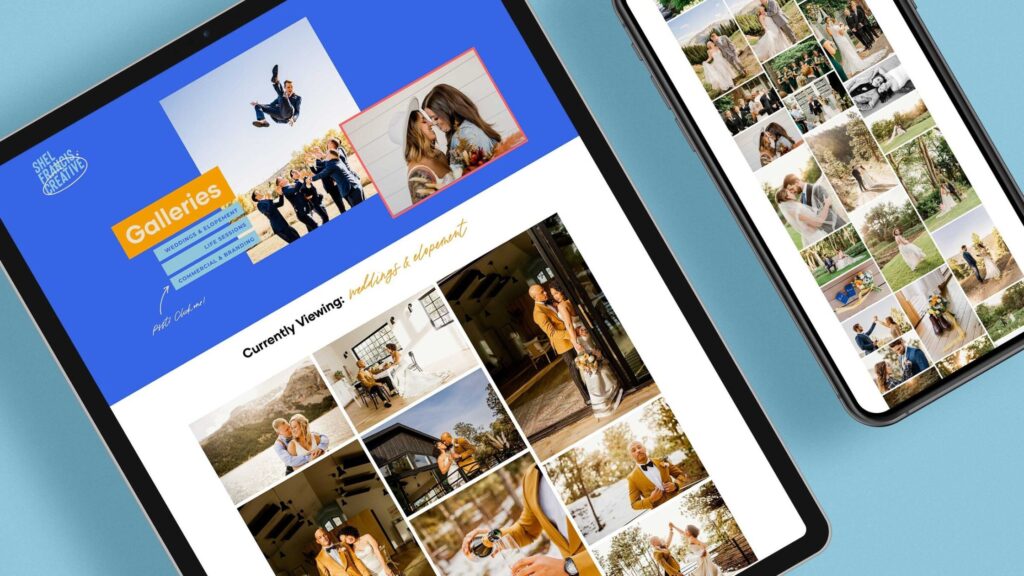
Intentionally curate your galleries
Next, when you are designing your portfolio, really try to make it an intentional portfolio!
So even a lot of our clients will opt to have a basic gallery page for their work, which is totally fine because that’s a lot easier for them to go in and update. But try to be intentional when thinking about it.
What we try to do with a lot of our photographer clients who are building their sites is, if they do just want to have galleries for their portfolio pages, we’ll break them up by theme.
Let’s say you’re a photographer who does branding, lifestyle, and weddings, so what you want to do is have a button that can change the gallery view based on what someone wants to look at.
If someone is here to look at weddings, they’re obviously not going to want to see all your branding work. So that way, they can just click on the weddings button, and it’ll switch and only show all weddings information for them, so that they can just see your past weddings work because that’s what they’re there to look at.
Another option, and this is something that I see designers do more so, but I feel like would really sell me on a photographer, is maybe having specific pages for different shoots that you’ve had.
So maybe under your weddings button for your portfolio, you have like three weddings that you shot that you’re super, super proud of, and that you want to shoot more of.
Underneath you have links to three of those different weddings, and people can go ahead and click on them, and each one will bring up a different page that will go in-depth about the whole planning process, what the inspiration was, how the photos turned out and maybe what they even looked like before and after with editing and everything like that, and just really try to tell a story.
Also be sure to throw a testimonial in there, and these don’t have to be long at all! (It’s preferable for them not to be long – this is one of the can’t-miss photography website tips.)
I personally really think something like that would like fully sell me on a photographer. So I’ll be like, wow, like I can fully see their thought process and everything that goes behind when they take these photos because I know for a fact that there’s like a lot of thought that goes into every photo you take or the editing decisions that you make and everything like that.
Going off that with the word “intentional,” – try to think about what kind of things you wanna continue to take photos of. And this was one that, even as a designer, I found a little bit hard at first because when I was brand new, obviously everything I did I wanted to put in my portfolio to be like look, I’ve actually worked with real people.
But you really wanna try to think about the kind of work you wanna continue to do. So maybe you did a wedding that you know you weren’t super happy with the photos or how they turned out, just because the client really wanted you to edit them a certain way and it’s just not your normal style, then that’s something you don’t have to put in your portfolio, or you can slightly edit the photos so that it does reflect your style.
Try to think about that and really be intentional with the work that you do end up putting in your portfolio, and it truthfully does not have to be everything because if people wanna see more, they can, of course, go follow you on like Instagram or Facebook, where you probably post your work a little bit more regularly.
Use movement throughout your website
Now, one thing that will really help you stand out as a photographer is making sure that your site’s not flat or stale, or static, so try to add some pieces of movement.
This could be with a GIF as your logo. So maybe your logo changes between two colors or something.
Maybe it’s having moving galleries. This is one of our favorite things to do on photographer sites, so Showit has an option where you can literally have galleries where a photo changes every two seconds or something, and it’s just like a fun little way to capture attention and add an element of surprise as people are scrolling.
You could also use parallax imagery, which I know you can fully do on Squarespace, WordPress, and Showit, and that’s just basically adding a little bit of movement to background images, and you could even turn some of your photos into GIFs if you want.
This is something that I love seeing on photographer sites, and it is a very easy way to stand out, especially if you already have photos that you can turn into a GIF, like if you maybe shot a few right after each other where it almost looks like the person is moving or something. It’s just a really fun touch!
Make it incredibly easy to get in touch with you
And then next, make it so easy to get in touch with you that it’s impossible for people not to get in touch with you, and what I mean by this is try to have a lot of your CTAs lead right to your contact page, especially from your home page.
Make sure you have “contact” up in the top bar of your site. In your nav bar, really make sure that you’re making it as simple as possible and using words that people will know really easily.
So if someone wants to see your services, they’re probably gonna wanna look more so for a services page than an experience page. So really try to keep your user in mind so that people can take fast action.
Use only your best and favorite photos
Next, while you’re deciding on the photos that you wanna use throughout your site, I know you probably have a huge backlog of tons of galleries that you can go through, but try to think of literally the best photos you’ve ever taken and use those throughout your website.
Make sure that it’s showing all of the photos that you wanna keep taking versus just trying to show all of the photos that you’ve taken on your site. So just really try to think about, “yes, like this was a shoot that I loved doing, and I wanna attract more couples like this or more brands like this” or anything like that.
Double-check that you have all of the essential pages
Next, again, this one might seem a little dumb, but I really think you need to make sure you have all of the essential pages, and what I mean by this is you need to have a home about contact services and then a work or portfolio page at minimum.
I say this because a lot of photographer sites I’ve visited again tend to have very weird page names that almost make it hard for me to navigate throughout the site, and sometimes they won’t even have a portfolio page when I’m like, I really just wanna see all of your work!
So those are the pages that I always recommend to photographers at minimum. Of course, you can also have other pages, too, if you want.
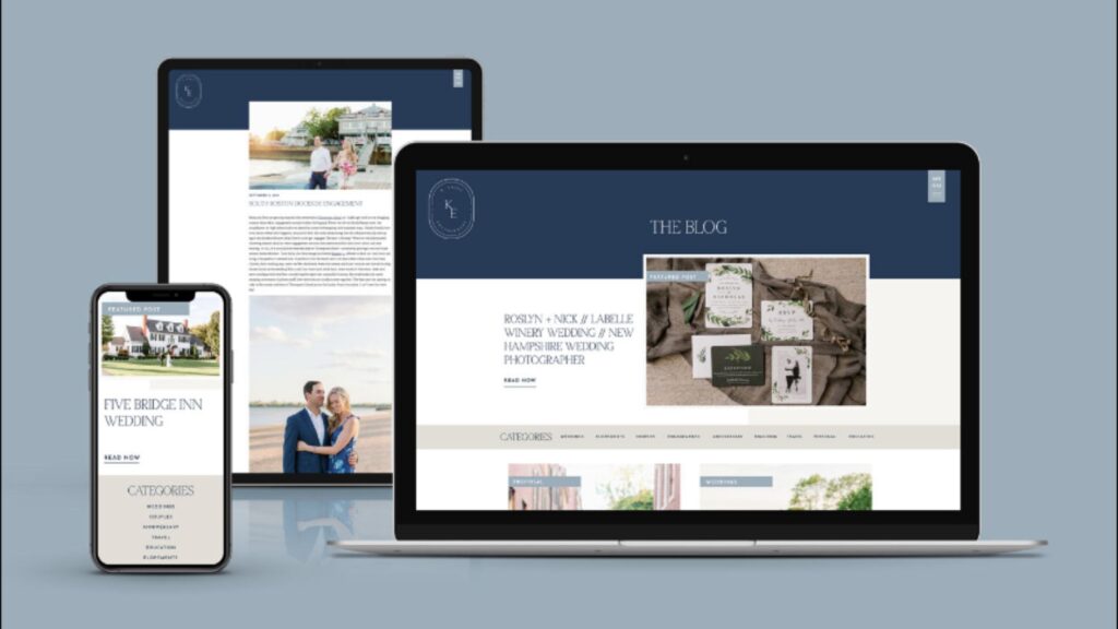
You can have a blog, which I think is a great way to really attract more clientele, especially as a photographer, as long as you’re actually SEO-optimizing your posts.
So, for example, don’t use the couple’s names as your keyword. Don’t even put the couple’s names in your URL or anything like that for that blog post. Instead, really try to focus on writing posts based on the place.
Maybe you did a wedding at some sort of estate, and what you wanna do instead is make your keyword like that estate’s name with the word wedding on the end, or like wedding at estate name, because that’s more so what people are searching.
They’re not gonna be searching for, you know, John and Kayla’s wedding or something like that. So really try to keep that in mind as you’re writing your blog posts.
And also, remember that a green light in Yoast or Rank Math in WordPress does not mean that it’s a good post. I think a lot of people tend to think that it just means that it’s a perfect post and it’s gonna start ranking, but that is not the case!
Showcase lots of your personality, but remember… simple is better!
When designing your site in order to have a standout photography site, really remember simple is better, but be sure to add personality.
This is kind of a weird one to say when it comes to photography website tips, just because I feel like there are two very distinct ends of a photography site.
They’re either so simple that there is no personality at all, and it looks like every other photographer site you’ve seen, or there’s this whole other end of the spectrum, and it tends to happen a lot with Showit sites, where there’s just so much personality and so much going on that you don’t even read the words.
You just exit the site because you’re like, I can’t even navigate the site. There’s so much going on. So try to be somewhere in the middle.
What I like to do when trying to do this is just to really design the site in a way that’s simple to begin with. Try to lay out the site before you go in and add the personality.
What I’ll do is I’ll go through, kind of add all the copy in, and just put little grayed-out boxes where I wanna put images. Then I’ll add the images in.
I’ll kind of work around the layouts a little bit, and then I’ll go through and add personality. So that could maybe be like adding color blocks behind images or adding little borders on the images, adding fun movements, and things like that.
So it’s always better to start with less and then add some stuff. And then you can, of course, take away any elements if needed, but really try not to go overboard.
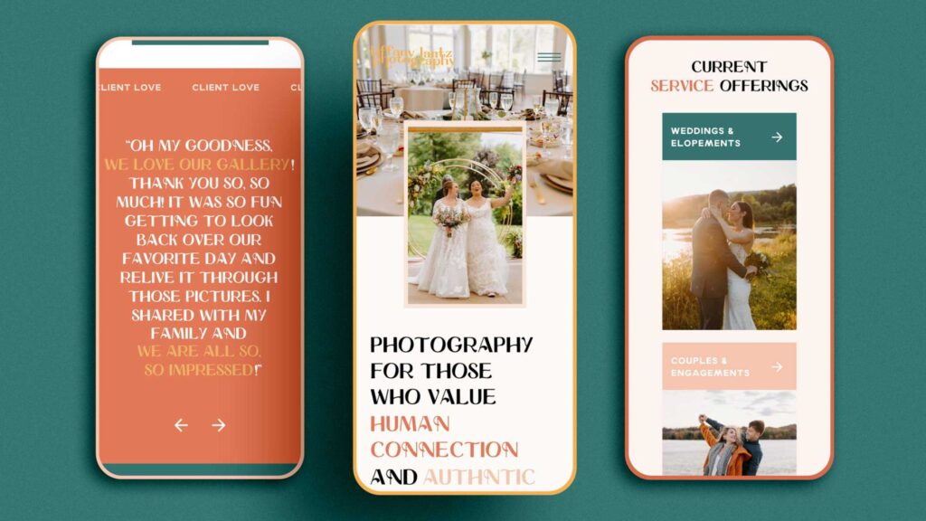
Make use of testimonials, but make them short
Next, be sure to use short testimonials. I feel like a lot of photography sites tend to put an entire, not even a paragraph, almost like a page’s worth of testimonials just for like one single testimonial, and I feel like you have to know people aren’t going to read that because that’s so long.
No one wants to come to your site and read a whole essay. They’d rather just see two sentences that showcase that you’re good at what you do and that couples or people you’ve worked with know that too.
So what I like to do is create a sliding testimonial section where it’ll go through a few different ones and basically make them all around the same length. I try to keep them three to four lines of text maximum.
I’ll make the text pretty large too, just so that they are a little bit eye-catching, and you can go through and highlight certain parts of the text if you want or put them in a different color so that you can really draw the eye to the part that you really want people to pay attention to.
Then at the bottom, you can also write the couple’s name or the business’s name. If you really want to go above and beyond, what I love recommending to my photographer clients is also to put a photo that goes with the testimonial next to it, if you can, or you can put it in a little tiny circle above the testimonial too, if you want.
This is a way to kind of stand out, because people are actually going to read your testimonials if you do this, I promise you, so many people are definitely going to skip over if you make them super long.
Ensure your URLs are accurate
Another thing that is going to easily help you stand out is to make sure that your URLs are actually what the page is for, and what I mean by this is, weirdly, a lot of photographer sites that I visited tend to have multiple pages for each page.
What I mean by this is, let’s say, I click on the about page link in the nav bar, and it will say, www.domain.com/about-3.
And I’m like, why is it three? What happened to one and two? So try to make sure that that’s not happening in your URLs.
If this is the third iteration of the page, just delete the other two or change the URLs to those and make the one that’s actually linked just your regular About page. This is better for SEO, and also, if people want to go to your about page and they don’t go to your site first, they’ll know to just type in www.domain.com/about, instead of typing www.domain.com/about-3.
SEO every page on your site
And then, last but not least, make sure that you add SEO to every page. I think it’s definitely easier to write your copy first and then try to do some keyword research and add SEO in.
If you don’t know anything about SEO, the most basic thing that you can do is to at least write your location with the word photographer after it.
So let’s say you’re in Denver and then you do weddings, that you would probably want to write Denver wedding photographer at least a few times throughout your site or put it in your footer or something like that, just so that you can start to rank for that.
If people are looking for a Denver wedding photographer, it’s likely that you’re going to pop up a little bit higher.
Make sure that you do add alt text to every single image on your pages, and I know, as a photographer, this can take a long time, like, trust me. I know because we do it for our clients, but it is 100% worth it for not only SEO but also accessibility.
So if someone can’t see what’s on your page and they’re using a screen reader, then you really want them to be able to understand what the photos are of. Also, if your images don’t load for whatever reason, that alt text is what’s going to load to tell somebody what’s there.
Be sure also to check your text properties. So make sure you only have one h1 on a page. Then you’ll also want to double-check that your h2s, h3s, h4s, and buttons and body paragraphs are all appropriately marked.
This is something that usually gets done automatically in other platforms, but in Showit, you have to triple-check because you actually have to go through and manually change everything and also be sure to add meta descriptions.
So go through and add a meta description for every page. One issue that we find a lot with photographer sites is that every page will, for some reason, have the same exact meta description, and your meta description is basically what’s going to pop up under your name in Google if somebody were to search something and your page pops up.
You can control what gets shown there, but also kind of not, because sometimes Google does what it wants, but it’s always a good idea to throw your keyword in there and actually write what the page is about.
Final Thoughts: Tips for Photography Websites
Well, there you have it! These were all of our top photography website tips. We hope you enjoyed. If you need help getting your website designed as a photographer, we’d love to help! You can check out our past work here and get in touch here.
Check these out next:
8/14/23
Published On:
Krystianna Pietrzak

 (1)")