Are you an entrepreneur who wants a website that actually represents them as a creative? You’ve found the ultimate post of the best standout websites for creatives.
As custom brand and web designers for online creatives, we’ve built a lot of fun and unique creative websites over the years. We’re here to show you that you really can have a website that matches your style as a creative… bland brands and websites are so last year.
In this blog post, we’ll take you through 13 standout websites for creatives who wanted their designs and branding to be different from the rest of their industry.
Jenni Chapman Photography
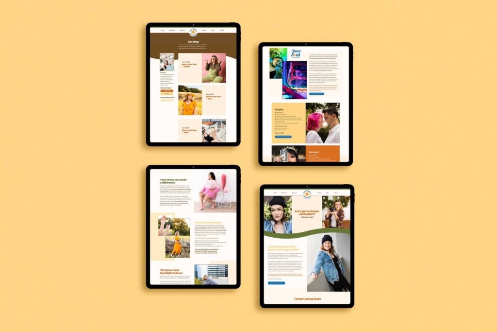
Jenni is a talented queer creative with a signature offer called the Queer Soul Experience – an innovative offering featuring podcasting, a book, and photoshoots (we’ve never seen anything like it). As an inspiring Californian trailblazer, Jenni needed to have one of the most stand-out websites.
Jenni’s website was simply “fine” design-wise when they first reached out but sorely lacked a professional finish and mobile optimization – two crucial elements of modern web presence. We were ready to take on the challenge of transforming their site into something much more polished, on-brand, and responsive!
With the switch to Showit, Jenni’s new website has eye-catching imagery and encourages visitors to keep scrolling until they hit that contact button.
MADE Tattoo & Mercantile
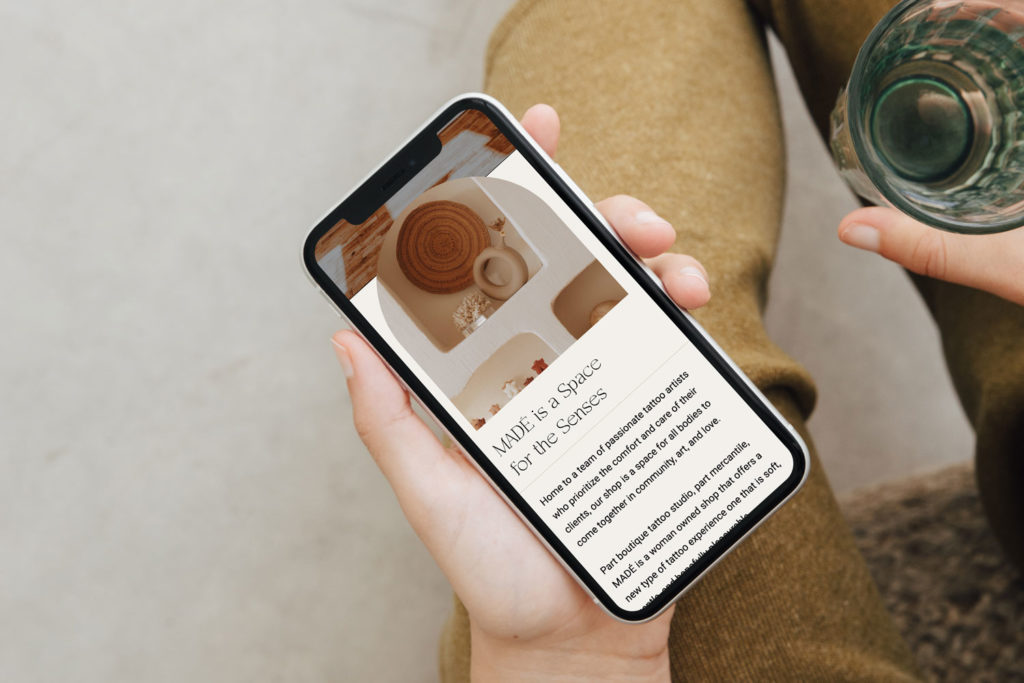
MADÉ Tattoo & Mercantile is a truly unique tattoo shop with a focus on the calm. The founder, Chloe, crafted a safe and peaceful environment, allowing those getting tattoos to relax during their experience of getting a permanent piece of art on their skin.
When Chloe connected with us, she already had a thriving business but saw the potential for even more success. She wanted to give her studio’s artists and creations an online platform.
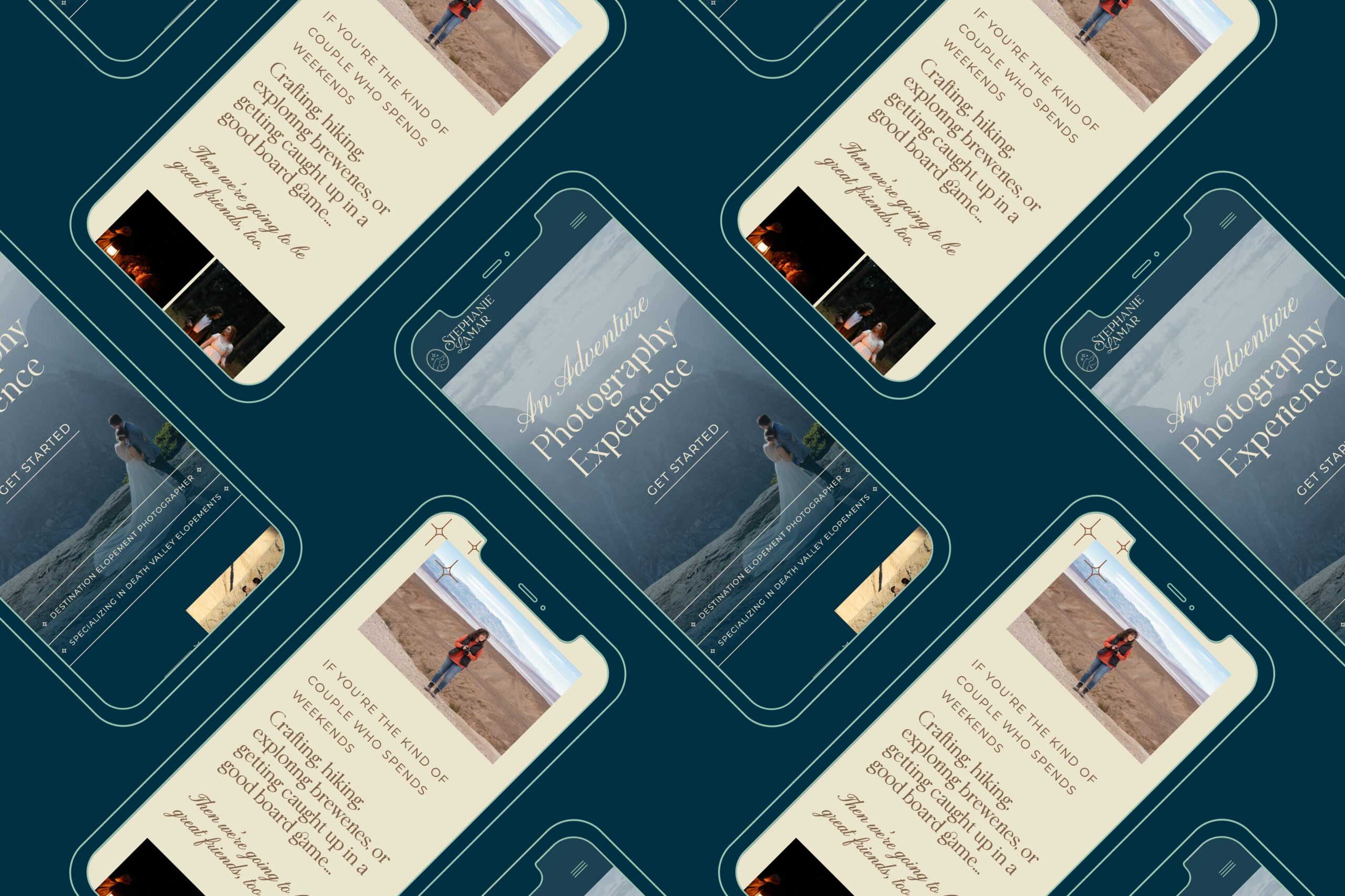
With just one day and our Clarke Showit template, we created an online version of the IRL shop that’s truly unique. From its delicate movements to unique arch shapes inspired by actual decor in the store, this website design really packs a punch.
A Lost Epic
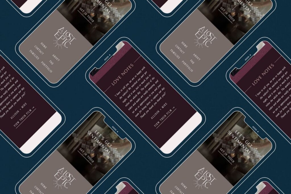
Leah, the talented videographer of A Lost Epic, knows exactly how to capture love in film. When Leah first reached out, she was ready to switch from her old website platform to Showit. We love it when clients want to switch to Showit because it’s so intuitive.
With a goal of wanting an amazing user experience for visitors, Leah knew it required more than just moving platforms—she wanted an entire level-up in branding and design as well.
With the goal of making her website stand out from all others, we strived for an elegant yet romantic design. We achieved this with subtle, thin lines to draw attention and playfully eye-catching parallax imagery that brings energy without relying too heavily on video.
Be Here Wellness & Counseling
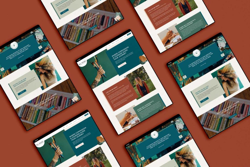
Brooke, the incredible therapist at Be Here Wellness & Counseling, embraced a new look through our unique partnership with Bethany Works®. Throughout the project, she received a brand new brand and website that truly is built to stand out from the sea of sameness online.
We had the honor of creating something unique for Brooke. We used her new brand photos taken by Kylee B Photography throughout the site to really make it feel unique. Since launching, Brooke has even grown her team!
Francesca Lee Photography
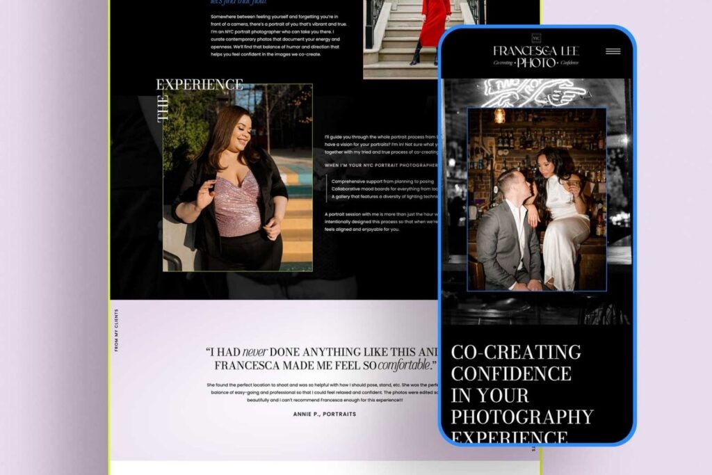
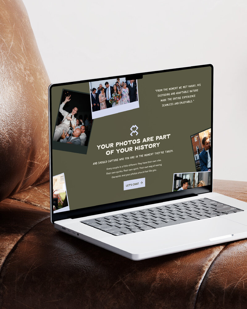
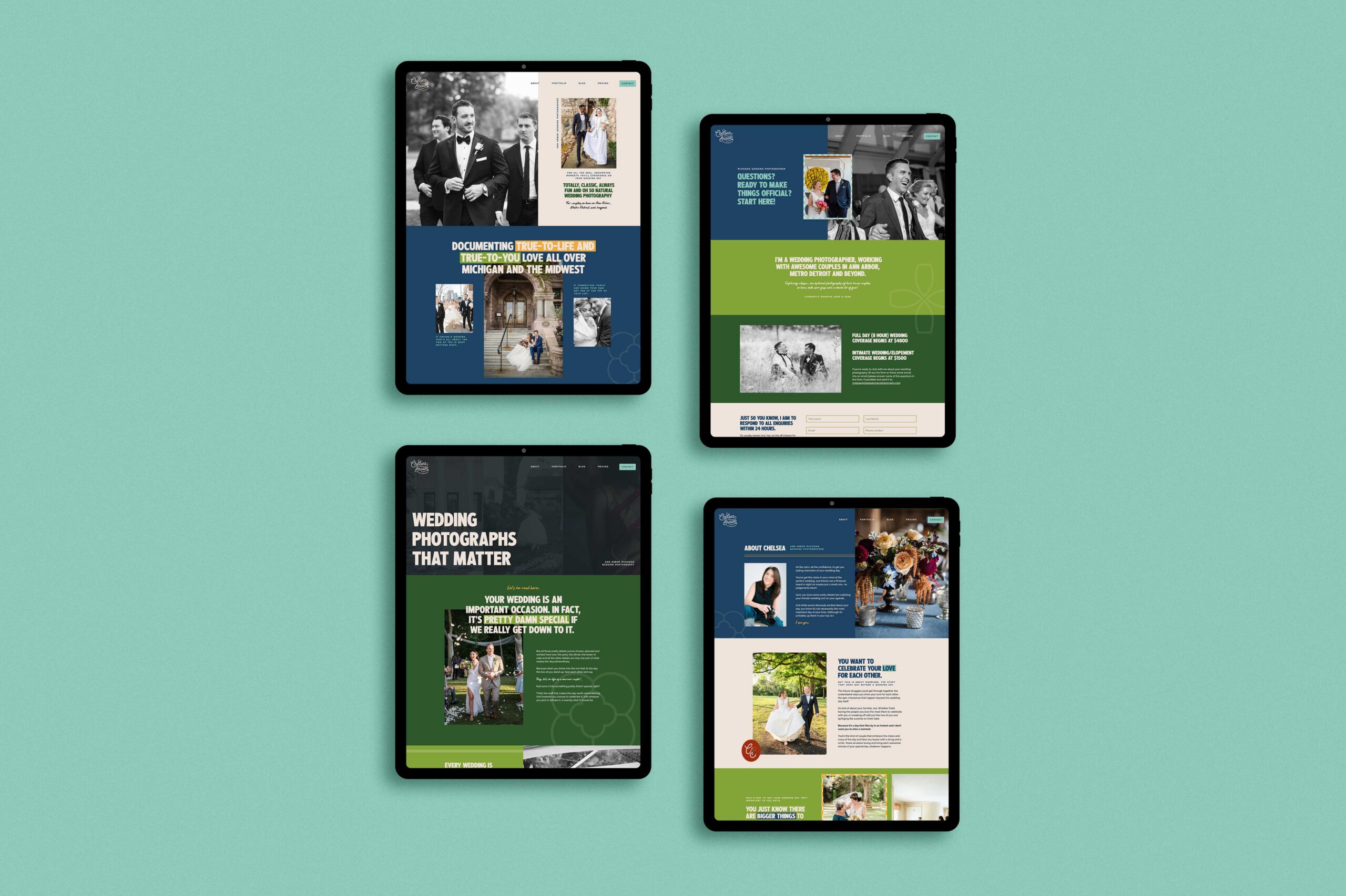
Francesca is an NYC photographer who recently took her business to the next level with a stunning new website, designed and crafted by yours truly. Her new signature style – bold yet editorial shots expertly balanced against pops of vibrant colors – completes this standout aesthetic that’s sure to make waves in New York.
With an existing website and some customization, she craved something more. Her website experience for visitors wasn’t super intuitive. The website lacked the care and quality of service she gives her clients.
To level up the website, we focused heavily on three main strategic points: using pops of color to inspire action, having linear elements in a dynamic design, and leaning into editorial inspiration.
Sara Bishop Photography
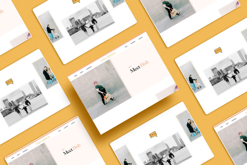
Sara Bishop (Bish) offers a taste of the Arizona sun with her wedding and lifestyle/portrait photography services, having brightened up life for folks ever since stepping into business in the early 2000s.
We got together to craft something especially unique. The result is a new brand as well as creating an exclusive website design tailored just for Bish.
To this day, Bish’s website is still one of our absolute favorites that we’ve created in our studio. It has an air of sophistication and class while still providing a playful twist!
Tiffany Lantz Photography
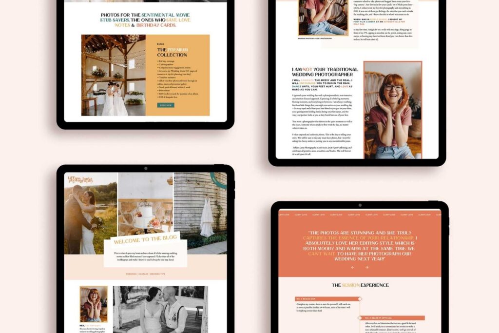
Tiffany is an awesome Pennsylvania-based photographer capturing life with a true, vibrant touch. She wanted to make her website equally as captivating as her image and knew she’d found the perfect partner in us to help bring it all together!
Tiff knew her website was missing something. She was on Squarespace originally. With Squarespace’s limited design capabilities, even the most ambitious DIYers tend to reach a dead end with their own sites.
Fortunately for Tiff, she heard about Showit and its dynamic design tools—they sounded like just what she needed to transform her homemade-looking site into one that screams professionalism and playfulness.
Eilish Bailey Photography
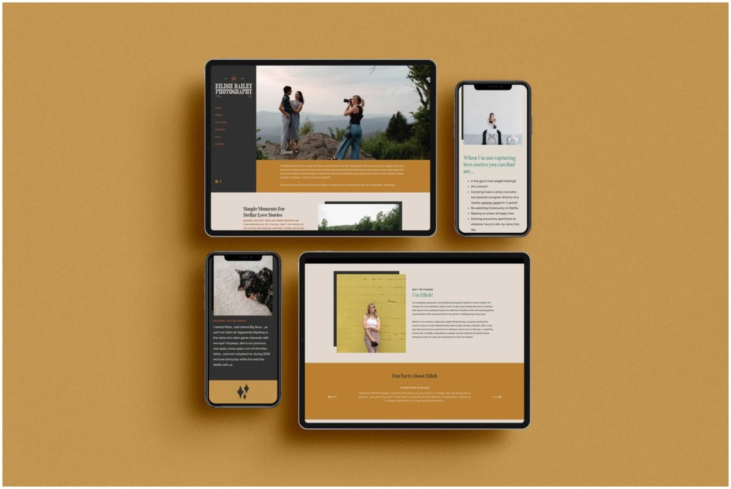
Eilish Bailey is a Virginia-based photographer! With an eye for capturing unforgettable moments and enough edge to be set apart from other photographers in her area, Eilish creates images with unique character.
When she first reached out, Eilish’s site wasn’t doing what she wanted it to; it wasn’t showing off her style and truly representing who she was as an artist. But after intensive work with us, that changed! She swapped out the designs for something as unique and standout as she is, so now her online presence stands out like never before.
Brandcendent
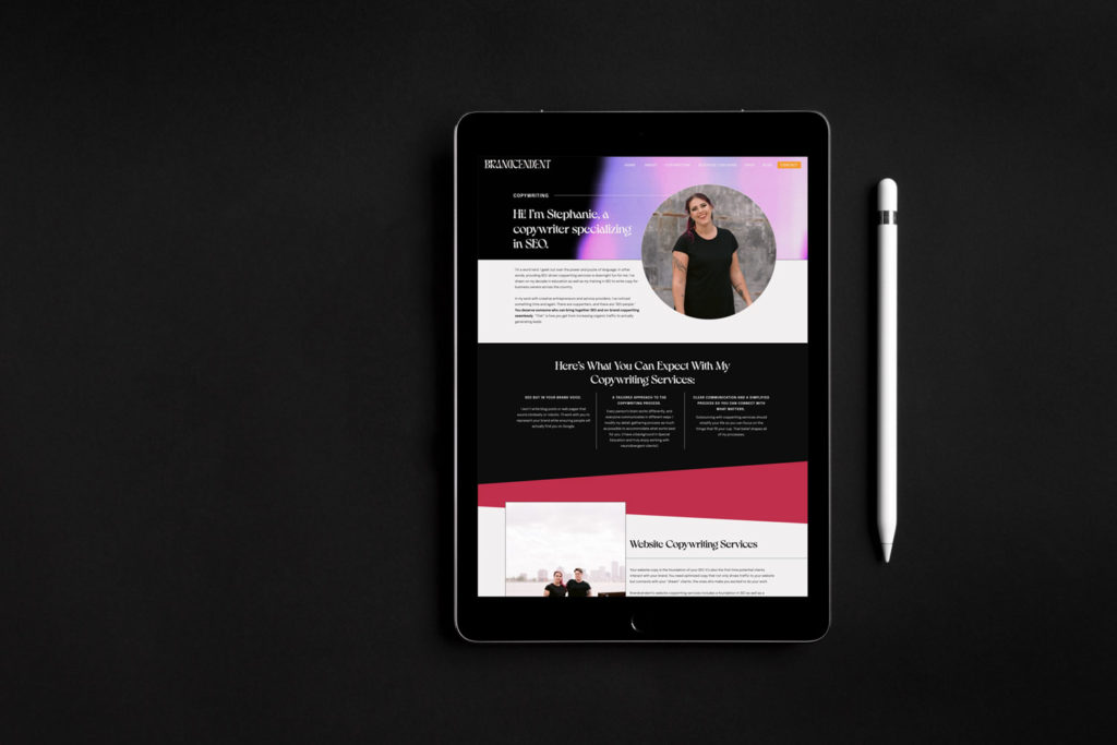
Brandcendent is a powerhouse coaching and copywriting business that’s run by the dynamic duo of Steph and Theo. They had a website designed on Showit already but were ready to bring it to the next level.
This project went above and beyond when it came to creating a truly unique website. Not only did we strive for uniqueness, but we also integrated interactive elements like hover effects and clickable canvases, which add an extra bit of visual interest that makes scrolling even more fun!
Max Catterson Photography
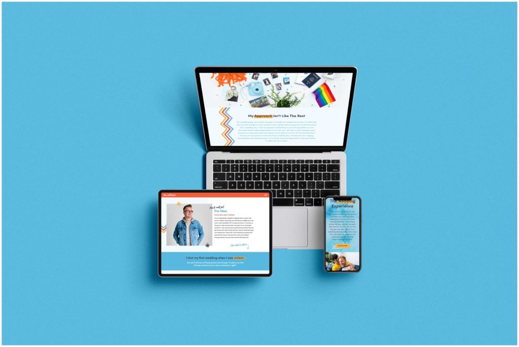
Max Catterson, an Indianapolis-based photographer, was ready to create a website that really represented his work. He sought something special to make potential clients sit up and take notice – he wanted them drawn in by his vibrant photographs.
Max had a website that was doing its job but wasn’t living up to its full potential. He sought an experienced designer who could inject his unique personality into the site, bring to life his new branding, and promote inclusivity.
Max’s new website invites visitors in for an unforgettable experience, enough to keep them exploring until they are ready to reach out.
Kylee B Photography
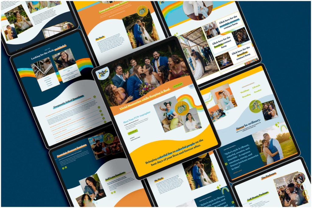
Meet Kylee, a Pennsylvania-based photographer with passion and personality. She specializes in weddings that are true to life and colorful! With the perfect mix of vintage vibes and a sharp approach, this website has dream clients glued until they are ready to take action.
Before signing up to collaborate with us, Kylee had already taken the initial steps to create an impressive website for her business. However, as she explained it, she wasn’t fully sharing her service’s details in a way that made sense for her clients. With that goal in mind, we worked together – refining and revamping so visitors could easily find out exactly how amazing Kylee’s work really is!
KEALA Co
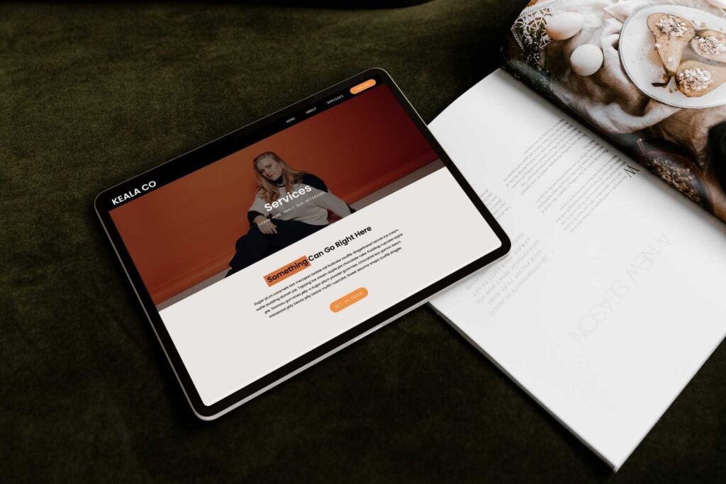
Jennifer Olsson, a savvy coach and entrepreneur, recently launched Keala Co. Entertaining the idea of expanding beyond Instagram as an avenue for sales, she decided to take things up a notch by creating a website that would easily share her offerings.
Jennifer was ready to take her business up a notch, and with our Callie Template from the shop, we helped that happen!
Liz Brindley
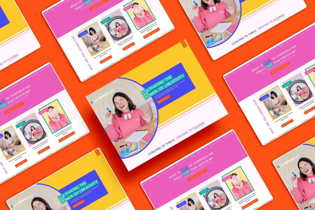
Liz Brindley is a multi-talented illustrator and creative coach extraordinaire! After changing her business name from Prints & Plants to Liz Brindley, she was back in our studio for a website makeover. With an eye for design and the know-how to match it with personality, we were pumped to work on this project with Liz.
We had so much fun bringing Liz’s personality to the forefront throughout the website with fun shapes, bold color, and unique hover features.
Well, there you have it! Now you know all about these standout websites for creatives.
Are you ready for your brand and website to reflect who you are as a creative? Click here to get in touch.
Check these out next:
- Minimalistic Tattoo Shop Website Design on Showit
- 13 Boundary-Pushing Modern Photography Websites
- Unique Website Design for Retro Photography Brand
- 13 Signs You Need a New Website
- 5 Reasons Why Your Photography Business Isn’t Getting Traffic To Your Website - March 30, 2026
- Why Bespoke Website Design Matters for Photographers - March 20, 2026
- Outlaw Brand Archetype Examples For Photographers - March 2, 2026
4/24/23
Published On:
Krystianna Pietrzak
