Squarespace vs Showit – which is better for my business? This is a question past clients have asked me many times. They both have their pros and cons, which can make it hard to decide which one is best for your needs.
Throughout this post, you’ll learn all about the differences and similarities between Squarespace and Showit, so by the end, you’ll be able to decide which one you should use for your business’s website. Plus, if you still aren’t 100% sure, there’s a link to take a quiz at the end to help you figure out which is best without too much thinking!
Read on to learn all about Squarespace vs Showit.
Prefer to listen? Check out our podcast episode!

What is Showit?
Showit is a web design platform that has recently gained popularity. It was initially marketed as a website platform for photographers but has since expanded to encompass all types of business owners. Inkpot Creative was built using Showit!
No design background is necessary to design on Showit, and it’s entirely drag and drop. In fact, it’s almost like creating in your favorite design platform, which is why it’s grown in popularity, especially among those in creative fields who value how their site looks.

What is Squarespace?
Squarespace is another website design platform, but it’s based on templates, making it perfect for those who need to set up a site quickly. The platform integrates blogging, products, and email marketing, all within the Squarespace dashboard.
To make changes on Squarespace, you can either use the pre-made blocks within the platform or further customize them using coding.
Pros of Squarespace
When comparing Squarespace vs Showit, it’s essential to look at the pros! Here are some of the best pros of Squarespace.
It’s a rather affordable platform to use.
If budget is important to you when it comes to web design, Squarespace truly takes the cake. You can start a website for just $16 per month with Squarespace, which is a $3 discount from Showit.
However, as you start to want more capabilities within Squarespace, like selling products, for instance, then you’ll have to bump up a tier. Once this happens, the pricing is just about the same as Showit!

Squarespace is easy to sell products with.
You can use e-commerce capabilities right within Squarespace without using a third party like you have to with Showit. So, this means that you can keep everything about your business all in one place. This is especially great for businesses who feel overwhelmed paying for other platforms!
There’s built in email marketing!
Another excellent pro of Squarespace is using their email marketing platform! This means that you won’t have to pay for something like Convertkit or Flodesk unless you want those extra capabilities.
Squarespace has beautiful email layouts too, which you can quickly edit to match your branding and messaging. The pro of using their email marketing platform is that it’s going to easily look just like your website, helping overall with cohesiveness.
Squarespace doubles as a design platform and your hosting.
This is one thing that Squarespace and Showit have in common. Squarespace is both a design platform and your hosting, so you won’t have to purchase hosting from somewhere else’s like you would if you were on WordPress.
Another great pro to Squarespace is that you can purchase your domain right through them instead of buying one from somewhere else. Again, Squarespace truly takes the cake if you want to keep everything in one place!
Blogging is a breeze.
This isn’t to say that blogging isn’t a breeze with Showit, but you can blog right within the platform, and you won’t have to log into a different dashboard like you have to if you are on Showit. Instead, right from your Squarespace dashboard, you can write out your posts, schedule them, and more.
However, if SEO is something you care about, WordPress blog posts (like the ones you’d be able to use with Showit) have more SEO capabilities as you can use plugins like RankMath and Yoast.
Cons of Squarespace
Just like any platform, there are still some cons to Squarespace. Here are a few of the top cons to the platform.
You have to use code to customize a site on Squarespace truly.
Don’t get me wrong, you can still easily customize a site on Squarespace using their color picker and everything, but if you want to change parts of your site to be custom truly, then you do have to use code to make parts of the template your own.
There are tons of great places online where you can find code for the site, though, including Squarespace Facebook groups. If customization is something you care about, you may find better luck with Showit because you can get the job done a bit quicker.
Squarespace did launch it’s Fluid Engine in summer 2022 which is a lot easier to use for making sites now, but a decent amount of code is still needed from our experience.
You can’t customize the mobile site separately (7.0 only).
Squarespace creates the mobile version of your site automatically. Usually, this is completely fine, but sometimes the mobile can look a bit wonky. When this happens, it’s extremely hard to customize it to make it look how you want, so most people just don’t touch it all.
With more and more people visiting sites on mobile, it’s extremely important for your mobile version of your site to look just as good as it does on desktop. If you’re in a time crunch, Squarespace doing mobile for you can be seen as a blessing… but with Showit, you can design the mobile version on your own, the same way you’d design desktop.
With the new 7.1 update, mobile can be designed separately!

It’s hard to make a Squarespace site not feel block-like.
Squarespace is known for its very minimalistic design style, and that means that Squarespace sites are very blocky. If you want fluidity, then Showit may be better for you. However, if you love the minimalistic block style (I love a good simplistic moment with pops of color), then Squarespace will help you achieve that a lot easier than Showit will!
Pros of Showit
There is absolutely no code necessary!
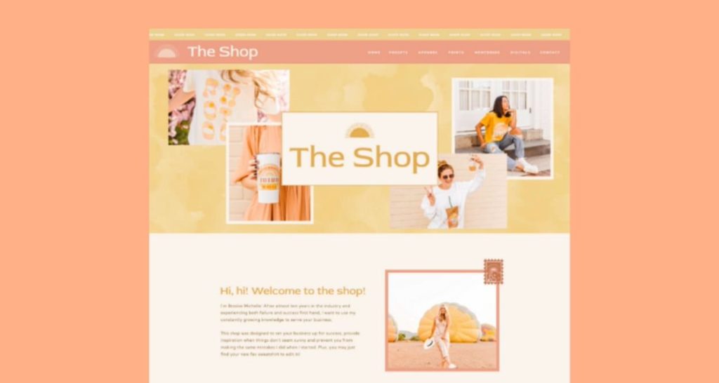
You don’t have to know a thing about coding to create a gorgeous website on Showit. All you have to do is use the tools that Showit already has to create a beautiful website. Right within the Showit dashboard, you can choose between tons of design elements, like shapes, lines, text boxes, and more.
Say goodbye to coding to get two images to overlap in just the right way!
Even though coding is not necessary, you can use coding if you need to for certain elements. I have only ever used coding once on a Showit site to create a fun rotating effect, and I’ve created 100+ different Showit sites.
It’s actually drag and drop.
So many website platforms claim to be drag and drop. However, many of these platforms use the term “drag and drop” to mean there are pre-designed blocks that you can drop into your design and then edit them to your needs.
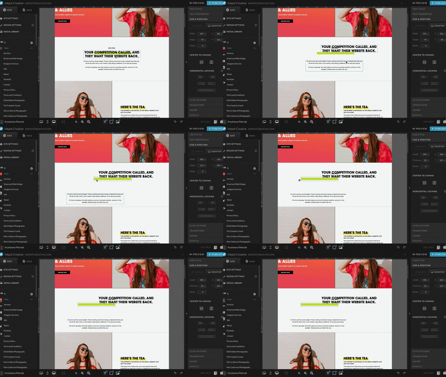
With Showit, however, you can design the same way that you would in a popular design program, like Adobe Illustrator, Photoshop, or even Canva. That’s right; you can move things around just by clicking and dragging. Talk about a dream!
The support is superb.
Any time you have a question in Showit, all you have to do is click the little question mark in the bottom right corner of your dashboard. Usually, within a few hours, you get a response to your question! The Showit support is always top-notch, and they’ll answer your questions fairly quickly.
Showit uses WordPress for blogging, so the SEO capabilities are immaculate.
Yes, you read that right. It’s super confusing, but Showit uses WordPress on the backend for blogging. This means that you have a separate WordPress dashboard that you can log into, and that’s where you will write and publish your blog posts.
WordPress is known for its incredible SEO capabilities, so you can rest assured that you’ll be able to rank well with your post if you’re using best SEO practices and keywords that you know you can rank for.
You can design mobile separately.
This can be seen as both a blessing and a curse, depending on your preference. With Showit, you have to design the mobile on its own. This means that the platform does not automatically put your mobile site together for you, giving you the flexibility to go through and set up mobile exactly how you want. You can even quickly hide certain elements on mobile if you don’t want them there.
As a designer, I love having the ability to go in and fully customize mobile sites. I work with many photographers, so this allows us to pick different photos for the mobile site versus the desktop site if needed so that you can show off even more of your work.

If you’re the type of person who doesn’t like designing something twice, you may not be very fond of this Showit capability. It completely depends!
It’s super easy to make a fluid design.
When it comes to Squarespace vs Showit, one of the best pros of Showit is that you can make your site very fluid. Everything doesn’t seem as block-like as it does in Squarespace because you aren’t stuck with a template. You can great fun waves and other accents to add movement to the site.
Showit will migrate your blog posts if you were on Squarespace or WordPress.
If you are switching to Showit from Squarespace or WordPress, Showit will take the time to migrate all of your posts for you if you’d like. They have different blogging packages, but if you have more than 50 different blog posts you want to be transferred, then you’ll have to purchase the Advanced Blog package.
They make it super easy to migrate over to Showit, and I’ve taken advantage of this awesome service many times with past clients before. It’s included in any of the blog packages!
Showit doubles as a design platform and your hosting.
Like Squarespace, your hosting is right through Showit, as is your design. This helps to keep everything in one place. Unlike Squarespace, however, you will have to purchase your domain elsewhere, such as through a place like GoDaddy, Google Domains, or Siteground.
Cons of Showit
Even though there are many great pros to Showit, there are some cons too. Read below to learn all about the cons of the platform.

You can sell products on Showit, but with limitations.
Showit is not the best platform for you if you sell tons of products. You have to design a separate page for each and every item that you want to sell, so if you’re selling more than 25 products, it’s not a good platform option for you.
However, if you’re a service-based business owner like me who will be using it just to sell some templates, then it’s perfect. Showit integrates with Shopify Lite and Woocommerce super easily. If you check out the templates in my template shop, you’ll see that I use Shopify Lite on my site, which is just $9 per month!
Sometimes, Showit sites look funky on larger screens.
Yes, you can optimize your site for desktop and mobile on Showit, but sometimes the site can look a bit wonky on a super large screen if it’s larger than 25″, so keep that in mind. Luckily, most people will be visiting your site on mobile or on a 13″ laptop.
There’s a bit of a learning curve.
If you’re not a designer, then you will have to work through the Showit learning curve. I have been using Adobe’s projects for about ten years now, and it took me about a day to pick up how Showit works. This came from me just playing around in the platform!
Some of my past clients, for instance, have found that it can take a bit longer to pick up, especially those who migrated over to the platform. Others, however, said that the platform was very intuitive for them and that they didn’t even have to watch any tutorial videos. So, again, this is one of the cons you can take with a grain of salt.

It’s more on the expensive side.
With the lowest tier starting at $19 per month on an annual plan, when considering Squarespace vs Showit, the latter is a bit more expensive. The $19 per month plan does not even include a blog, so this is something to think about.
Would you rather pay more for better design freedom or pay less and have to work from a theme? The choice is totally up to you, and everyone’s priorities are different!
Squarespace vs Showit
So, now comes the final question: is Showit or Squarespace better for you? When it comes to these two platforms, it totally depends on your needs.
If you need a quick website setup and want something simple to use (especially if you’re not tech-savvy), then consider Squarespace. This platform is also perfect for those who want to keep everything in one place, including their products, domain, email marketing, and more. Squarespace is excellent all-around because it has so many capabilities!
On the other hand, if the design is essential to you and you want the ability to design something exactly how you want with no code necessary, then Showit is a better option for you. Even though it’s more pricy, the design capabilities are unparalleled in the web design world, which is why all of my clients opt to use Showit. This platform is also great for those in creative fields, like photographers, coaches, and copywriters.

Click one of the graphics below to save the post to Pinterest!
Read more:
- Website in a Day: How We Designed a Copywriter Website in 8 Hours
- Rock-Inspired Website Template Customization
- Fun Showit Web Design for Colorado Photographer
- 9 Website Launch Announcement Ideas for the Most Epic Launch Yet
- Caregiver Brand Archetype Examples For Photographers - February 12, 2026
- Hero Brand Archetype Examples For Photographers - January 28, 2026
- Sage Brand Archetype Examples for Photographers - January 20, 2026
1/06/22
Published On:
Krystianna Pietrzak


