
This wedding planner Showit website created by us at Inkpot Creative will knock your socks off!
We are brand and website designers who have designed 50+ websites for wedding professionals over the years. We’ve designed for every type of client, from photographers to wedding planners and everything in between.
In this blog post, we’ll delve into the design behind One Bell Designs’ stand-out website. From our strategic design choices to our dedication to making sure mobile is just as fun to scroll, you’ll discover how we used the power of the Showit platform to craft a digital experience as unique as the weddings our clients plan.
Keep reading to explore the thought processes, design strategies, and personal touches that breathe life into One Bell Designs’ Showit website. Get ready to be inspired with this wedding planner Showit website design!
Meet the Client: Who is One Bell Designs?
Rachel and Amy, the founders behind One Bell Designs, are wedding planners based in Connecticut and serve New England. They have a passion for creating unforgettable experiences and a keen eye for detail that we knew we wanted to showcase throughout the website.
Early in 2023, they realized the importance of having an online presence that reflects their expertise and style. Rachel and Amy decided it was time to take their business to the next level by having a stunning website built… so they reached out to us!
By having a website they could send clients to before booking, Rachel and Amy could reach more clientele and allow them to showcase their portfolio, services, and unique approach to wedding planning.
The Perfect Strategy for One Bell Designs
When Rachel and Amy approached the task of creating their dream website, they had a clear vision in mind. Having used Showit in the past, they were already familiar with the platform’s flexibility and creative possibilities. Armed with professional photography, branding elements, and well-crafted copy, they were ready to turn their vision into reality with the help of our studio!
As with all of our design projects, we started with a strategy first. Here’s a breakdown of what we did when it came to creating a strategy for One Bell Designs.
The Power of Action Colors
One of the first design choices we made was the strategic use of color, particularly dark purple, for Rachel and Amy’s call-to-action buttons. Rachel and Amy already had a color palette from their branding, so this deliberate choice wasn’t about aesthetics but rather a psychology-driven decision to guide visitors toward taking action.
By using a color that stands out, our goal is to drive user engagement and conversions across the site. Plus, it will teach website visitors that when they see that dark purple, we want them to click!
Personality-Driven Imagery
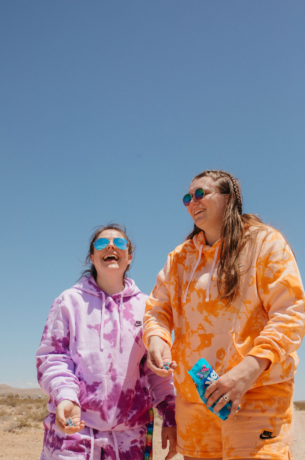
We infused their website with all of the imagery that showcased their personality! Think about it… when you hire a wedding planner, yes, you are hiring them for the service, but you also want to vibe with them. Wedding planners spend a lot of time with their couples, so by letting their website visitors get a feel for who they are before reaching out, they’ll be even closer to booking by the time they inquire.
Our goal here was to showcase their personality so that by the time someone hopped on a call with them, they were ready to go!
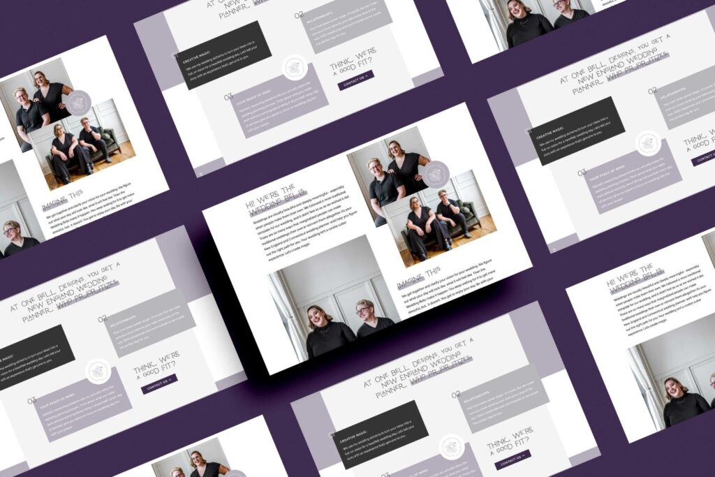
Layered Design Aesthetic
To establish a unique and cohesive visual look across the website, we utilized a layering effect throughout their website’s pages, drawing inspiration from our Charlie Showit Template, which we used as a base.
This design element added depth and dimension to the site (two things we love), creating an engaging and fun browsing experience for visitors. The layering effect integrated different sections and content, making the website feel super elegant and sophisticated!
Designing the Internal Pages
We wanted to carry the overall strategy throughout One Bell Designs’ website. Let’s take a closer look at some of the standout pages that make up this fun wedding planner site!
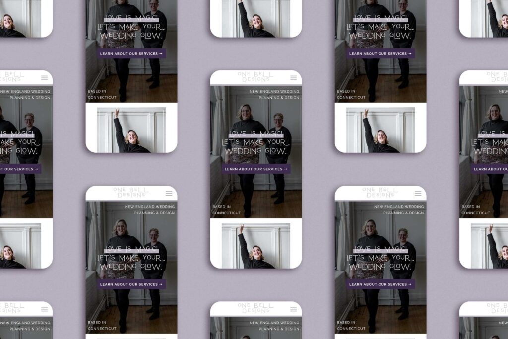
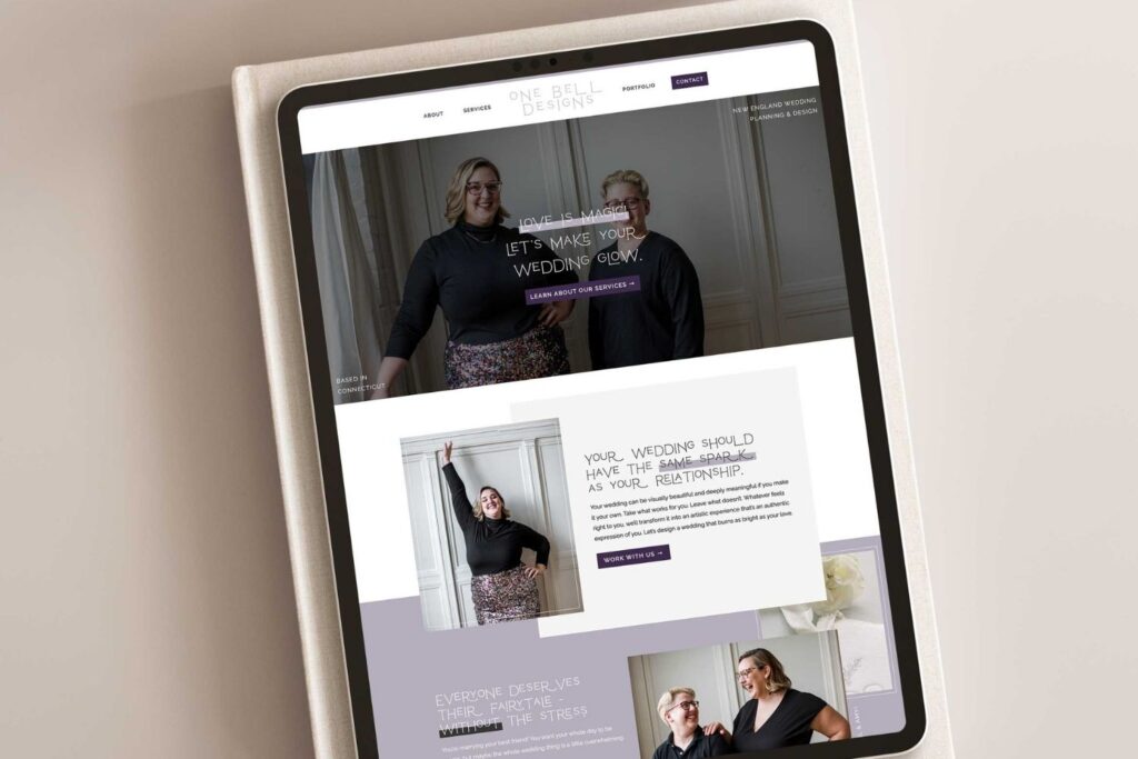
Home: Introducing Visitors to One Bell
We all know that the homepage sets the tone for the entire website, and One Bell Designs’ homepage does so with grace and flair. The use of a large, captivating hero image immediately captures visitors’ attention and conveys what they offer rather quickly.
Gallery: Showcasing Past Couples
The gallery (which was added on later in the summer of 2023) serves as a way to quickly give social proof to scrollers, displaying a curated collection of stunning photographs from past weddings. Each image tells a story of love, happiness, and meticulous planning to give a visual to One Bell’s work.
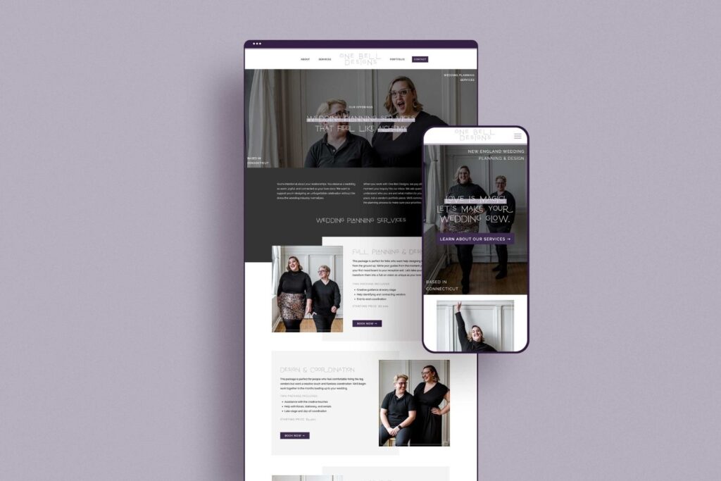
Services: Sharing One Bell’s Offers
The services page outlines the variety of offerings provided by One Bell Designs. Through concise descriptions and engaging visuals, Rachel and Amy communicate their commitment to creating personalized, unforgettable wedding experiences while utilizing the same sort of design style that we used throughout the rest of the website.
The strategic use of dark purple for CTAs here encourages visitors to take the next step in their wedding planning journey.
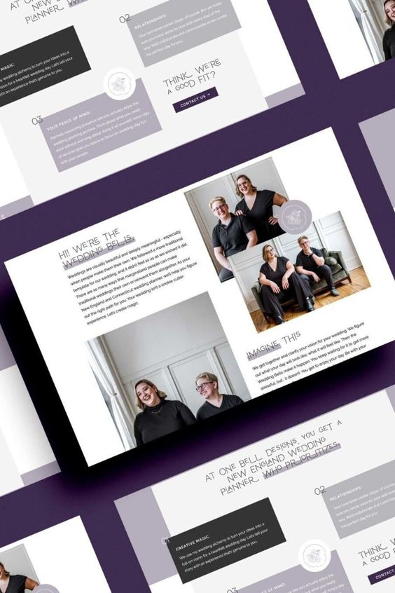
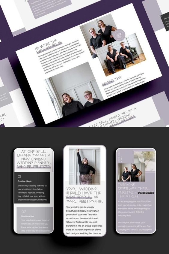
About: The Faces Behind the Business
The about page offers a glimpse into the personalities and talents of Rachel and Amy. Through a combination of candid photographs, they establish a genuine connection with visitors.
This page humanizes their brand (and is truly one of the most visited pages on any website), reinforcing the idea that every wedding they plan is infused with their passion and expertise.
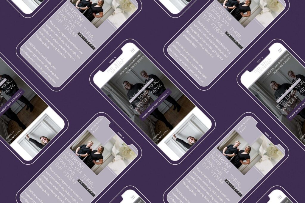
Creating a Scroll-Worthy Mobile Experience
In today’s digital world, a seamless mobile experience is non-negotiable! To be honest, odds are high that at least 70% of your traffic will be mobile. So, we ensured that their website design translates beautifully across various devices, from desktops to smartphones.
The responsive design guarantees that visitors can access the magic of One Bell Designs on the go without sacrificing any of the visual appeal or functionality.
This is one of the reasons we love Showit, because we have complete control over the desktop and mobile versions of the website.
Which website platform is best for your business?
We’ve got a free quiz for that. Click here to take it!
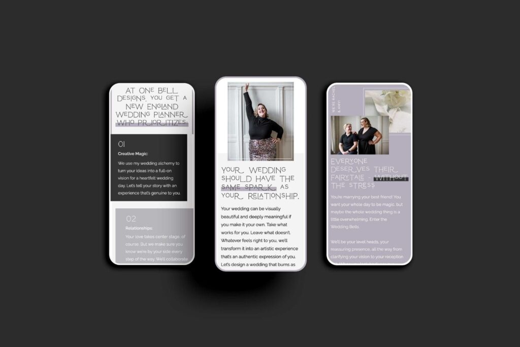
Putting Personality Throughout the Website
One of the most fun aspects of the One Bell Designs website is its ability to convey the personality and ethos of the wedding planning duo. Every element, from the color choices to the imagery and copy, reflects Rachel and Amy’s passion for the work that they do and the commitment that they have to their couples.
This authenticity establishes an emotional connection with visitors, allowing them to envision how their own wedding dreams could come to life with the guidance of One Bell Designs.
We also really honed in on keeping the layering effect, inspired by the Charlie Showit Template, which also serves as a visual representation of the layers of care and thoughtfulness that go into planning each wedding, too.
Final thoughts: Showit Wedding Planner Website Design
As you can see, we have crafted a website that not only showcases Rachel and Amy’s expertise but also invites visitors to become part of their world!
As you begin on your own website design, consider the lessons from this project we did with One Bell Designs. Think strategically about color choices, leverage the power of imagery, and infuse your personality into every corner of your website.
Remember, the goal here is to create a website that resonates and leaves a lasting impression. You want your website to be the one that’s remembered when couples pull up all wedding planner websites in your area. Be so different that you can’t be ignored.
If you’d rather hand off your website design, you can click here to learn more about our services. Get in touch here!
Did you like this website? Pin it for later!
KP’s design journey began in book publishing, but she fell in love with the truly limitless possibilities that web design presents. Since then, she’s been helping photographers and creatives become the no-brainer option for their dream clients before they even get on a call.
- How to Reset & Prepare for the New Year with Renée Dalo - February 15, 2024
- Building a Personal Brand as a Photographer with Maddie Peschong - February 15, 2024
- How to Make Your Website Stand Out: 5 Best Tips - January 25, 2024
9/09/23
Published On:
Krystianna Pietrzak
 (1)")