
Looking for a luxe website design? You’re in the right place!
Francesca Lee Photography’s website is one luxurious site. Based in NYC, Francesca needed a website that stood out from the crowd while also upholding a sense of elegance.
Creating a website for Francesca Lee Photography was a special project for us. We wanted to create a site that captures the essence of Francesca’s photographic work – capturing moments of beauty and artistry. Each element was carefully constructed to make an impactful statement that reflects the personality of Francesca’s brand.
The result is an impeccable website design that truly stands out. We worked with Francesca throughout the entire process, always ensuring that her vision for her website and the strategy we created took priority over anything else.
We are proud of what we were able to achieve with this project – a stunning visual representation of Francesca’s photography and unique style. The combination of creative visuals and intuitive navigation makes it easy for any user to appreciate and enjoy all the wonderful work that Francesca has done.
Keep reading to learn more about this luxe website design.
About Francesca, the Founder of Francesca Lee Photography
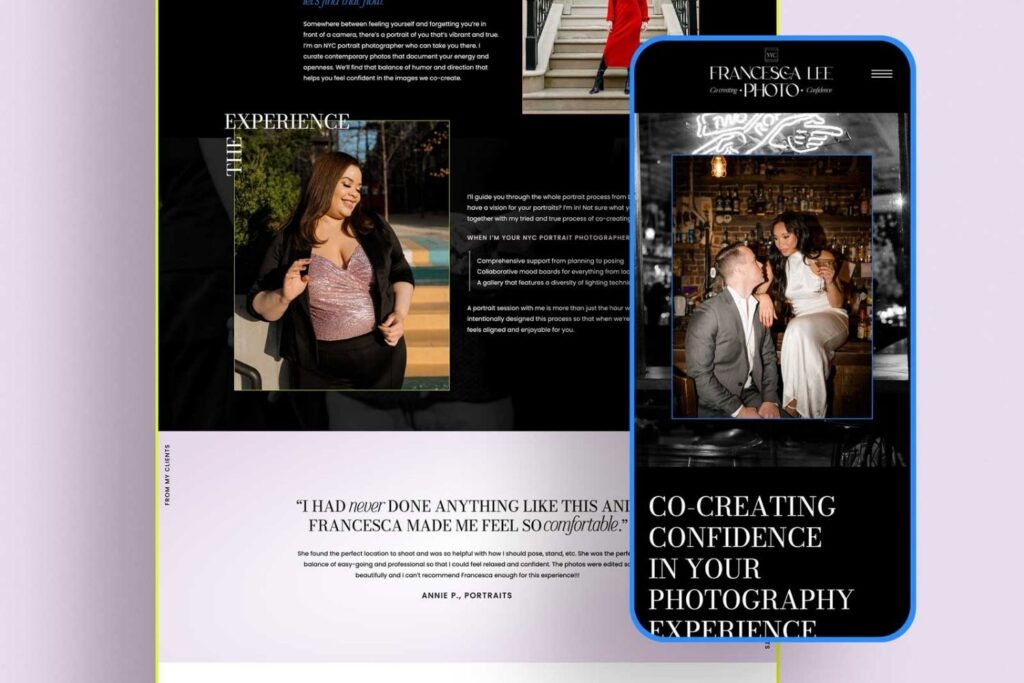
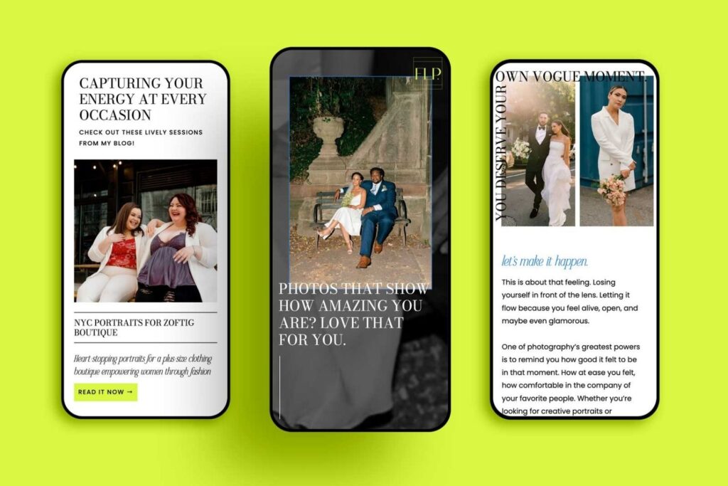
Francesca (she/her) is a photographer based in New York City who worked with us on an all-new custom website design on Showit. Her style is very editorial with pops of color, and we had a lot of fun showcasing that with her new branding that she just had done.
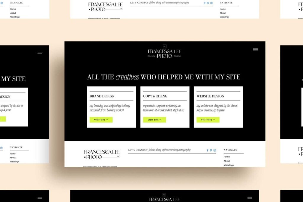
Before working with us, she collaborated with Bethany of Bethany Works to have new branding created that we were able to use to truly set the website apart.
With a timeless, editorial style and pops of neon yellow throughout to help visitors take action, Francesca’s website is set to help her stand out amongst the crowd in NYC.
How Francesca Felt Before Working With Us
Francesca wanted to create a website that showed her clients the level of work she was capable of. She was hoping for something polished, professional, and inviting.
The initial design Francesca had put together herself simply wasn’t what she wanted, leaving her feeling dissatisfied with her online presence. She knew it was time for a change and contacted Inkpot Creative to get some help.
Francesca had a website on Showit already that she had made herself and customized, but the overall user experience wasn’t super clear for visitors, and the design was not reminiscent of the level of work that she gives her clients.
When asked, Francesca said this of her original website: “I thought it was very mediocre. I wasn’t a fan and I didn’t really feel like I had a true solid brand.”
We knew that we could help her elevate her online look. So, we got to work on creating a strategy.
The Website Strategy Created for Francesca Lee Photography
We started by designing the website with a strategy in mind. We want to make Francesca’s website an enjoyable and memorable experience for her visitors. So, we hopped on a vision call with her to learn more about what she was envisioning.
To create this strategy, we focused on three major design elements: pops of color, linear elements, and editorial design.
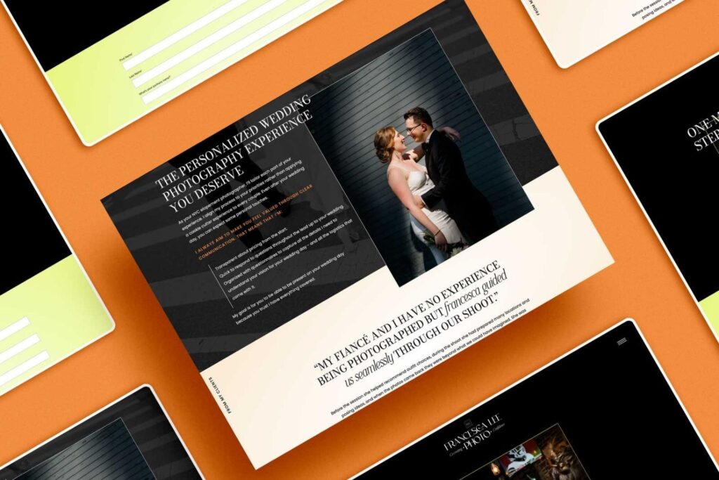
Pops of color are used throughout the website to draw the eye to important sections. The highlight color used throughout the website is a neon yellow, which complements the black and white throughout the site perfectly. When visitors see this neon yellow, they will immediately be drawn to the content that follows.
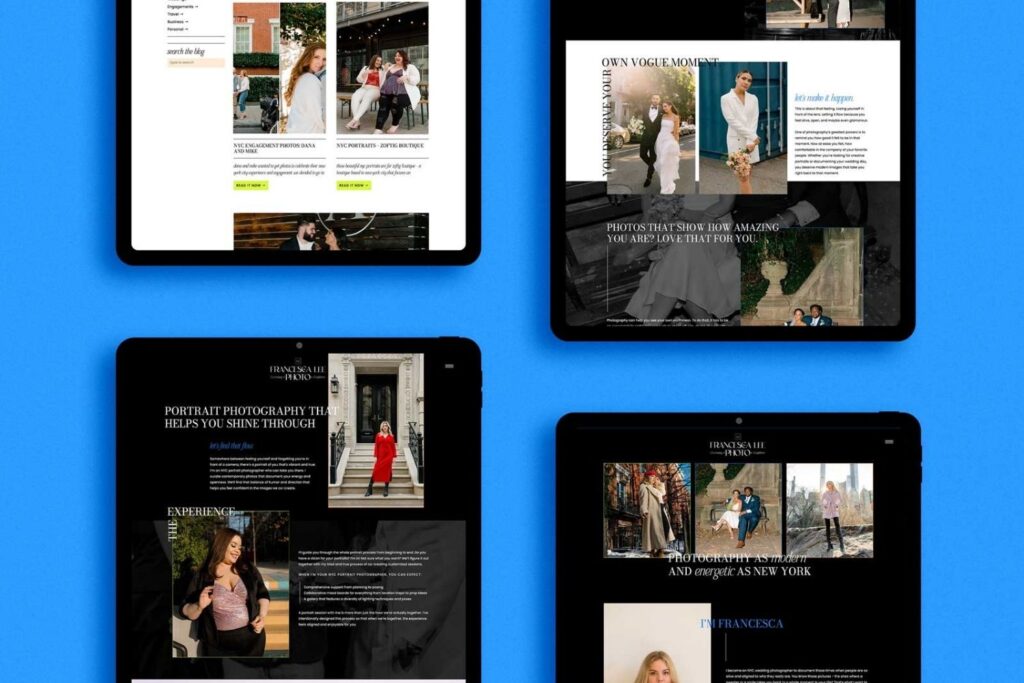
Linear elements add a touch of elegance while also playing on Francesca’s branding. On each page, lines are used in various areas such as borders and frames to help define different chunks of content and separate them from one another. This helps keep things organized while still being visually appealing.
The editorial design was inspired by fashion magazines and makes visitors feel like they’re reading the latest issue of Vogue or Cosmopolitan when they visit Francesca’s website. It’s most obvious when you check out the blog page, which is styled to look like your favorite editorial magazine.
One of our favorite parts of the design is the movement. We did this in a few ways, including creating a GIF version of her logo that switches between a few different colors of her logo. It creates a fun piece of movement from the second someone lands on the website.
We also did lots of parallax spots throughout the website to create a little bit of a background movement that wasn’t overwhelming. Images were layered on top to create a very elegant and upscale feeling. It’s also a bit unexpected as you scroll, providing a fun element that really stops the scroll and catches attention!
After developing the strategy, we put together a presentation to share with Francesca to get her feedback. This 15-page presentation went into detail about website inspiration, her main website goals, what we were going to do to help her stand out, and more. Needless to say, she loved it, so we designed the whole site and developed it… in just two weeks flat.
Keep reading to learn more about the final results and see what Francesca had to say.
Final Results of This Luxe Website Design
Obviously, we were absolutely thrilled with how this luxe website design for Francesca Lee Photography turned out! It’s one of our favorites still to this day. However, we were ecstatic that Francesca loves it, too.
Here’s what she had to say:
“I can’t even put into words how much I love it! It’s exactly what I wanted but also somehow so much more.”
If you’re looking for a brand new custom website for your own business on Showit, be sure to get in touch. We’d love to create a custom strategy for you and build a website that is perfect for your brand!
Check these out next:
- Photography Website Tips: How to Stand Out Online as a Photographer
- 13 Boundary-Pushing Modern Photography Websites
- Vibrant Web Design for a Retro Sacramento Photographer
KP’s design journey began in book publishing, but she fell in love with the truly limitless possibilities that web design presents. Since then, she’s been helping photographers and creatives become the no-brainer option for their dream clients before they even get on a call.
- How to Reset & Prepare for the New Year with Renée Dalo - February 15, 2024
- Building a Personal Brand as a Photographer with Maddie Peschong - February 15, 2024
- How to Make Your Website Stand Out: 5 Best Tips - January 25, 2024
9/09/23
Published On:
Krystianna Pietrzak
 (1)")