If you’re looking for web design for wedding professionals, you’re in the right place! Whether you’re looking for design inspiration or you’re a photographer, florist, or other type of wedding professional yourself, you’ll truly love seeing the variety in these sites.
As Showit web designers, we’ve designed countless websites for web design for wedding professionals, ranging from photographers to event planners. With this post, we aim to show you that websites for this industry can truly vary from editorial luxe to colorful and retro!
Take a peek at past websites we’ve designed for those in the wedding industry below.
Elopements & Destination Weddings Website for Emily Kyle Photography
Service: Custom Website Design
Industry: Photographer (elopements and destination weddings)
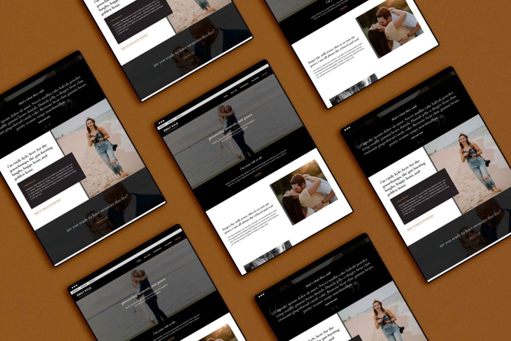
First is this gorgeous website created for Emily Kyle Photography. The face behind this great business, Emily, is a Detroit-based photographer who focuses mainly on destination weddings and elopement photography.
Her website has a very sleek yet editorial look, using fun interactions, italicized text for emphasis, and small lines to add a touch of elegance. We took Emily’s website from looking like a template (she was on Squarespace) to something that looks truly custom after we moved her to Showit.
The end result was a website unlike any others out there, with a moody vibe that helps put the focus on her incredible imagery.
Luxury Wedding Photographer Website for K Engel Photography
Service: Custom Website Design
Industry: Photographer
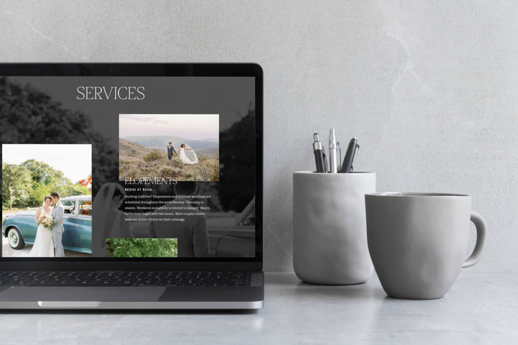
Next is another web design for wedding professionals created for K Engel Photography! Kendra, the photographer behind this great business, is a Boston-area wedding photographer who wanted an elevated and luxurious vibe to her website.
She was initially on WordPress with FloThemes and was ready for a change. After discussing the amazing pros of the Showit platform, she was sold, and we created her site a month later. This website features lots of parallax imagery, unique overlapping with text, and an overall clean yet opulent aesthetic.
Needless to say, we are obsessed with how this website turned out, and so is Kendra.
Nature-Inspired Web Design for Mei Lin Barral Photography
Service: Custom Website Design
Industry: Photographer
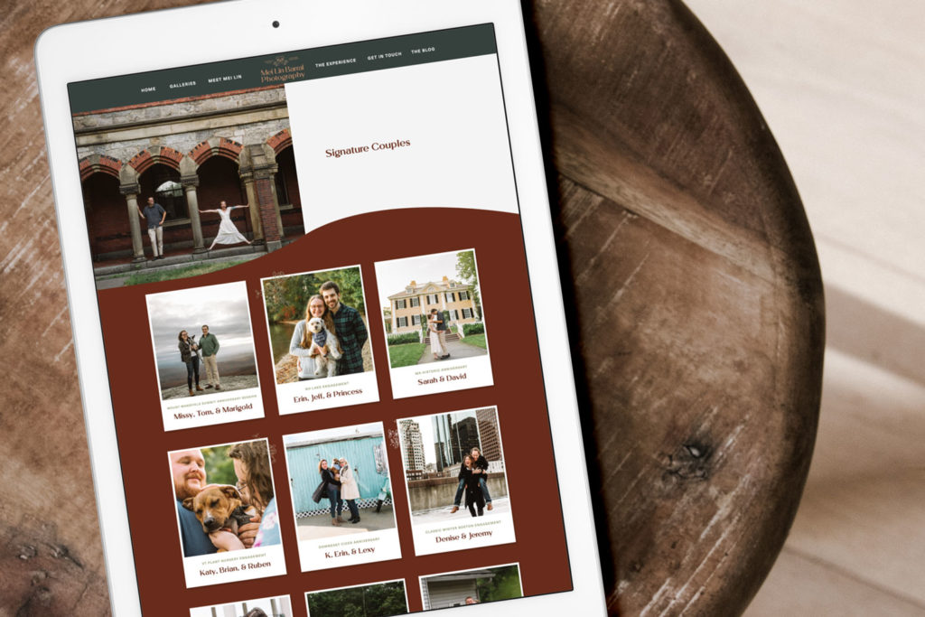
Nature comes to life with this beautiful site created for Mei Lin Barral Photography! As a photographer for couples and their four-legged friends, it was important to create a website that truly felt welcoming for Mei Lin.
We started with creating Mei Lin’s branding and really drew inspiration from her imagery to keep everything cohesive. Then, when designing the site, we added fun features including polaroid-like imagery, funky waves, and tons of hover effects. It almost feels like a scrapbook!
Colorful & Inclusive Site for Max Catterson Photography
Service: Custom Website Design
Industry: Photographer
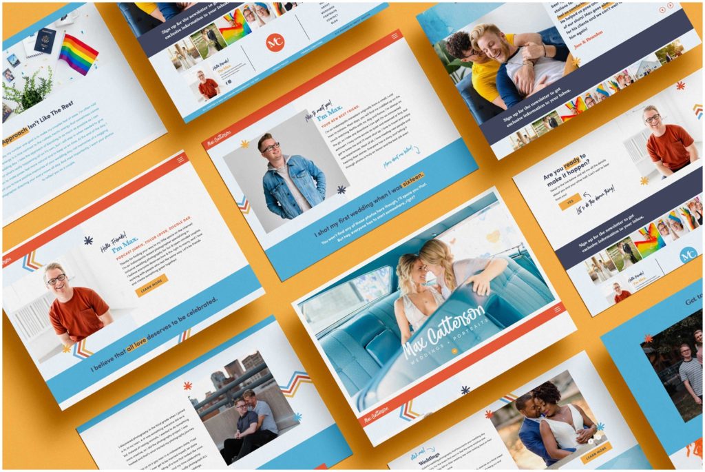
If you can’t tell already, at Inkpot Creative, we love collaborating with clients who put inclusivity above all else. Well, Max Catterson does just that with his photography business, and we are absolutely obsessed with how unique his website turned out!
The site has a heavy focus on his imagery while also adding funky little touches throughout, like a zigzag design, handwritten font (which makes it look like he wrote on his pages to guide the user), and fun interactivity to keep the user clicking.
The result is one website a visitor will never want to leave!
Quirky Event Planner Website Design for K. Cutright Wedding Coordination + Design
Service: Custom Website Design
Industry: Wedding/Event Planning
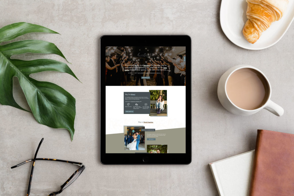
Even though we tend to create websites for lots of wedding photographers, we’ve created quirky sites for wedding planners too! Just take this one designed for K Cutright Weddings. We moved Kelsey from Squarespace over to Showit to create this masterpiece.
What makes this website so fun is that it’s very different from other wedding planner websites. Even though you can’t tell in the image above, there’s actually a funky background or two used throughout the site that’s super subtle! (Hint: one of them is of an astronaut holding a coffee!)
To make this site special, we used lots of overlapping effects, diagonals, interactive canvases, and a wave to really break up the blockiness of her old site on Squarespace. The result is magical!
Colorful Luxury Site for Sara Bishop Photography
Service: Custom Website Design
Industry: Photographer
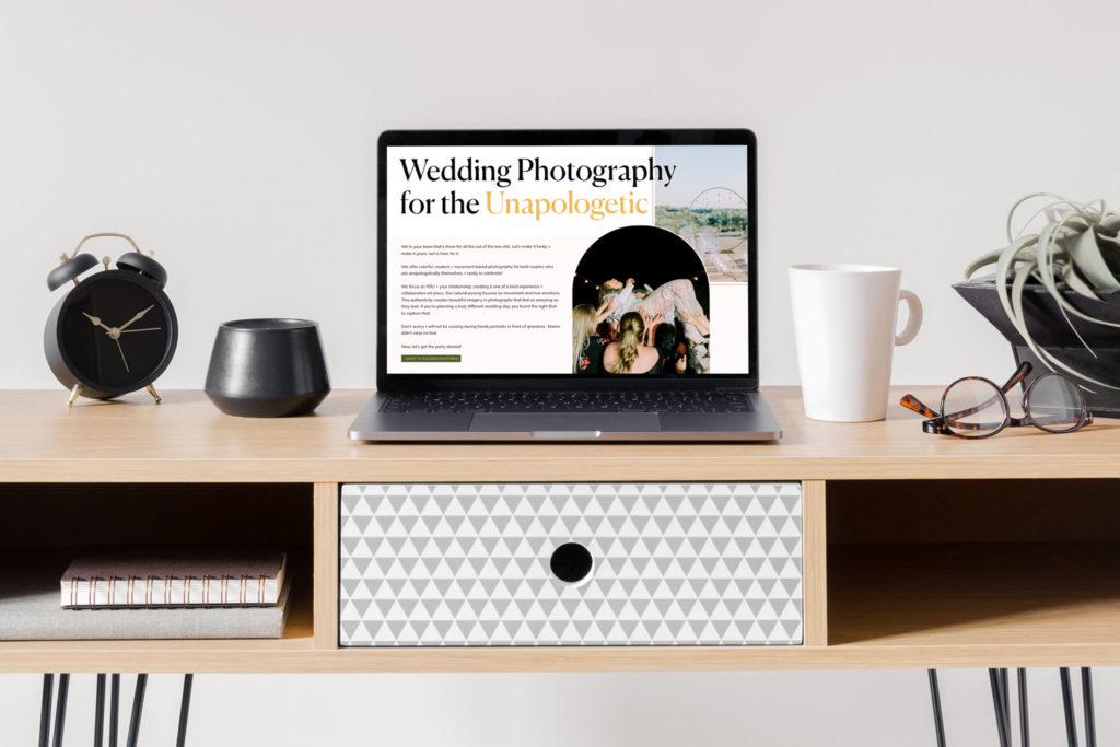
When it comes to web design for wedding professionals, this one created for Sara Bishop Photography is truly top of the pack. Not only did we do Sara’s branding, but we also redesigned her entire site and moved her from Squarespace to Showit.
What makes this website so different compared to other web designs for those in her industry is that it features super funky shapes and lots of color. The typography is also hella bold, drawing the user’s eye with specific words called out in a different color from the rest of the text.
’70’s Inspired Rock and Roll Website for Eilish Bailey Photography
Service: One Day Website
Industry: Photographer
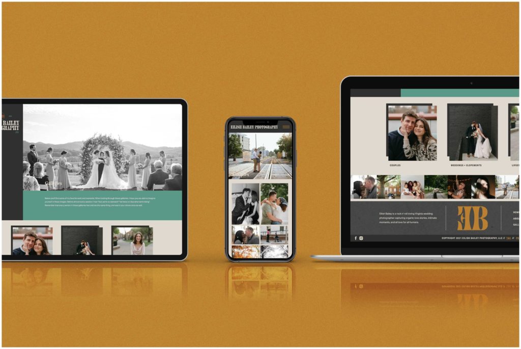
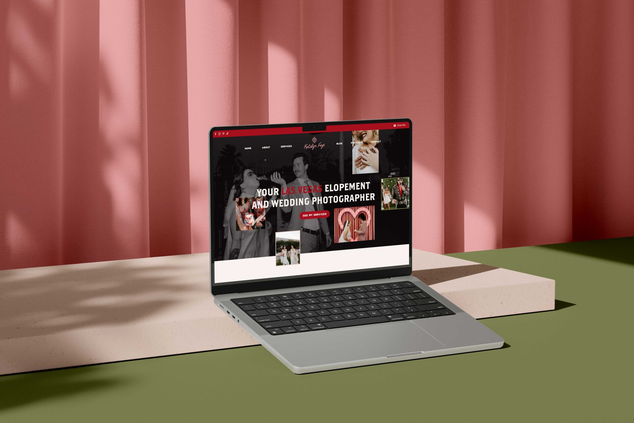
When it comes to ’70’s-inspired web design for wedding professionals, Eilish’s site takes the cake. Based on our Casey website template, this website was created in just one day during our VIP service. Plus, we also designed Eilish’s branding beforehand!
Even though it’s based on a template, we took the time to make sure Eilish’s website showcased exactly what her style was. The result actually increased her inquiry to booking conversion rates. Now that’s the power of strong and strategic design!
Calming Boho Design for Viceth Vong Photography
Service: Custom Website Design
Industry: Photographer

Even though color is right up our alley, we also love a boho and neutral moment for websites, especially when it matches a creative’s style. With this site for Viceth Vong, it made complete sense to use warm, neutral colors with a few dark tones to complement his photography!
The final result for Viceth’s site has boho elements with fun arches and collages throughout. It also has fun transitions, so as someone is scrolling through the website on desktop, they’re able to really stay visually interested which will keep them scrolling.
Retro and Funky Website for Kylee B Photography
Service: Custom Website Design
Industry: Photographer
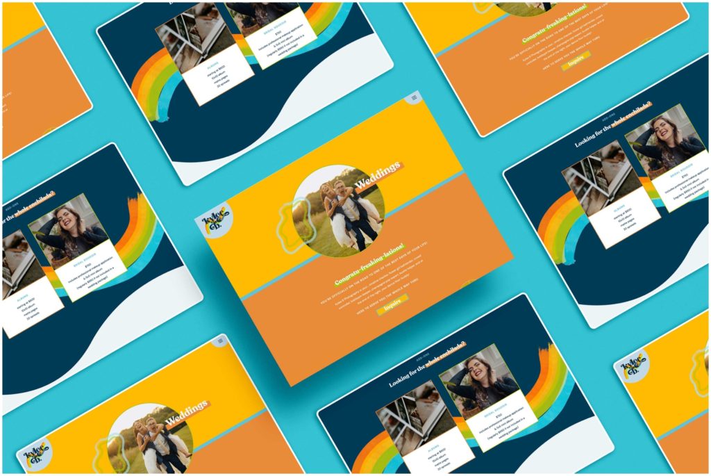
One of our favorites for web design for wedding professionals is this truly retro yet fun site for Kylee B Photography. This is one of the most unique wedding photographer websites out there, with its bright color palette, bold image outlines, and fun use of shapes.
Throughout the site, lots of movement was added in with gallery features, a gif logo (one of our personal touches!), and of course, a fun wave element to help break up the blockiness of regular websites. Our goal with this was to truly showcase the fun photography style that Kylee has while also helping her to attract those dream clients!
Playful Website for Shifted Focus Photography
Service: Custom Website Design
Industry: Photographer
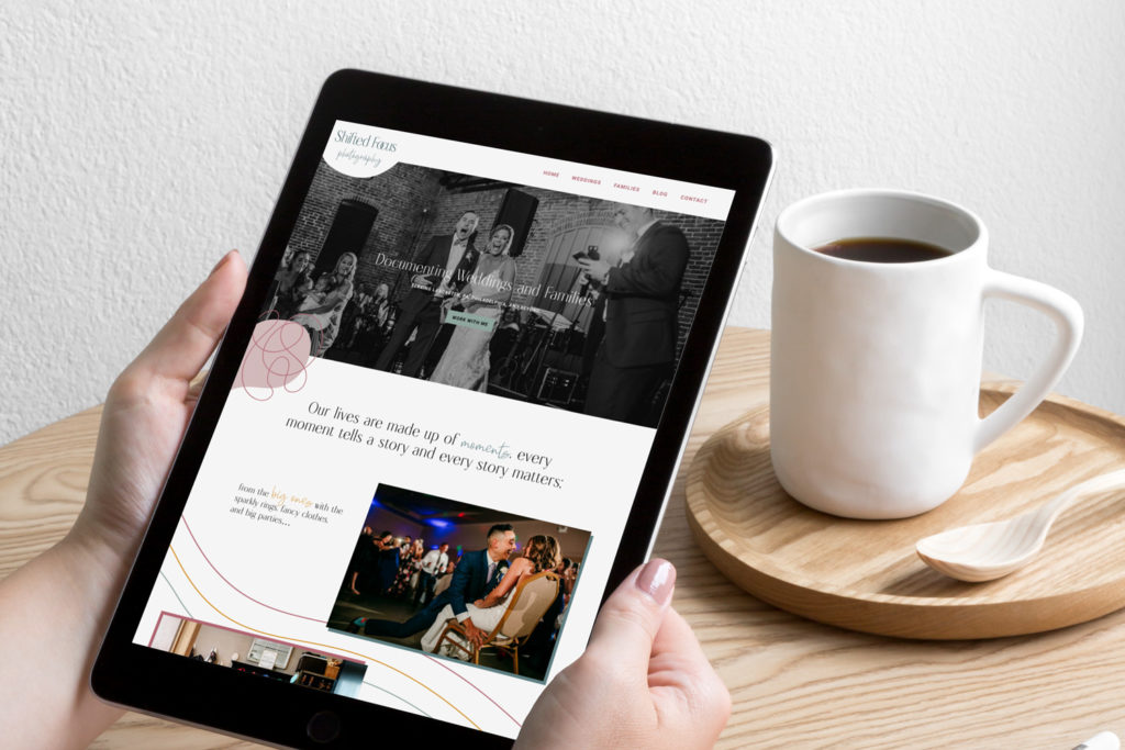
This website for Shifted Focus Photography is yet another example that you can be a wedding photographer and still have some fun with your website. When it comes to web design for wedding professionals, it’s okay to stand out from the crowd!
With Mel’s site, we used tons of galleries for interactivity, created a gif logo, and even used fun wavy lines to help draw the user’s eye down the page to lead them from section to section. We also used lots of color blocks to help the photos have some edge.
Unique Website for Shel Francis Creative
Service: Custom Website Design
Industry: Photographer
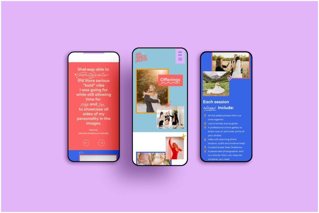
Did somebody say color!? This website designed for Shel Francis Creative is truly unlike any other wedding photography websites out there. It features tons of image collages, bright and bold colors, and thick borders to make a statement.
Throughout the website, tons of small touches were added, like hand-drawn elements from her branding and a script font to help call out specific pieces of text to draw the user’s eye. Lots of galleries were used to add a touch of movement throughout the website, too.
This post was all about the best web design for wedding professionals. Did you love this inspiration? Then we may be a great fit! Get in touch with us; we’d love to discuss your project.
Keep the party going:
- 13 Wedding Photography Websites That Will WOW You!
- Luxury Website Design for a Boston Wedding Photographer
- What is Showit? Here’s Everything You Need to Know - March 25, 2025
- 4 Biggest Keyword Research Mistakes Photographers Make (and How to Fix Them) - January 16, 2025
- How to Repurpose Blog Posts to Maximize Your Content - January 16, 2025
7/26/22
Published On:
Krystianna Pietrzak
