
If you’re looking for wedding photography websites, you’re in the right place! This post was made just for you, whether you’re looking for inspiration or you’re eying our services and want to see some of our past work.
At Inkpot Creative, we tend to work with a lot of wedding photographers. We love working with them because they do something so special: they capture the best moments of one of the most fun days of people’s lives. Plus, we are incredibly lucky to work with hella inclusive wedding photographers too, which is very in line with our mission, especially as a queer-run Showit web design studio.
A lot of the clients we work with are different, too. We don’t just say that; as you peek through these photos, you’ll see what I mean. From edgy wedding photographers to true-to-life ones, we’ve worked with a wide variety of styles!
So, what are you waiting for? Here are some beautiful wedding photography websites that will knock your socks off!
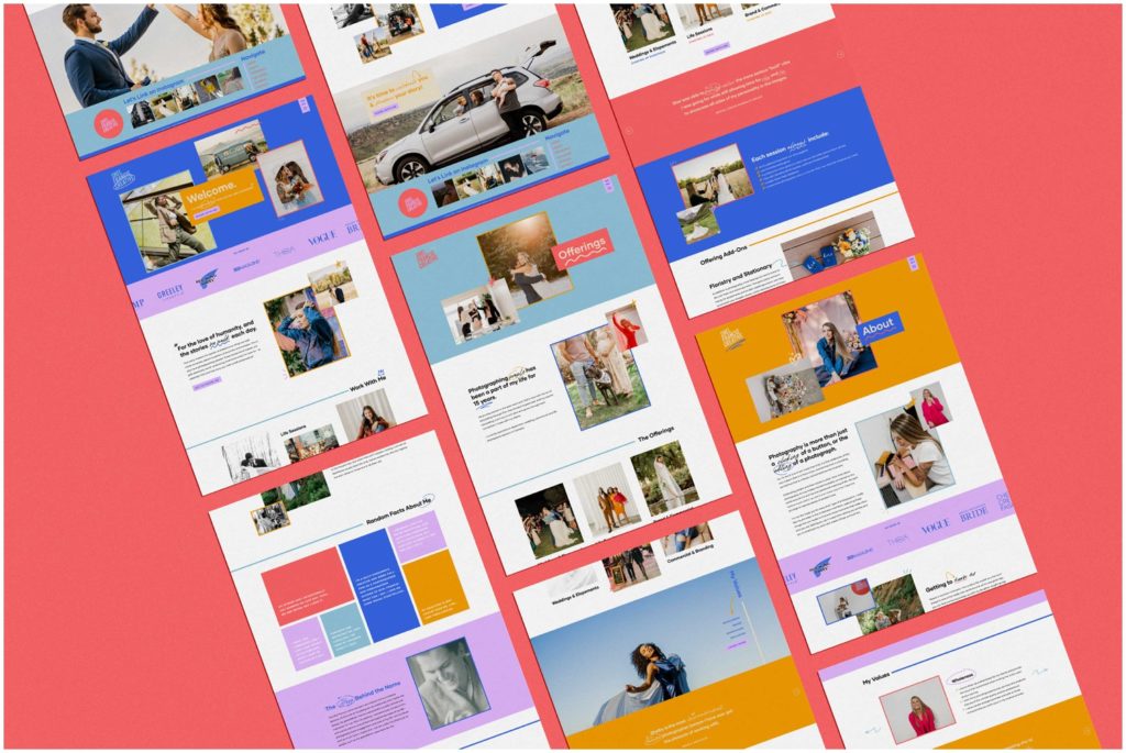
True Love Photo
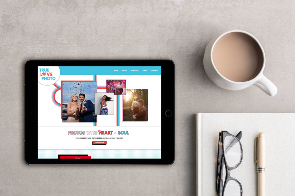
First on this list of wedding photography websites is this fun, retro-inspired website for True Love Photo. This amazing photography business is run by Beth, who is based in Sacramento, California. She wanted a site that felt more fluid and cohesive, and that’s exactly what we did!
Throughout this website, find fun photo pop outlines, pop-art-inspired typography, and even buttons that look 3D. Plus, there’s a unique line design that goes throughout the site, leading your eye from piece to piece. An abundance of halftones are also placed throughout the website as well.
Jannatul Pramanik Photography
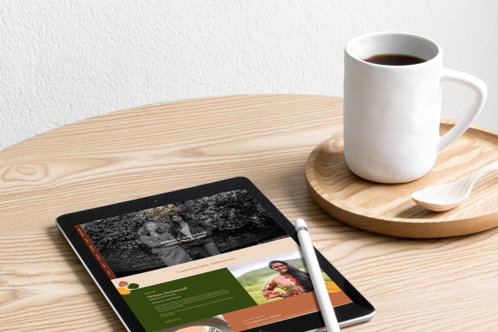
The earthy website for Jannatul Pramanik Photography was created during our One Day Website service. Essentially, we take a template from our shop (in this instance, it was Santana) and completely transform it over the course of a day. The finished version was just about unrecognizable.
We also did Jannatul’s branding, and we are obsessed with how it turned out. This website has lots of earthy tones, fun line drawings, and pieces of movement to keep the viewer interested on their scroll. Plus, it’s so cohesive!
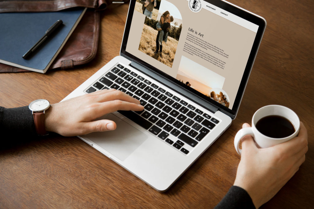
Mei Lin Barral Photography
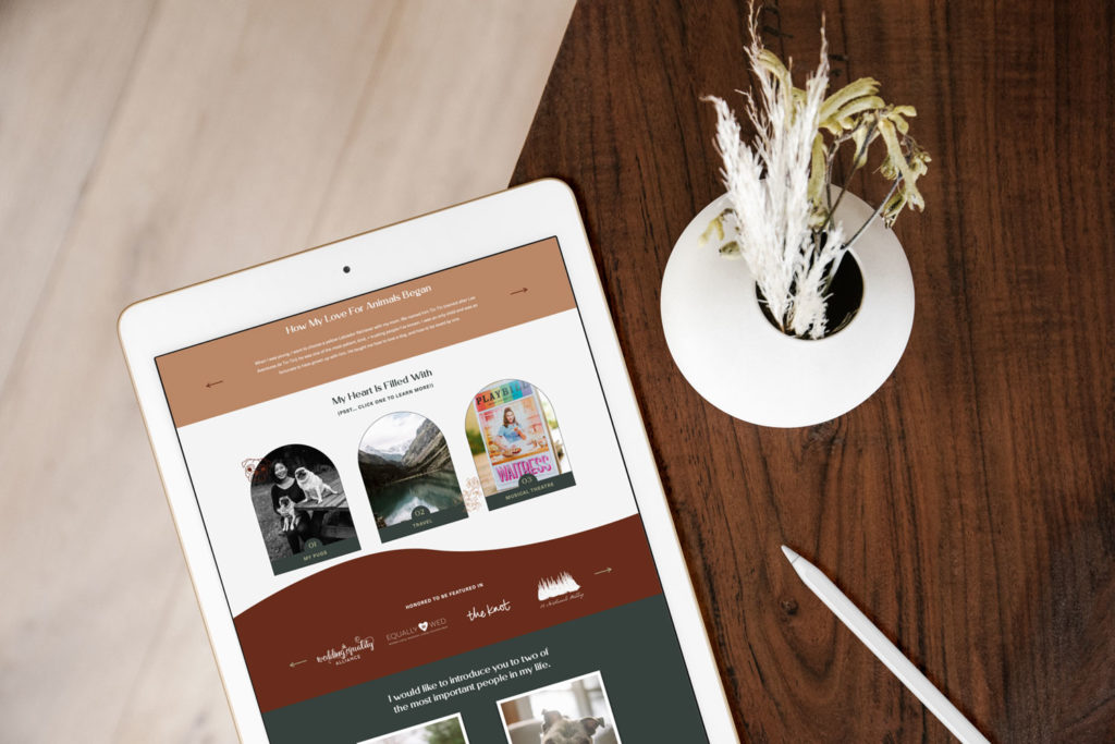
Another of the earthy wedding photography websites we’ve created is this one for Mei Lin Barral Photography. Mei Lin has a very naturalistic style with lots of earthy tones, so we brought that to life with her branding and then her website.
The final result includes lots of fluidity (like the wave above, so it’s not so block-like), arches, and little drawings to add some personality. Everything is incredibly cohesive, yet it’s very different than other wedding photographer websites.
Amanda Luisa Photography
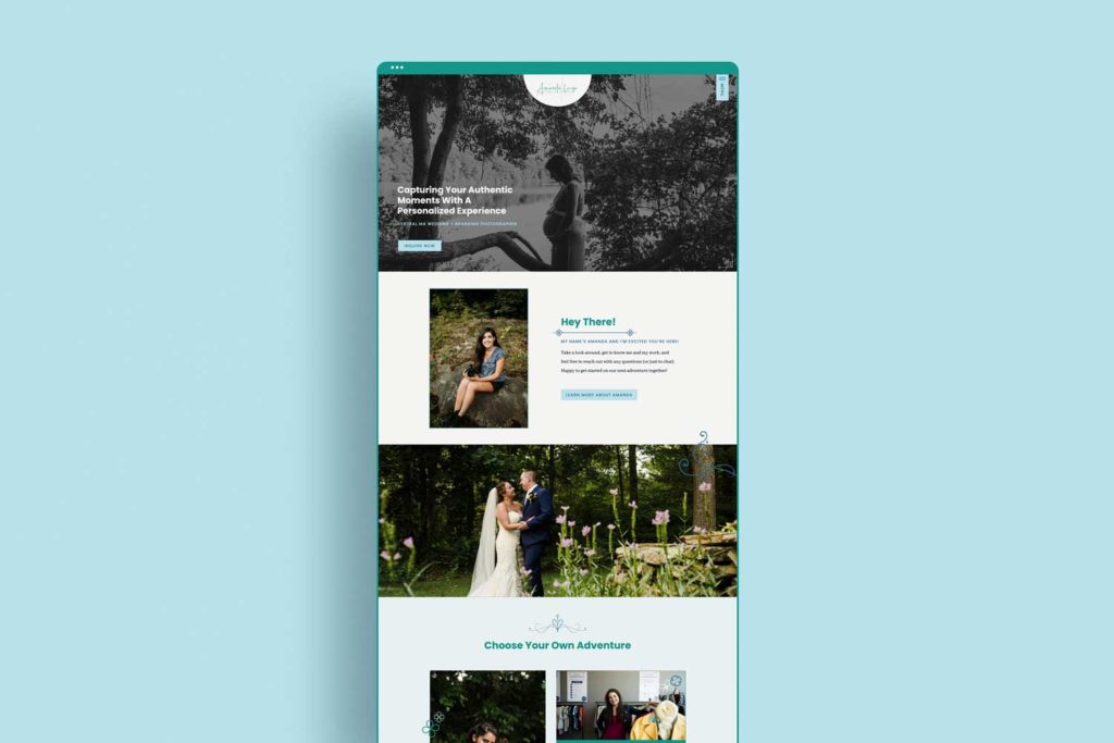
This beautiful site for Amanda Luisa Photography was also created during a One Day Website. Based in Oxford, Amanda was looking to level up her website presence and chose our popular Santana template, which is the same one Jannatul chose. As you can see, it looks super different!
This website has fun little delicate features throughout and also lots of movement. We utilized the gallery feature in Showit, so as you scroll, many of the images change the longer you look at them. This helps to keep a user interested in the website, so they don’t click away.
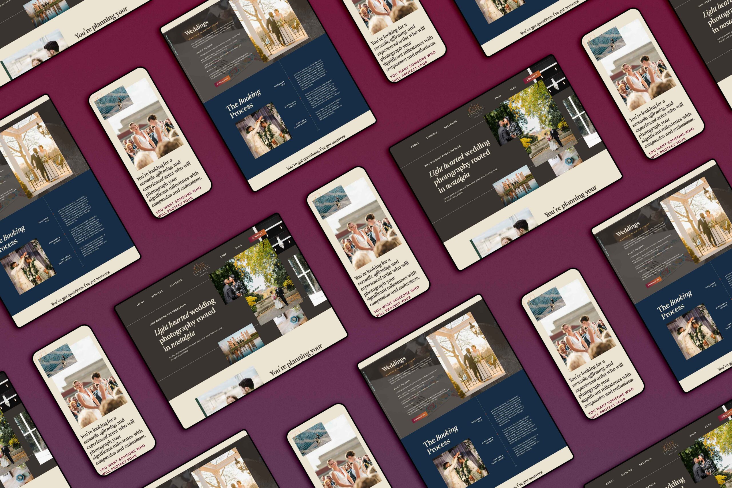
Kylee B Photography
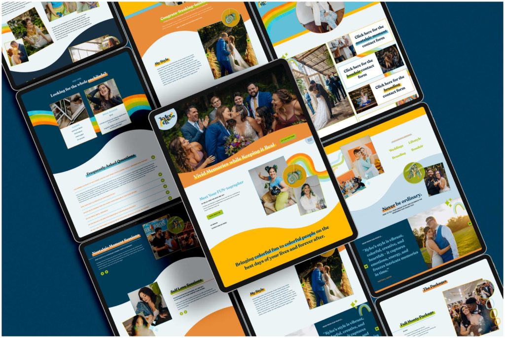
If you follow us on social media, then you know that we rave about Kylee’s site a lot. That’s because not only is it super fun and retro, but it’s one of our favorite sites we’ve ever created. I mean, just look at it! With fun wave features, unique text call-outs, and sections that almost feel like your old high school journal, this site is nostalgia to the max.
This site gets a lot of love and for good reason. It’s so different from other wedding photography websites and really helps to attract the fun couples that Kylee wants to work with. Plus, it’s very image-driven, allowing Kylee to show off her incredible work.
Click here to learn more about Kylee’s site!
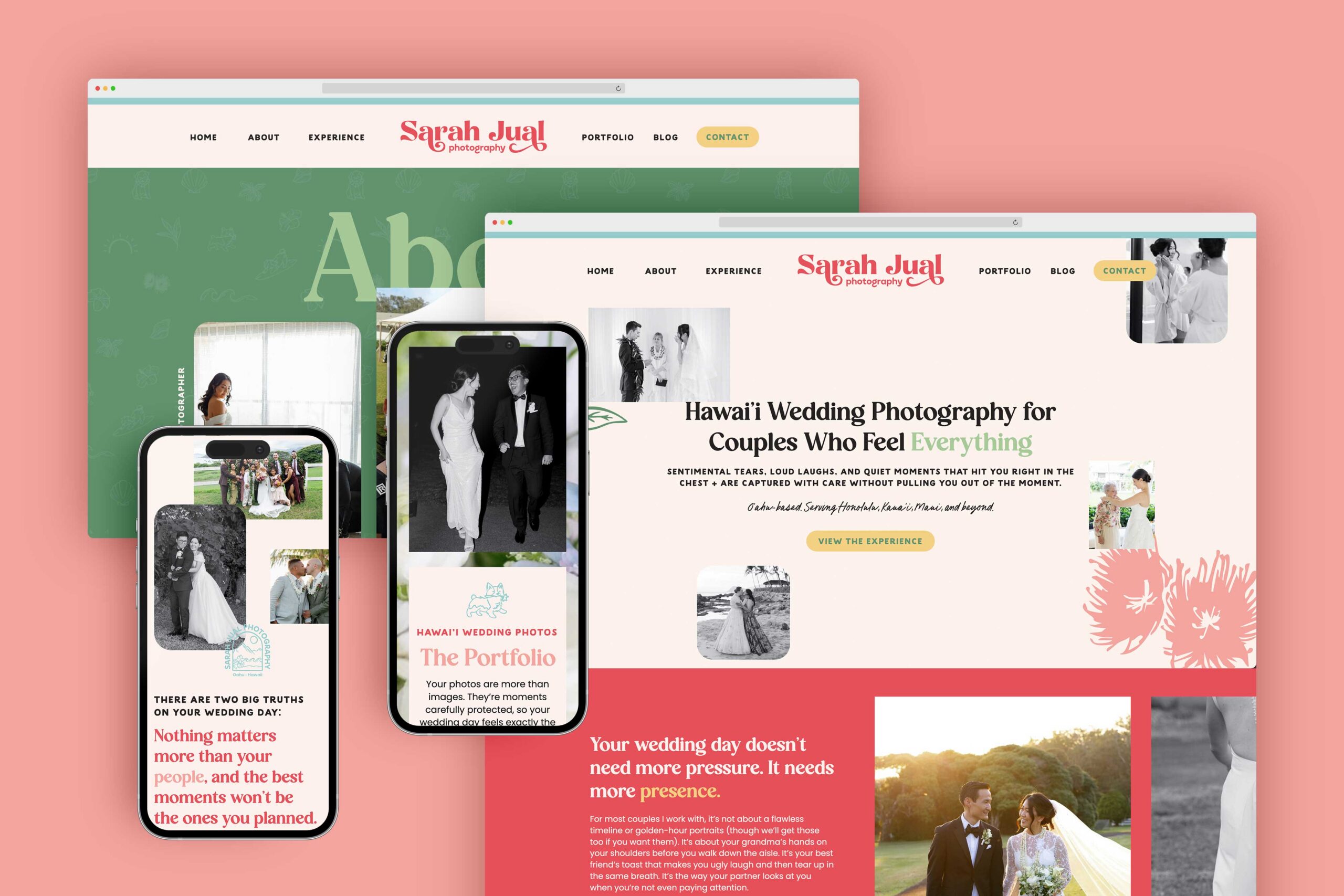
Sara Bishop Photography
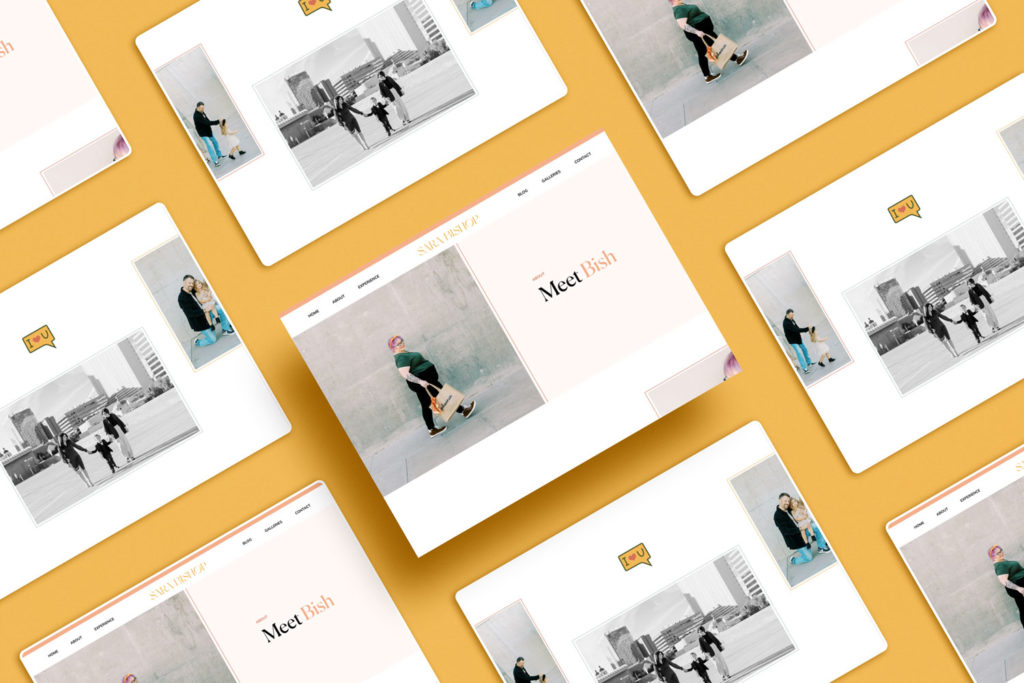
When we first connected, Bish was on Squarespace and wanted to truly elevate her site. So, we moved her to Showit, completely redid her branding, and started over from scratch. The end result sums up her work perfectly; it’s quirky with fun gifs but also screams elegance.
This comes to live throughout Bish’s site with small line elements, bold text with color pops, and lots of color. Some arch shapes are also added throughout the website to add touches of uniqueness. All in all, this site feels like a vacation and is super different from other websites for wedding photographers.
Click here to learn more about Bish’s site!
Emily Kyle Photography
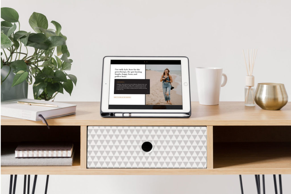
Based in Michigan, Emily was another client of ours who was on Squarespace, but we ended up moving her to Showit so she could basically separate the parts of her business. Her site now consists of a section just for weddings and another just for branding/lifestyle.
This website has a lot of elegant touches that make it feel comforting yet also showcases her beautiful photography style. There are lots of thin lines that guide the eye as you scroll as well as parallax backgrounds and other forms of movement to allow you to focus on her work truly.
Click here to learn more about Emily’s site!
Max Catterson Photography
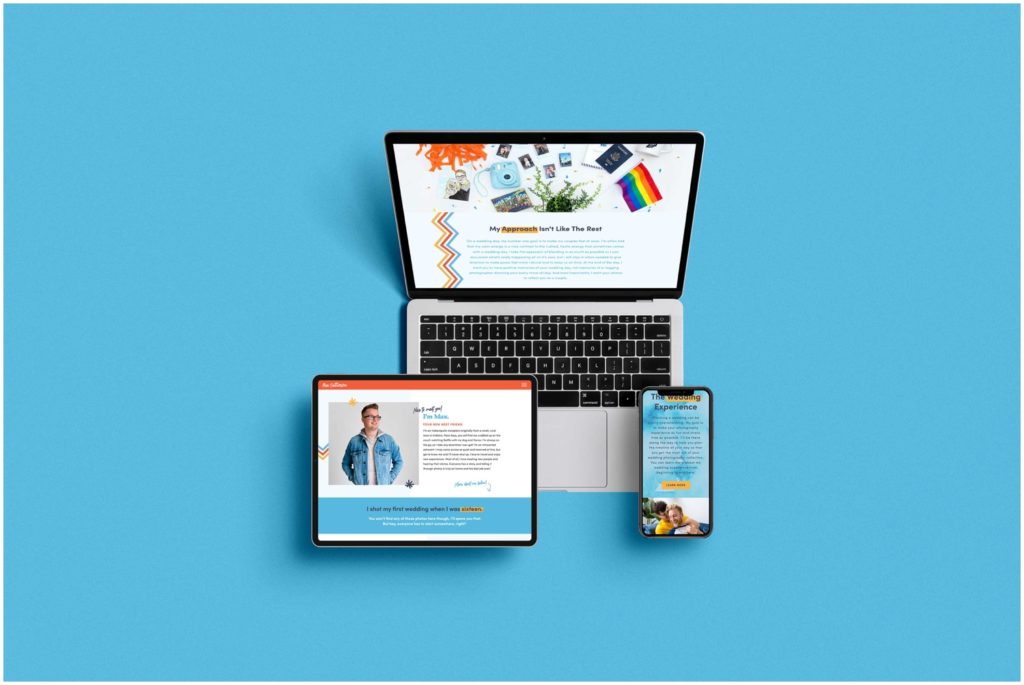
One of the first wedding photography websites we ever designed was for the incredible Max Catterson Photography. Based in Indianapolis, Max is extremely inclusive with his business, so our values were very aligned. He wanted a site that truly showcased his style.
The result was a website that’s hella colorful and funky! We designed fun little stars to go throughout the website as well as zig zags to guide the eye. We also used lots of highlighting to showcase important pieces of text and made it look like he wrote on the screen with a fun accent font.
Click here to learn more about Max’s site!
K Engel Photography
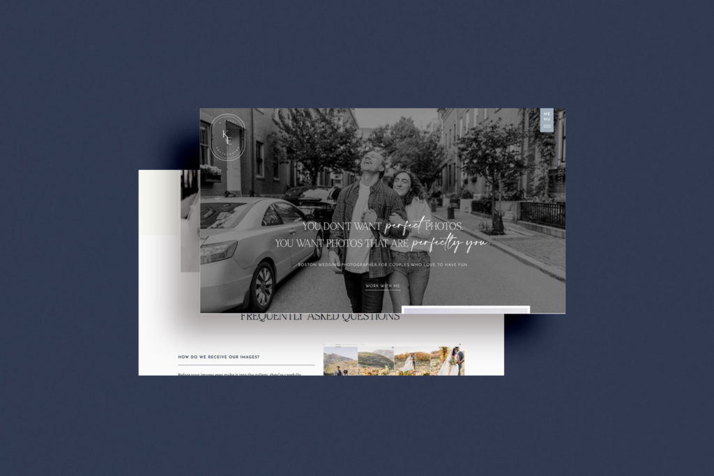
Luxury and elegance are the words that come to mind when thinking of the Boston-based photographer K Engel Photography! This website uses colors reminiscent of Cape Cod; think the colors of the sandy beaches of your dreams.
The site features lots of luxury elements, with a call-out script font, lines to help guide the eye throughout the website, and layering photo effects that add a unique touch of movement. The result is one site that will speak directly to Kendra’s target audience.
Learn more about Kendra’s site here!
Viceth Vong Photography
Viceth’s boho website is truly a calming experience to visit. His color palette was revamped and we used lots of the colors that you can find in his San Francisco photos; think dark blues and sandy tones. This allowed the focus to truly be on his work.
As you scroll through his website, you’ll get touches of movement that you didn’t expect. So, photos fly in from each side of the screen, there’s some parallax imagery, etc. Overall, the site is super simple, but clean design is the most effective.
Shel Francis Creative
When it comes to color, Shelby’s site takes the cake. Shel Francis Creative had just had her branding done by an incredible brand designer and was ready to bring it to life with a super colorful website to match, so we were the perfect fit.
She was already on Showit, so we knew we could do absolutely anything we wanted. Throughout the website, there are lots of layering effects, fun image borders, parallax image backgrounds, and handwritten effects that make this website stand out amongst other Colorado photographers in the wedding industry.
Click here to learn more about Shelby’s site!
Shifted Focus Photography
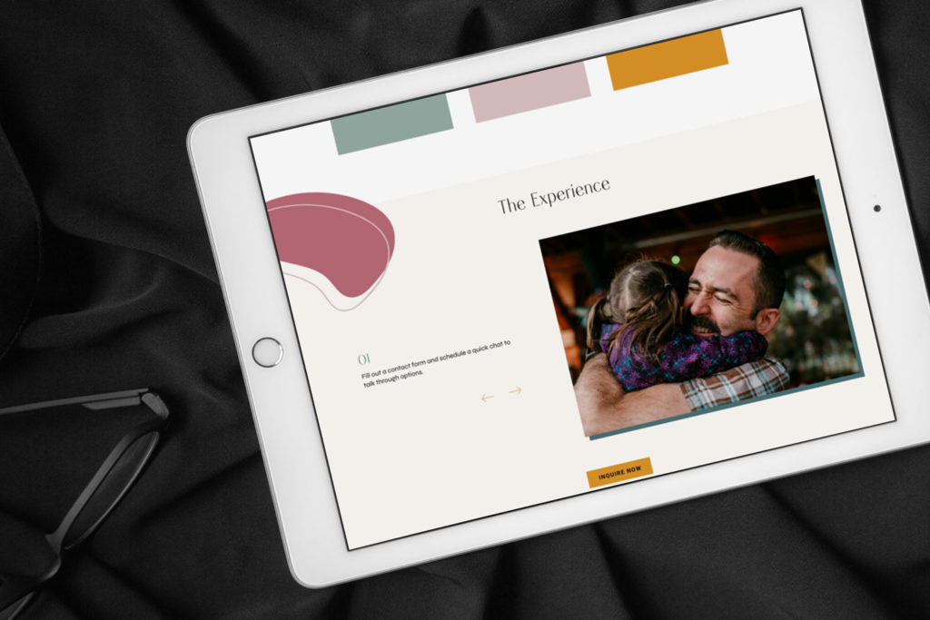
Mel is a family and wedding photographer who wanted a site revamp to help showcase both sides of her business. It can be hard to combine both of these into one design, but we nailed it! We started by redoing her branding; the logo is reminiscent of weddings, while the colors are very similar to the true to live tones she brings out in her photos.
After the branding, we got to work on the website. We added lots of interactivity like the canvas section above, which allows the user to interact on the page to learn more information. There are also fun image pop effects, parallax backgrounds, and organic shapes.
Eilish Bailey Photography
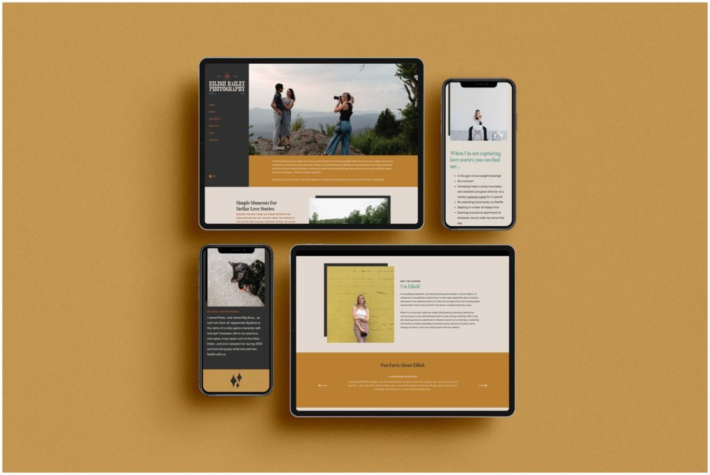
Last but certainly not least is a rock n’ roll website created for Eilish Bailey Photography. This one was also created during our fun One Day Website, but she chose to have our Casey template customized. Before we even started customizing, we revamped her branding too, so it was more in line with her edgy style and personality.
In the end, the website helped her increase her inquiry to booking rate, which is what we love to hear from our clients. Throughout the site, we added grainy textures, interactive canvases, parallax backgrounds, and some galleries to showcase her work.
Hopefully, you enjoyed this post all about wedding photography websites. If you’re a wedding photographer interested in getting your site revamped, we’d love to help. Get in touch here!
Keep the party going:
8/25/22
Published On:
Krystianna Pietrzak

 (1)")