As an entrepreneur, you’re always trying to stay ahead of the game. Showcase your business in the best way possible with a great website… using Showit is one of the easiest ways to do that. So, we’ve rounded up some of the BEST Showit websites.
From funky modern designs to minimal and sleek layouts, you will surely find something that will knock your socks off! Anything is truly possible on the Showit platform, which is why we mostly design in the platform for our services.
Keep reading to learn about the best Showit websites and get truly inspired!
Best Showit Websites
Justin McCallum Photography

Based in New York City, Justin is a talented photographer known for a vibrant and distinctive style. His photography is a unique fusion of editorial flair and documentary style, capturing moments with both creativity and authenticity.
This blend not only showcases Justin’s versatility but also adds a dynamic depth to his portfolio, appealing to a diverse audience.
The design of Justin’s website was crafted to mirror his lively and upscale persona! We focused on creating an engaging, bold, and high-end digital space that truly represents Justin’s artististry. The website’s layout encourages visitors to explore his work extensively, designed to entice them into reaching out.
The site features three key elements: vivid colors, branded aesthetics, and subtle animations. These elements work together to create a visually interesting experience, with colorful borders and strategic pops of color that align with Justin’s branding, ensuring a seamless and memorable user journey.
Susan Stripling Photography
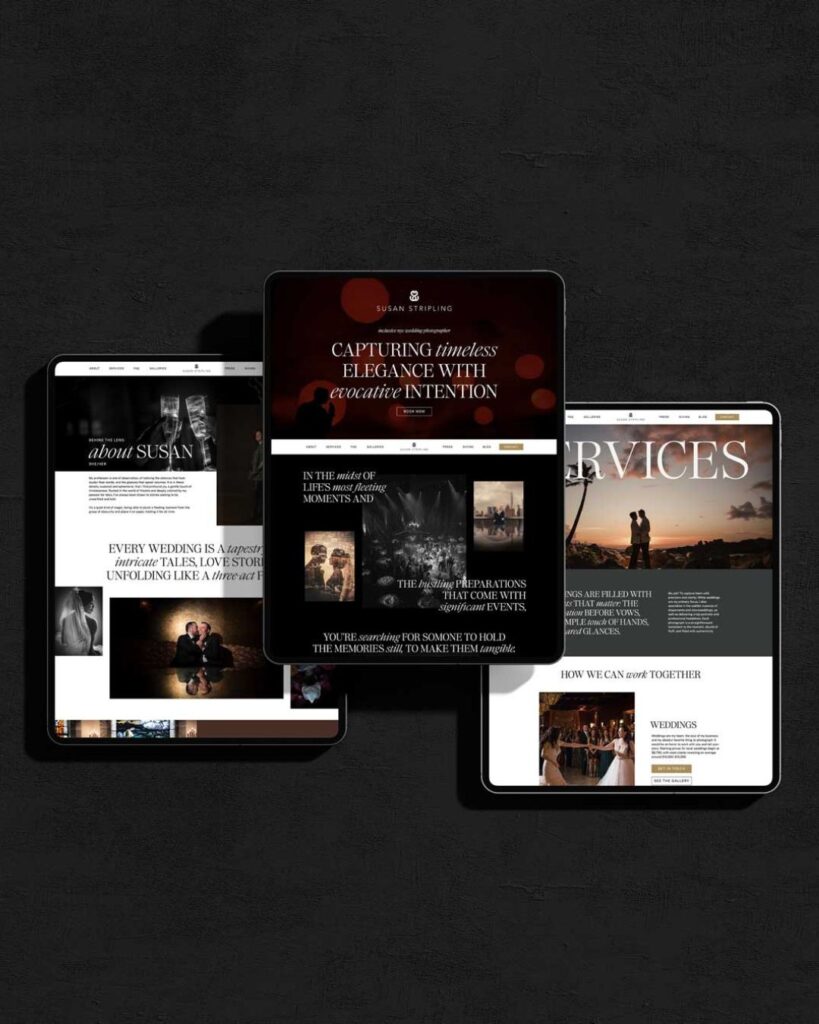
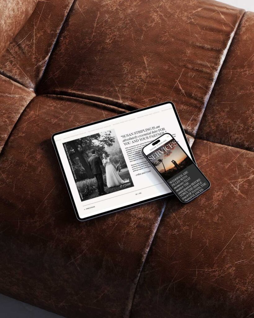
Based in NYC, Susan Stripling is an incredible luxury and high-end photographer who was ready to level up her website in fall 2023. She booked our Intentional Changemaker Experience, where we completely design a website, write 6 blog posts, and optimize the website for SEO in just 5 weeks.
The result is a website is elegant, theatrical, and dramatic. And of course, there’s a BIG focus on Susan’s incredible work. Large, sweeping typography is used throughout the website to bring a sense of elegance.
Hitched AF
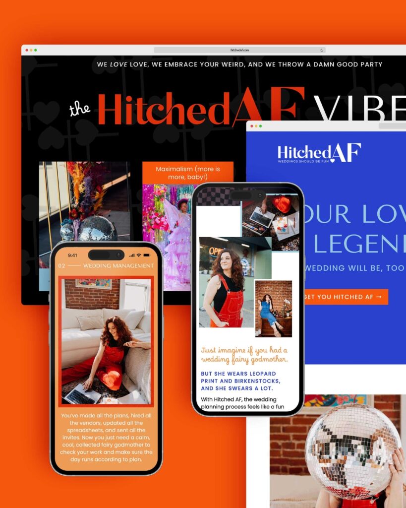
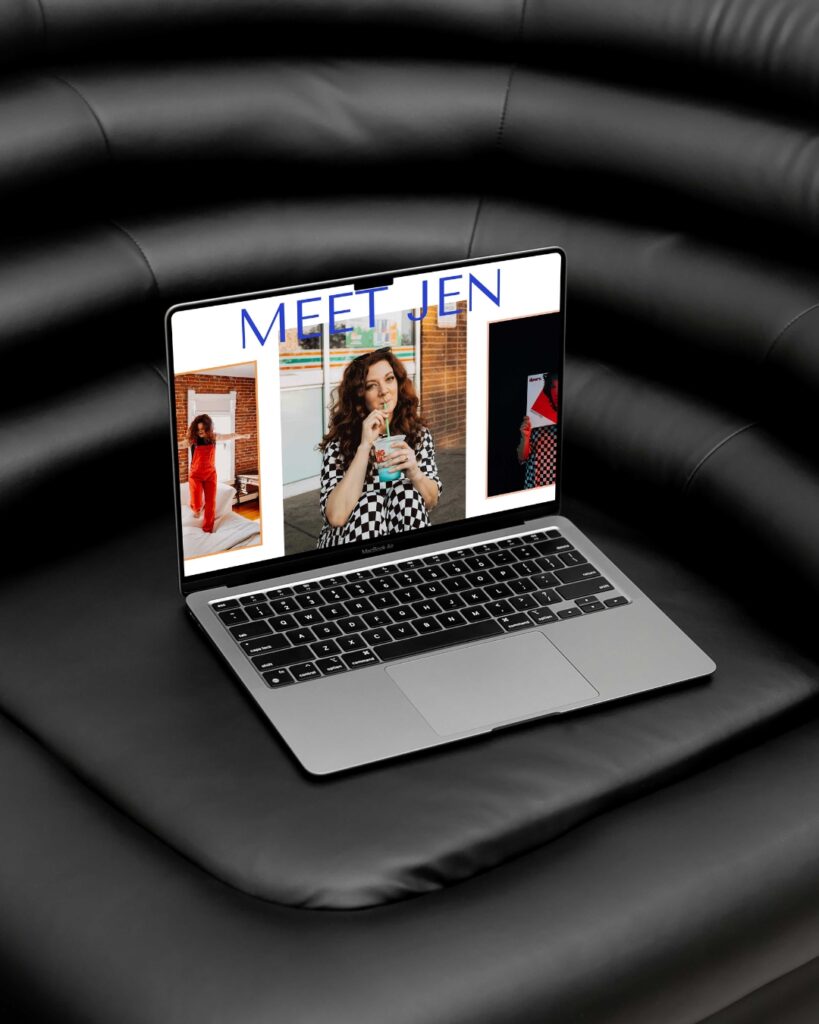
Hitched AF is run by Jen, a wedding planner based in Denver, Colorado. She also invested in our Intentional Changemaker Experience and we completely redesigned her website, moving her from Squarespace to Showit.
The new site has tons of movement through GIFs, videos, and scroll actions. Everything about the website is unique and showcases the experience that Jen provides to her couples.
Devon Rowland Photography
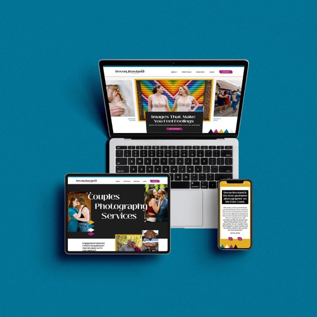
Devon, a vibrant photographer operating in Baltimore and DC, sought a website that reflected their unique style and attracted clients aligned with their creative vision. To meet this need, we provided our custom website design service, tailored specifically for Devon over a two-week period.
The focus was on creating a fun, colorful, and standout website. Special attention was paid to font and color choices, ensuring these elements resonated with Devon’s brand and aesthetic, setting the stage for a website that doesn’t just inform but captivates.
The website was crafted to make visitors feel seen and connected, an essential aspect of the design. The end result is a distinctive, engaging website that perfectly aligns with the aspirations and identities of Devon’s dream clients, ensuring a deep and meaningful connection from the first click!
Sukaina Rajabali Portfolio
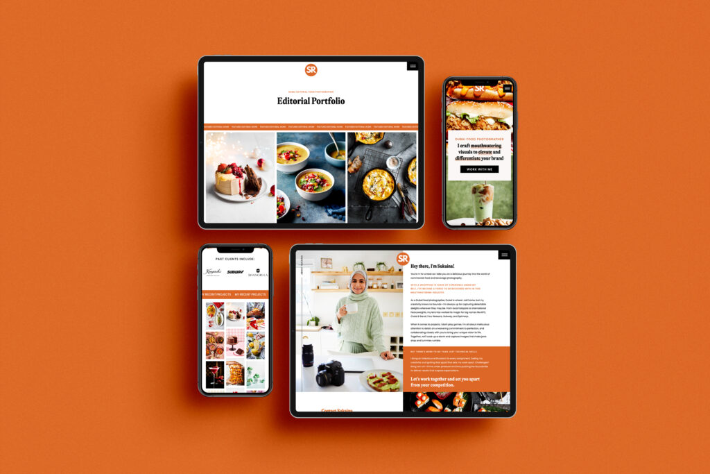
Sukaina Rajabali, a talented food photographer based in Dubai, partnered with us to create a stunning portfolio website that showcases her exceptional talent. We employed our semi-custom website design service, transforming the process into a week-long endeavor to meet Sukaina’s needs.
The chosen template, Antoni from our shop, known for its elegance, was meticulously customized to align seamlessly with Sukaina’s distinctive aesthetic and the remarkable quality of her work. The final website is a true reflection of Sukaina’s artistry, inviting viewers to immerse themselves in the visual feast of her photography portfolio.
The end result is a captivating online space that not only showcases her portfolio but also serves as an extension of the artistic expression found in her photography.
D. Hayman Photography
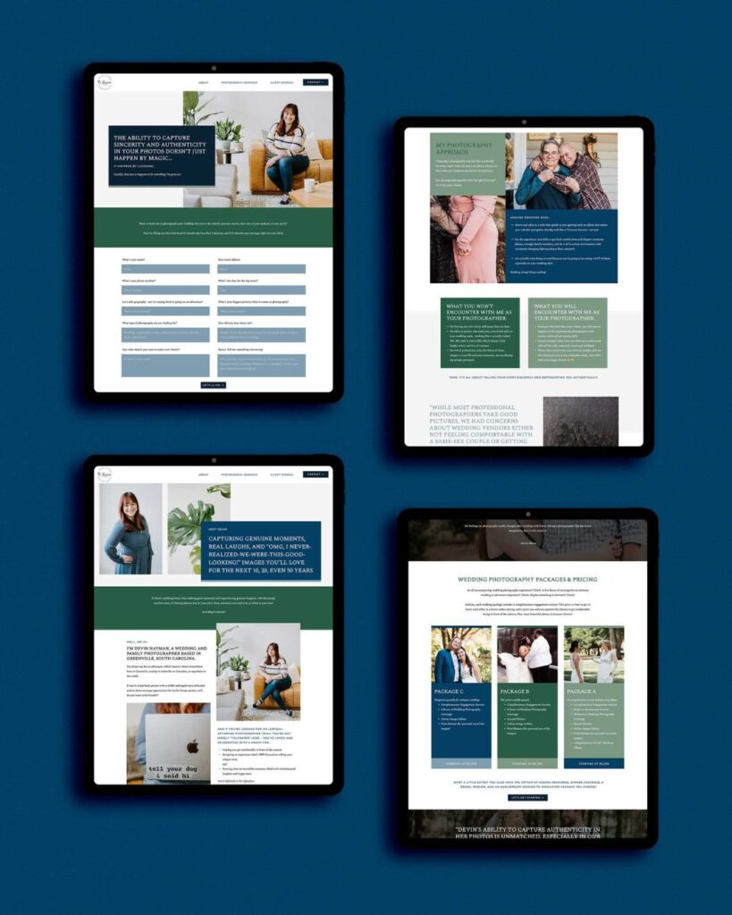
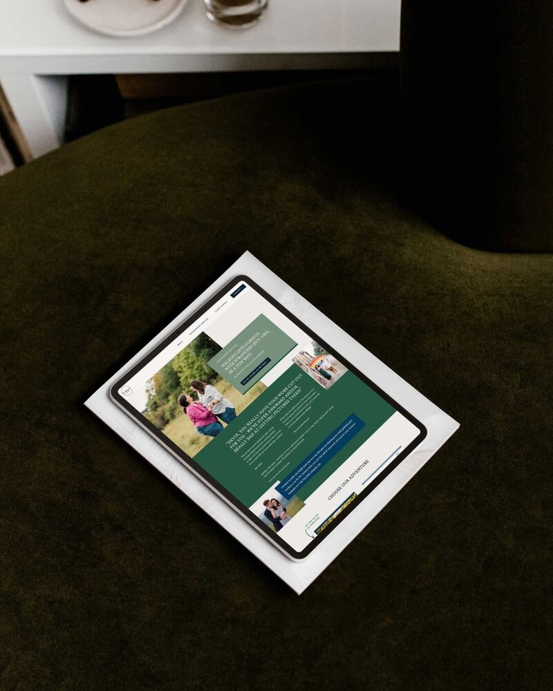
Devin of D. Hayman Photography, based in South Carolina, stands out as a trailblazer in the realm of photography with her focus on inclusivity and a distinct personality-driven approach.
Recognizing her unique position in the industry, particularly among Southern photographers, our collaboration aimed to craft a website that not only highlights her diverse portfolio of couples but also reflects her vibrant personality.
Our goal was to design a website that broke away from the typical ‘light and airy’ style prevalent in her are. By fully customizing our Santana template, we created a website for Devin that was bold and distinctly unique, setting her apart from her peers.
Liz Brindley
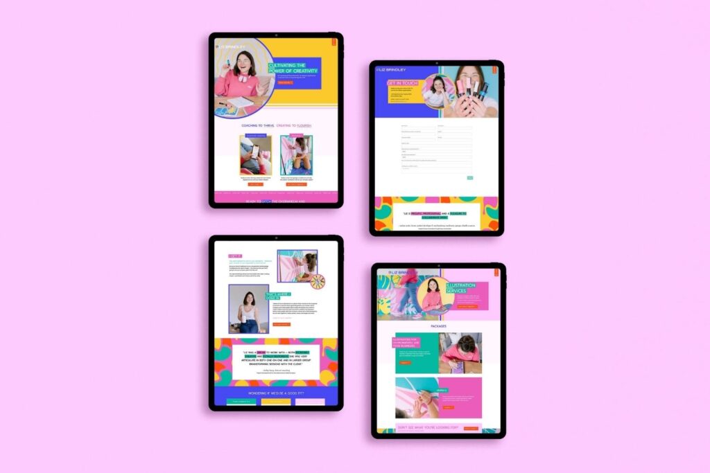
Liz Brindley (she/her) is an artist of a different kind. Formerly Prints & Plants, she’s come back to us with her new branding and mission in mind – to create a website that stands. With our help, Liz has been able to have something beautiful built that captures the essence of who she is and what services she offers.
Liz had a website that was built using solely a TONIC website template, so we created something unique! We helped her distinguish between illustration and coaching services with eye-catching colors of yellow/blue for one and pink/green for the other. Now, she has an exciting new look to wow customers!
One Bell Designs
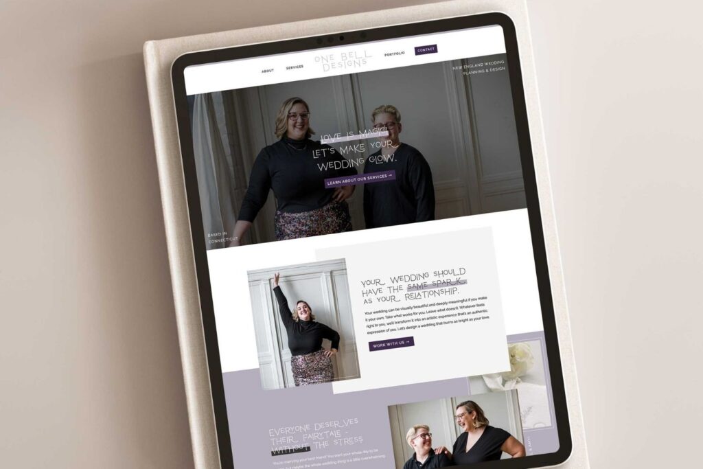
This is easily one of the best Showit websites we’ve created! Rachel and Amy, founders of One Bell Designs wedding planning company, had a dream to upgrade their website.
With the help of the Charlie Showit Template, we were able to make that vision become a reality! This dynamic duo is ready for even more success as its site is built with room for growth and expansion into the future (and beyond).
Rachel and Amy were eager to get a website up and running, so they went with the Showit platform. Having their photography, branding, and copy all set to go made them the perfect fit when it came time to choose from our collection of fab templates– in this case, Charlie!
Keala Co
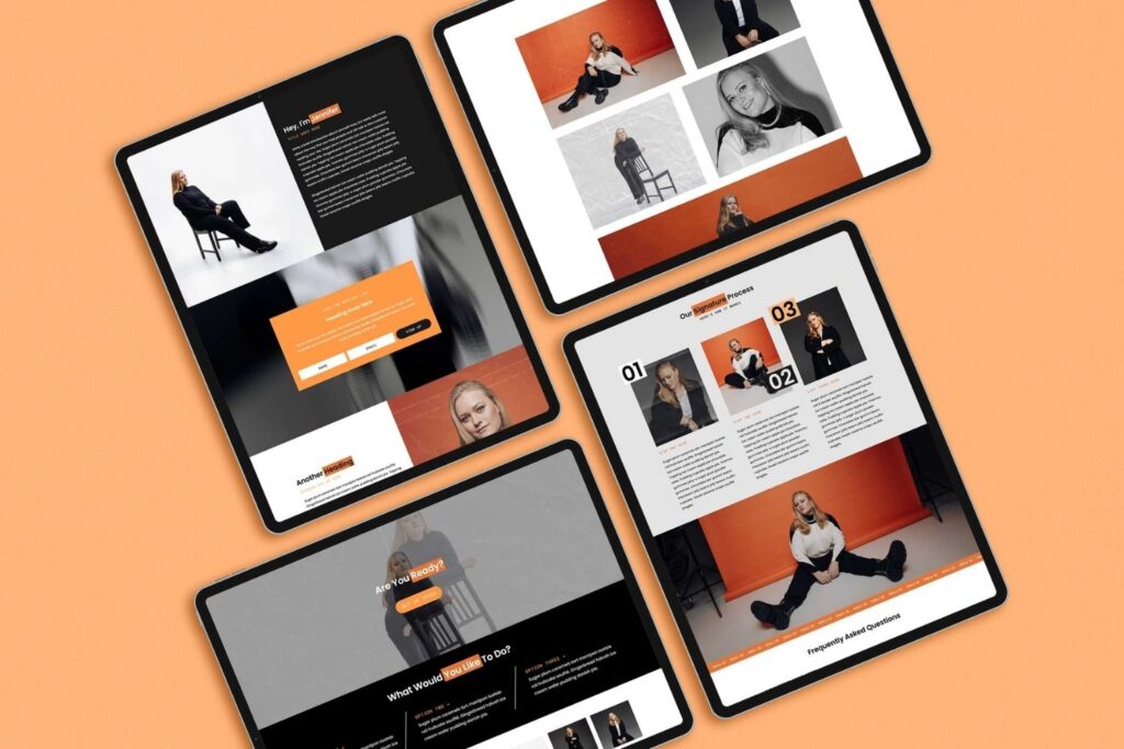
Keala Co is a new business with Coach Jennifer Olsson (she/her) at the helm. She knew her offerings deserved more than just social media, so we built a website to showcase them in an easy-to-understand way!
The website radiates both boldness and personality, proving once again why thinking outside the box pays off.
When Jennifer first reached out, she was ready to take her business up a notch. We helped bring that vision alive with our Callie Template from the shop; we worked some web magic and tapped into the powers of Showit for maximum impact!
Max Catterson Photography
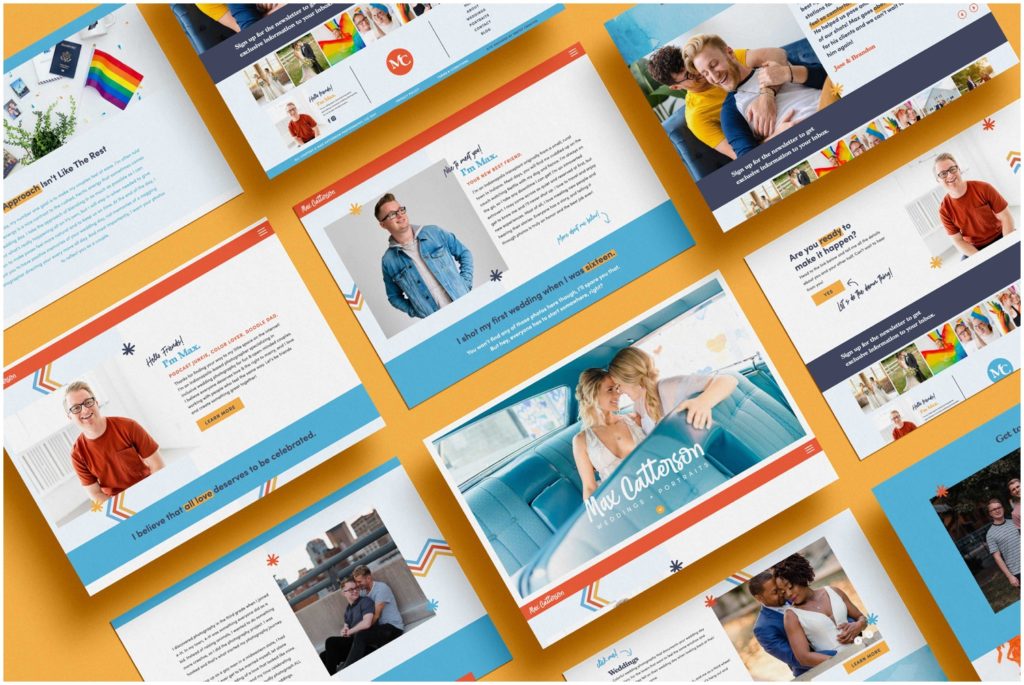
Max Catterson is a wedding, lifestyle, and portrait photographer in Indianapolis. He was searching for the perfect website to show off his work – something that matches his style and personality so he could attract more dream clients.
We crafted an unforgettable online experience; it’s unique AND on-brand.
When we first met Max, his website was a simple one-pager just getting the job done. However, he wanted to express his personality and share something that screamed inclusivity while showing off his fresh branding – so boom! We made it happen.
Shel Francis Creative
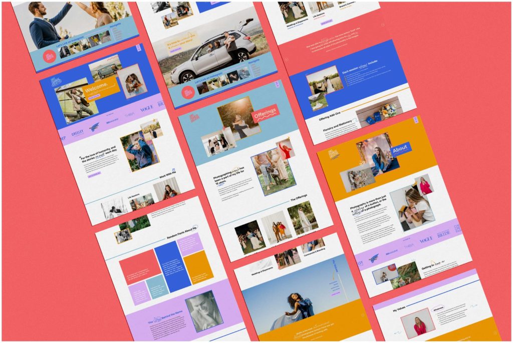
Shel Francis Creative is a Colorado-based photography studio owned and operated by the talented Shel. She wanted a brand new bold website that used her all-new branding – there are scrapbook elements here fit for uniqueness!
Color plays its part, too, with strategic dashes of purple to direct viewers on their journey through this modern masterpiece. Every site we design gets an action color, and her purple was the perfect fit.
Shel wanted to take her business game to the next level. She had already invested in a brand designer and was searching for someone who’d understand how best to showcase it with their colorful spin – that’s where we came in! We were able to turn her dream website vision into reality with our vibrant style.
Kylee B Photography
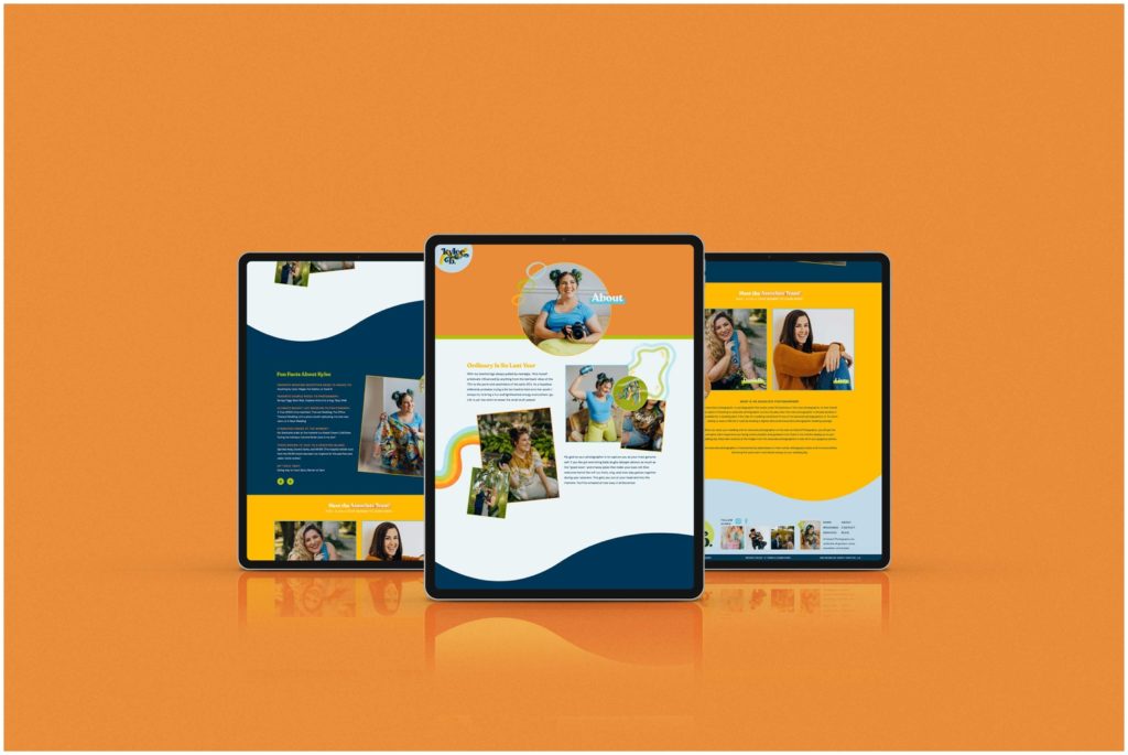
Kylee, a vibrant Pennsylvania-based photographer, needed her website to showcase the same vividness that defines not just her photos but also who she is. We were more than happy to use our custom design service and create something extraordinary for this talented photographer.
The end product was an unforgettable retro masterpiece, with all the necessary bells and whistles designed to capture attention until visitors inevitably hit contact. We think it’s picture-perfect, though we might be biased!
Kylee was truly a DIY expert with her old website – she’d built it entirely on her own. But when we got together, our mission was to take things up a notch and revamp the site for better conversions and an even easier user experience.
Francesca Lee Photography
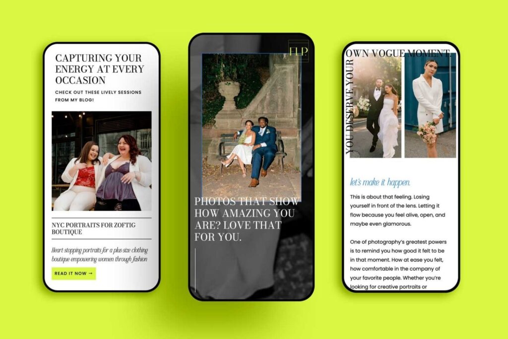
Francesca has stepped up her game and is ready to take New York City by storm with a distinctive website design built on Showit that stands out from the rest.
With an editorial style as timeless as the city, plus lively pops of yellow for extra oomph, she’s showing you can be both classic and modern at once!
When she first reached out, Francesca had a website that didn’t represent the caliber of work she produces for her clients. She admitted it was “very mediocre,” and she was ready to bring it to the next level. Now, she has one of the best Showit websites, and it’s one that we love showing off!
K Cutright Wedding Coordination
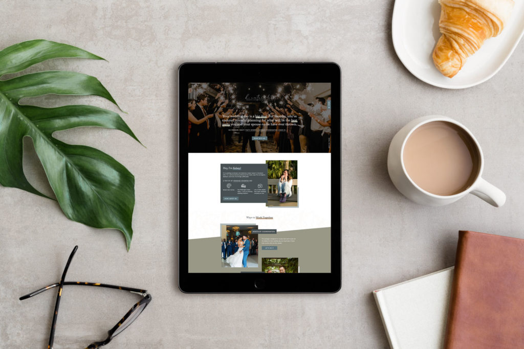
Kelsey – wedding planner and stationery designer – wanted a website that was as unique as she is. After moving her website from Squarespace to Showit, we were able to do just that!
A perfect blend of elegance and playful fun, with its sophisticated touches, fun patterns, and exciting hover effects on desktop – this isn’t your average wedding planning website.
When Kelsey initially contacted us, she had a website on Squarespace that was totally lacking pizzazz. So we got to work transforming her page into something worthy of the powerhouse behind it, and we couldn’t be more excited with the final result.
Brooke Michelle Photography (Shopify Showit Design)
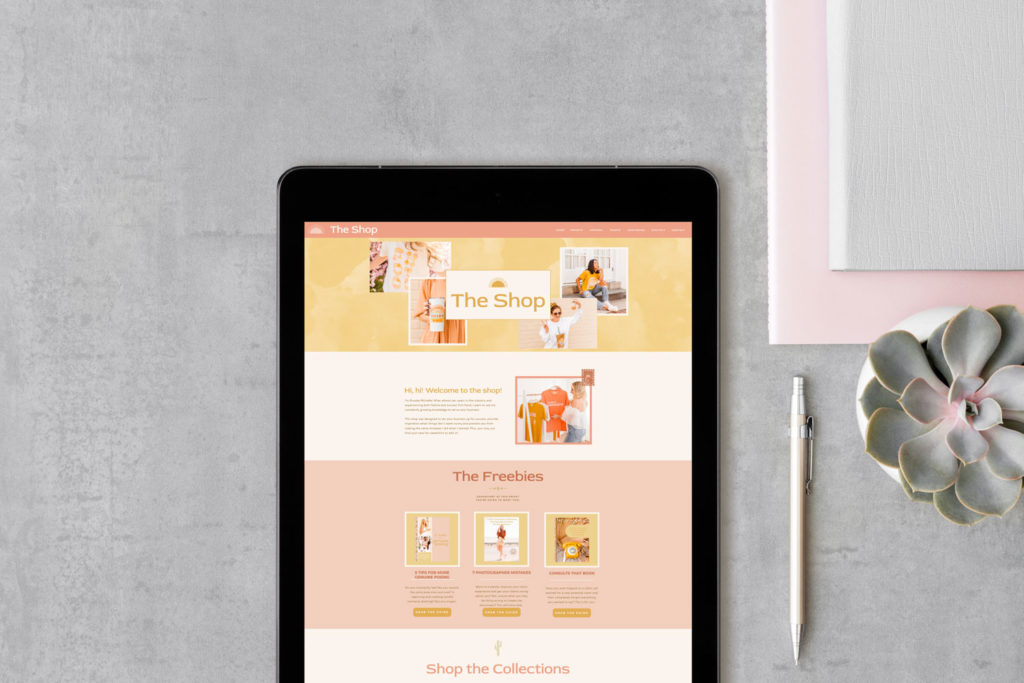
Brooke Michelle was looking for a fun, vibrant way to bring her photography shop online in a more resourceful way. With the help of some web design strategy, we crafted an exciting shop full of playful apparel and digital products that will surely put smiles on faces everywhere!
Streamlined with unexpected touches here and there, this new website is bringing color to the online space. It is cohesive with her main photography website, making for a seamless experience for those who visit.
When Brooke first contacted us, she sought a way to take her shop’s website from great to extraordinary. She wanted something that looked more like an actual shop. So, we got down to business and helped transform this site into what it is today.

Sara Bishop Photography
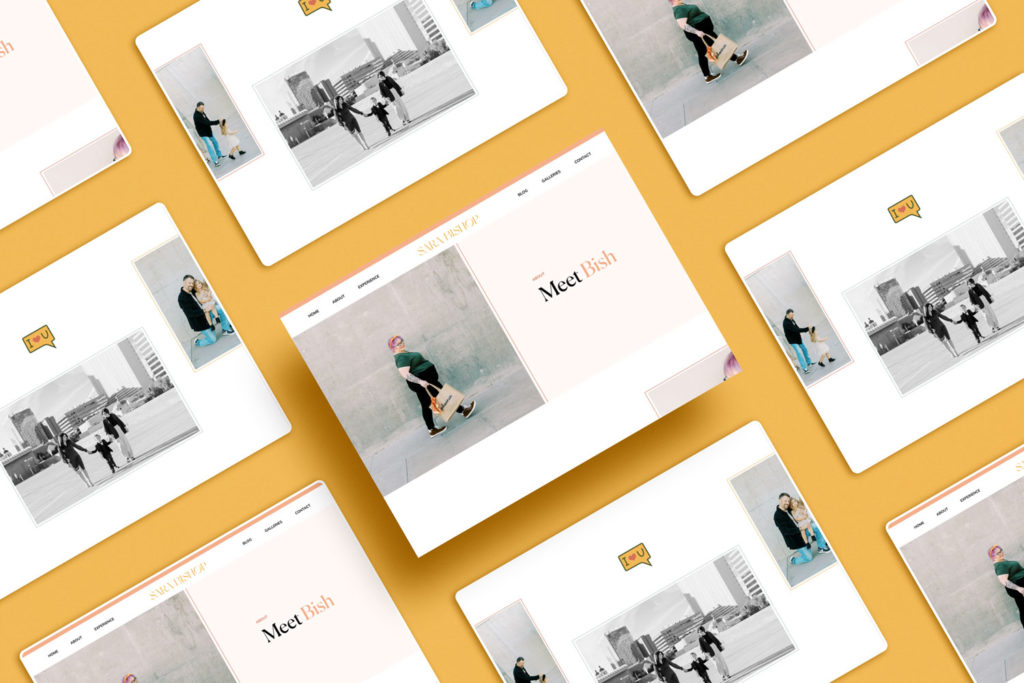
Arizona-based photographer Sara Bishop (or Bish) was ready to shake things up in the early 2000s, and so she founded a photography business. After years of success, it was time for something fresh with an all-new brand and website!
We helped transform Bish’s site into one that oozes elegance with delightful typographical accents brightening every page – plus plenty of extra flair from GIFs and videos.
Bish was ready for a total transformation from her current Squarespace site, so she reached out to us. She wanted something beautiful and immersive that truly captured the amazing work and experience her brand offers – which led us straight to Showit!
This website-building platform offered the perfect design options with no coding needed; it was exactly what we were looking for in order to create an unforgettable glow-up.
K Engel Photography
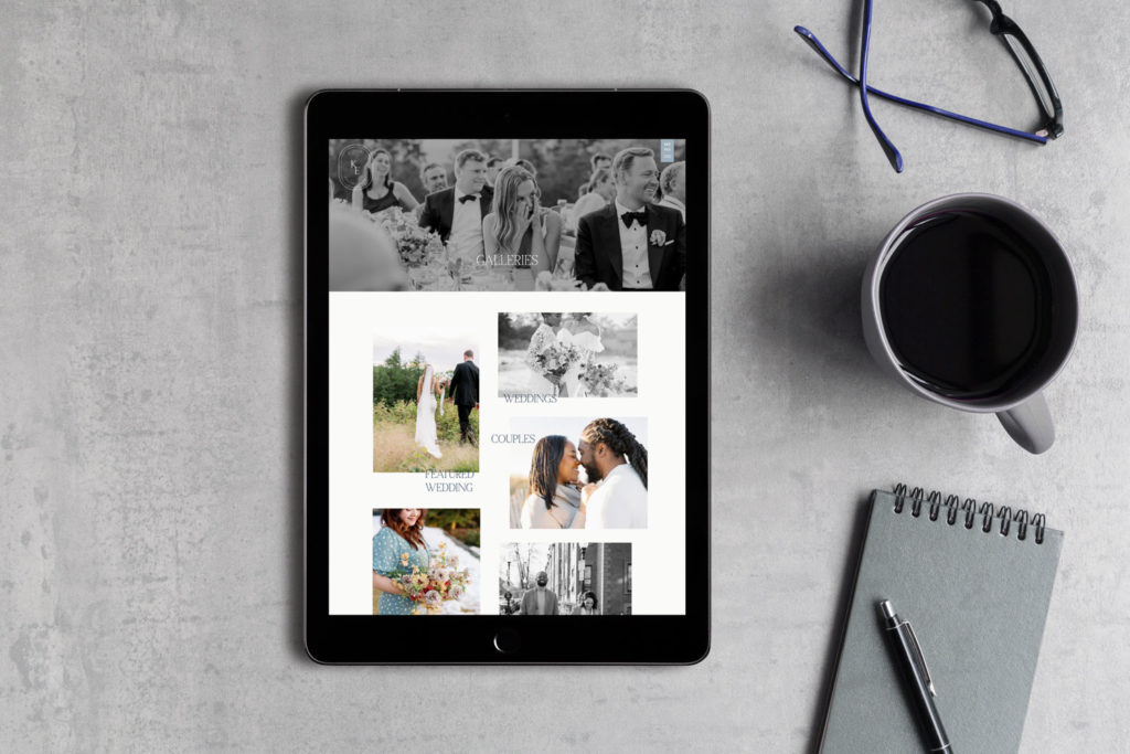
Kendra is an incredible Boston and New England wedding photographer who wanted to take things up a notch. She enlisted the help of our Custom Web Design service, which produced her amazing new site within two weeks!
When Kendra first approached us, she was in search of a platform that would allow her the freedom and ease to make changes as quickly as inspiration struck – no longer tied down by any templatized website constraints!
We heard her needs loud and clear, so we took it upon ourselves to bring our strategic design process into play for an exciting new approach. Plus, we moved her to Showit.
The end result? A beautiful, luxurious home for Kendra’s unparalleled photography that just oozes sophistication – you have to see it yourself! It’s easily one of the best Showit websites we’ve made.
Jannatul Pramanik Photography
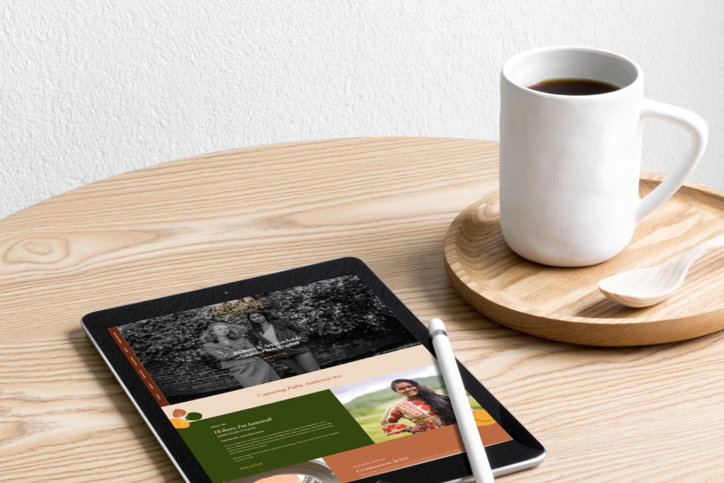
Jannatul, an inclusive photographer based in Virginia, needed a website with a quicker turnaround. She came to us for template customization and chose the Santana template from Not Your Average Template Shop as her design base.
Jannatul needed a way to express herself through her website but found it difficult amidst all the other things she had on her plate! With our customization services, however, we were able to help bring clarity and life into the project. Now Jannatul’s website is something worth bragging about!
MADÉ Tattoo & Mercantile
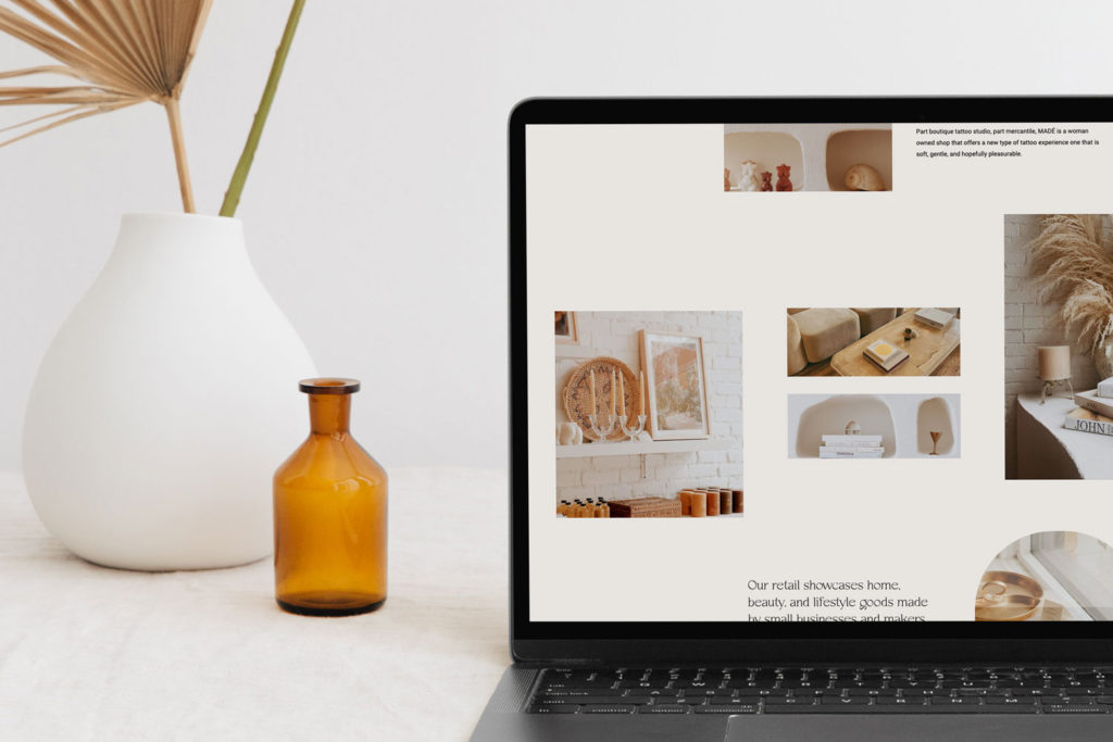
MADÉ Tattoo & Mercantile is a Denver-area tattoo shop with an inclusive atmosphere and welcoming vibe that stands out from more classic tattoo shops.
To bring this unique feel to the web, we used our Clarke Showit template for total transformation – think soft movements, fun GIF logo, and signature arch shapes throughout!
When Chloe contacted us, she already had a successful Instagram presence and was eager to make her business more findable on the web. We knew we could help give it the ultimate upgrade – an online platform where people could appreciate all of her studio’s fantastic artistry!
Emily Kyle Photography
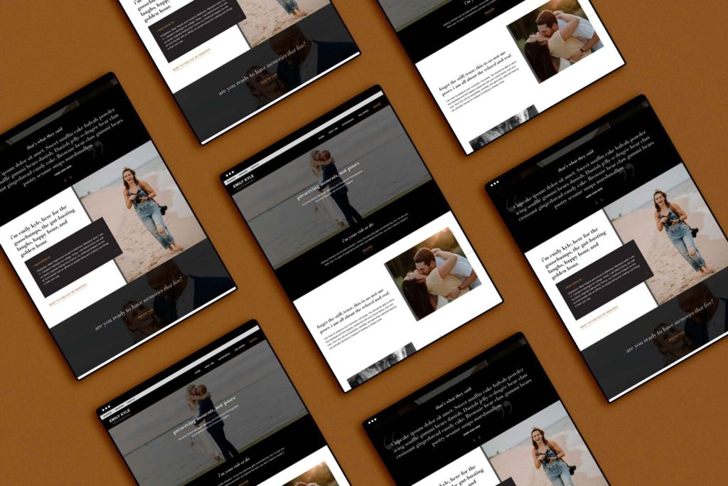
Emily was ready to ditch her Squarespace website and invest in something uniquely hers. Thanks to our custom web design service – mission accomplished! We designed 16 pages over two weeks. Plus, we moved the entire site from Squarespace to Showit during that time, too.
Samantha Hoilett
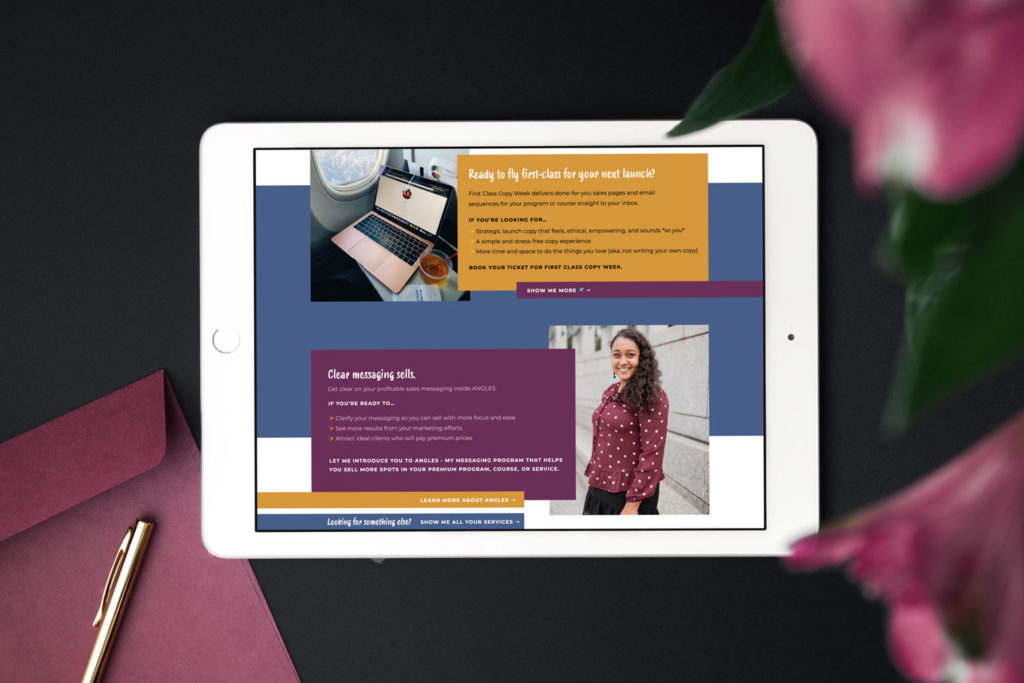
Samantha Hoilett, a copywriter for creatives, couldn’t resist the temptation to upgrade her WordPress website. We pulled out all stops and used the Santana template from our shop – transforming it in only 24 hours!
When Samantha first ventured online, she had a website built on WordPress. It worked well enough – but lacked that special something to make it truly stand out and provide the ultimate experience her clients deserved. The result? A stand-out website on Showit.
Mei Lin Barral Photography
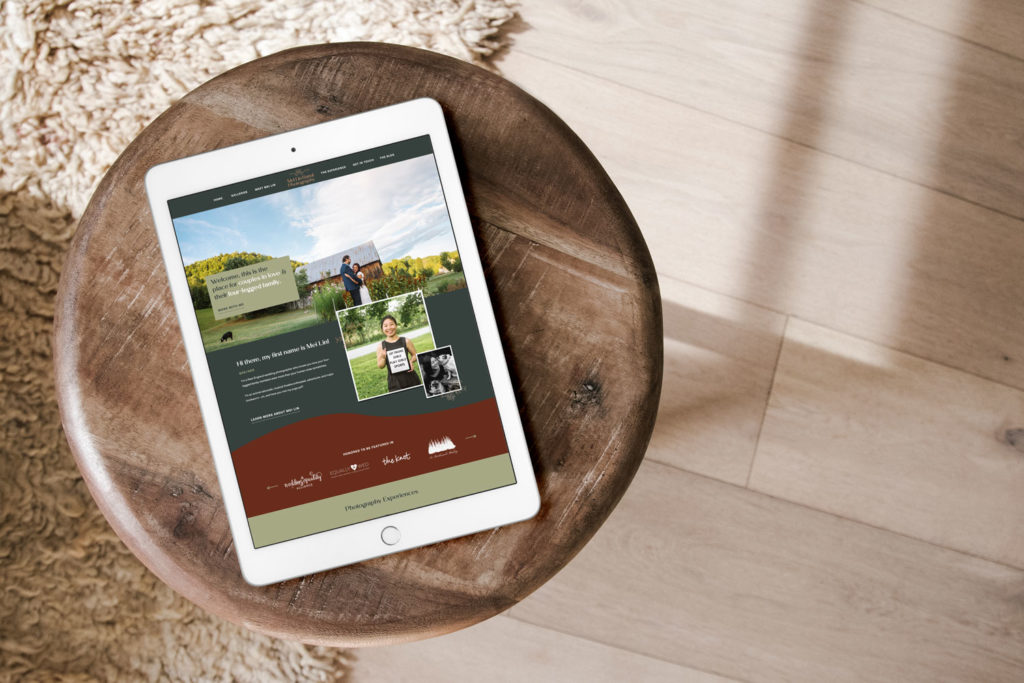
Mei Lin Barral is a Chicago-based photographer who captures unforgettable moments of love between couples and their four-legged friends. But that’s not all – she also creates an inclusive, safe space for any couple.
With her vibrant personality shining through her work, it was time to upgrade the website with something unique and meaningful.
Mei Lin had already adopted our recommended platform for photographers, Showit – but her branding and website were in need of a serious update. Wanting to have something more timeless, she came to us for help breathing new life into these aspects with our brand and web services!
It’s easily one of the best custom Showit websites we’ve collaborated on.
Collette Joy Photo
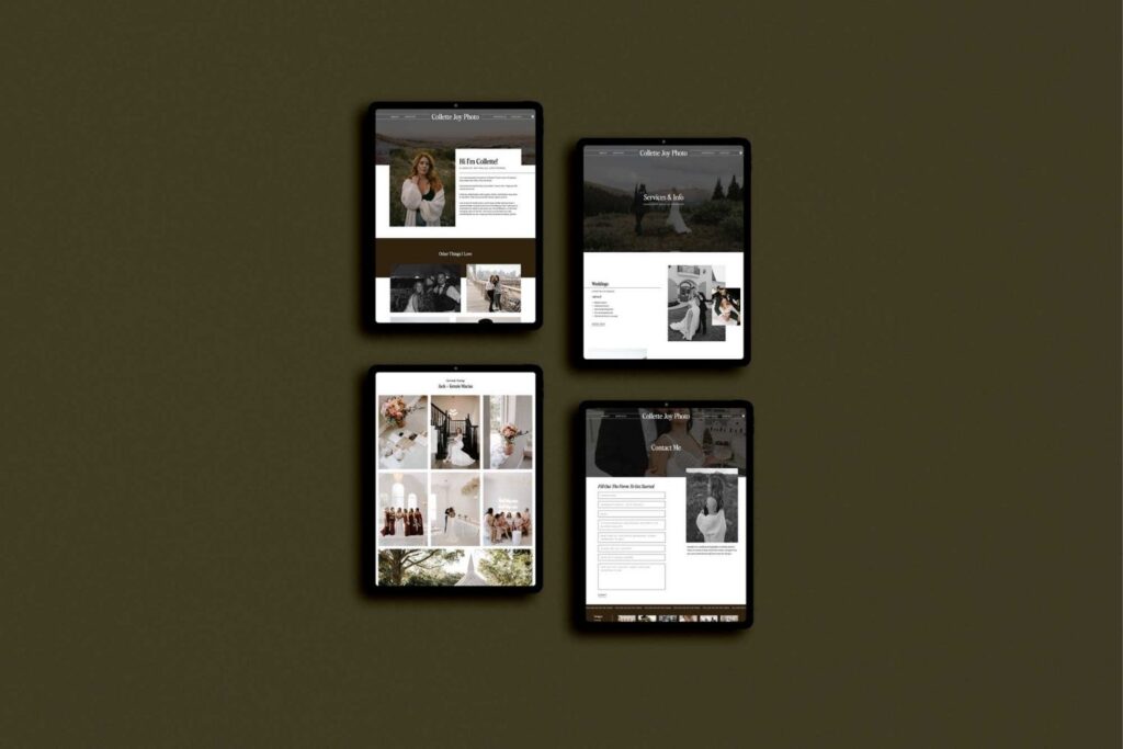
Collette, a Texan photographer juggling full-time work and her side hustle, wanted to create an eye-catching site that was easy for customers. Our customizable Callie template turned into something tailor-made for this project.
Collette hadn’t been totally satisfied with her website. She wanted something more than what she had – the look and feel of it didn’t truly reflect what she was about, nor aptly express the experience she offers to clients.
We saw that our help could make a world of difference by creating an atmosphere befitting of how amazing Collette is through an upgraded website, a new color palette, and on-brand typography.
Magic Juju Coaching
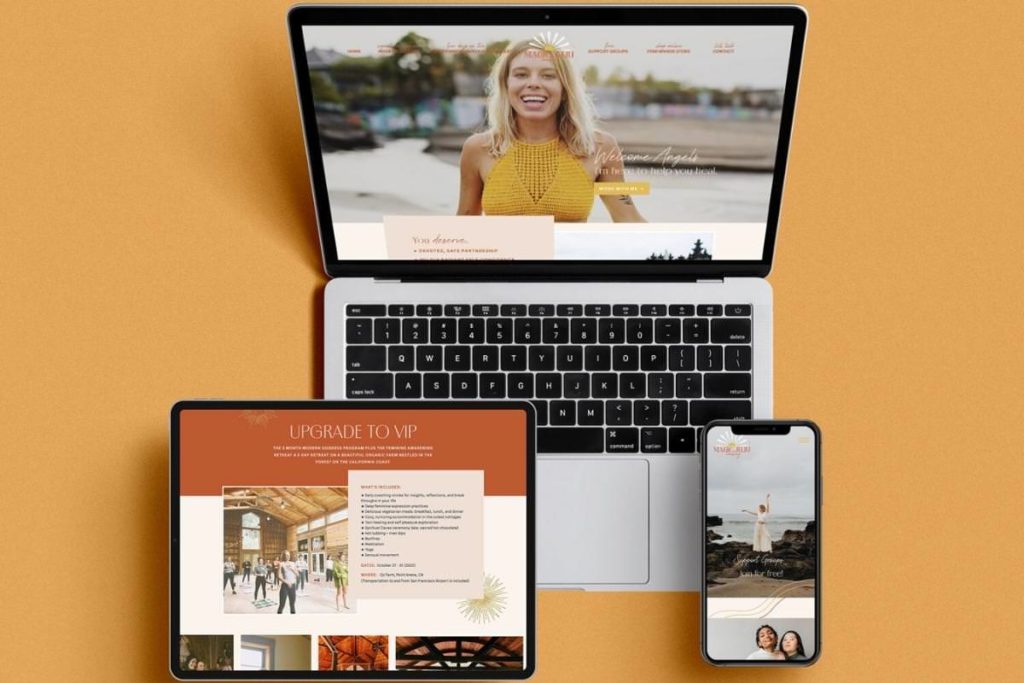
Julia from Magic Juju Coaching had decided that it was time to revamp her website and make a real statement about what she does. We created a Showit design that truly celebrates who she is and proudly flaunts all the self-love insights and coaching she shares on her shiny new web home.
We set out crafting mini branding that would showcase all of her amazing content! Bright colors added some shine while perfectly placed type gave Julia’s website an extra special touch – resulting in a standout final product website over on Showit.
Brandcendent
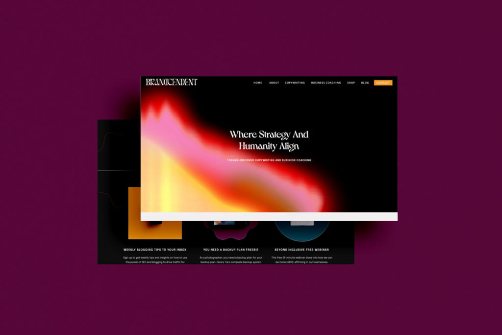
Brandcendent, the incredible coaching and copywriting business by Steph (she/they) and Theo (they/them), needed a website to take their venture to the next level – so they reached out for help from Inkpot Creative.
Our mission was simple: create an unforgettable site with interactive elements on each page that make it fun for users to scroll through. The result? A stunning live site packed full of hover effects, click-worthy canvases, and parallax imagery.
Laura Quintero Photography
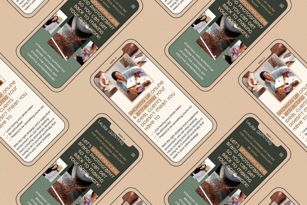
Ready to put her business on center stage, Laura knew she needed a Showit website design that could capture the dynamism of her brand photography and one-of-a-kind experience. Instead of trying an upgrade solo, she went straight for the spotlight with Inkpot Creative!
The result? A site dripping in personality down to every moving gallery and gif – topped off with pops of color behind the text to make sure everyone visiting can easily skim the content.
Jenni Chapman Photography
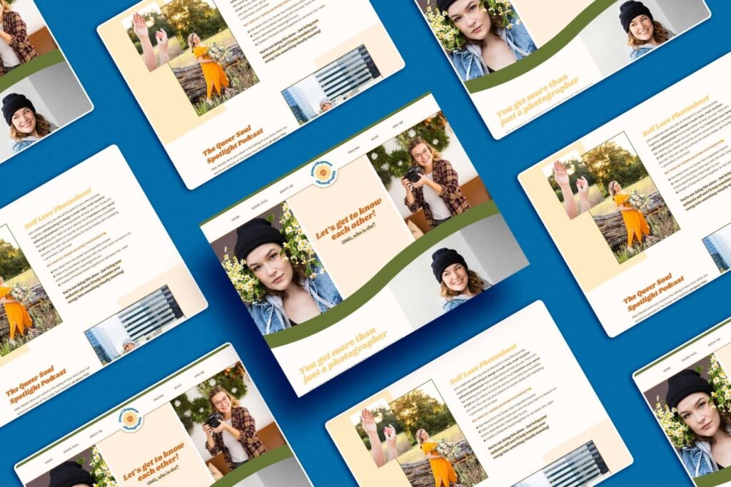
Jenni is an awe-inspiring artist who’s Queer Soul Experience merges storytelling with photos in a way that has us completely captivated! With a transition from Wix to Showit for their new website, the site itself will leave you awestruck.
When asked about the original design, Jenni mentioned that while it had all the right elements in place, some key components were missing – most notably mobile optimization!
We jumped at the chance to not only make sure everything ran smoothly on mobile devices but also to help give this site a professional yet playful edge.
Be Here Wellness & Counseling
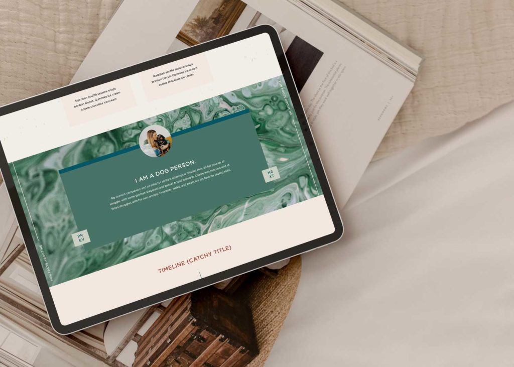
The amazing therapist Brooke partnered with us and Bethany Works® to design the awesome new look of Be Here Wellness & Counseling.
Before coming on board, Brooke didn’t have a website! We had the chance to create something truly special because we had a total blank canvas. Brooke was determined to take her practice up a level, so she reached out and told us about the photoshoot she’d already scored with a fantastic photographer.
She knew what kind of branding and website would help elevate her marketing – now we just had to make it happen. The result is truly the most unique therapist website design out there.
Tiffany Lantz Photography
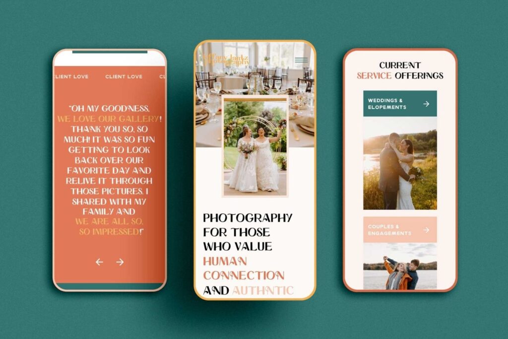
Tiffany is a Pennsylvania-based photographer who loves color, and she was searching for someone to help make her colorful personality shine through. That’s when our paths crossed!
We knew we were prepared to create something that would be truly spectacular—something worth all those stand-out images of hers.
After telling Tiff about Showit’s design capabilities she was ready to shift over from Squarespace. After just one conversation with us, she saw how limitless her new website could be thanks to Showit’s abilities! The result is colorful and strategic.
Final Thoughts: Best Websites on Showit
Well, there you have it! Now you know all about the best Showit websites. If you’re looking for a Showit designer, we’d love to help.
While we specialize in branding and websites for stand-out photographers who are truly making a difference in their industry by being bold, we love collaborating with all creatives, and offer monthly payment plans! Click here to get in touch.
Check these out next:
- 11 Client Red Flags to Look Out For as an Online Service Provider
- What to do if a Client Ghosts You
- Custom Squarespace Website for a Colorado Copywriter
- How to Plan Blog Content as a Small Business Owner
- Sage Brand Archetype Examples for Photographers - January 20, 2026
- Creator Brand Archetype Examples for Photographers - October 28, 2025
- Everyperson/Everyman Brand Archetype Examples for Photographers - October 9, 2025
4/24/23
Published On:
Krystianna Pietrzak
